HOME | DD
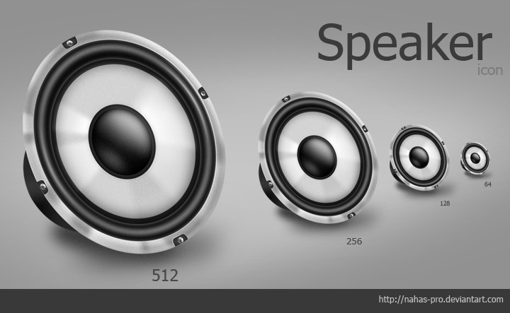
 basstar — Music Box Icon Packet
Published: 2007-09-11 19:43:22 +0000 UTC; Views: 18503; Favourites: 70; Downloads: 5015
Redirect to original
Description
8 files + preview256, 128, 64, 32 .ico and .png
size: 378 KB
Please don't redistribute these files as your own.
Contact: 292147734
Related content


Comments: 32


Kinda late..but there'd you get that pattern for the background? i love it.
👍: 0 ⏩: 0


Nice work dude. Where are the 24x, 22x and 16x versions?
Once you scale your hi-res icons down to smaller resolutions (either in vector or through raster resizing interpolations) you need to make sure that they continue to function as icons and not become blurry blobs: icons need to have a distinct shape and a good visual metaphor to quickly convey the message or functionality they represent. A good thing to do when scaling to smaller sizes is to use a raster editor and brush up the outline and otherwise most important visual elements. Think of the 1 pixel outline that a text document mime-type icon would have or something similar.
I did some work a while back on fixing a whole lot of icons that had been scaled down and exported without optimization for their new sizes. See [link]
")
👍: 0 ⏩: 1

Hm they are no vectors.
Take the 256, scale down and
show me what you mean
 (Smile)")
👍: 0 ⏩: 1
For example: the power management icons by Jakub Steiner:
128x128: [link]
48x48: [link]
22x22: [link]
16x16: [link]
If everything were scaled, then the stroke/outline of the icon would get smaller than 1 pixel and become fuzzy at smaller sizes. Jakub either aligned a stroke/outline of the main shapes to a pixel-grid at 1:1 in the vector editor or used a raster editor to add the outline after rendering the vector into raster format.
Here's the 32x version of the music box: [link]
👍: 0 ⏩: 1
No worries. Looking forward to seeing more icons now.
👍: 0 ⏩: 1

128x128: [link]
48x48: [link]
they look different, that guy redesigned the icon to make it more clear for people who can't view large icons.. and of course it takes more time X.X''
Any way, thank you for the complainant!
have a nice day.
and basstar, nice work.. keep it up!
take care
")

👍: 0 ⏩: 1
actually those links are the ones you posted up there
👍: 0 ⏩: 1
Ah... right: I thought you were going to link to something. (:
👍: 0 ⏩: 0

They look great. I might use them as a replacement for iTunes.
👍: 0 ⏩: 1


really nice, the perspective isn't correct but the other parts looks good.
👍: 0 ⏩: 1
Hm... i don't agree, but thanks.
Illustrate what's wrong.
👍: 0 ⏩: 1
It's not complete wrong but I think it looks confused ")
👍: 0 ⏩: 0


 (Wink)")

russian warez sites here I come! really good job, very clean.

👍: 0 ⏩: 1


