HOME | DD
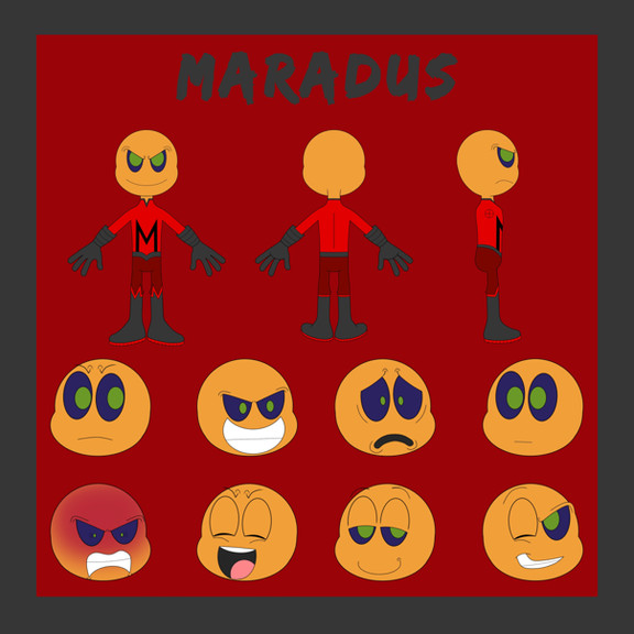
 batbeasts — COM: Ague Reference Sheet

Published: 2013-02-03 02:05:06 +0000 UTC; Views: 548; Favourites: 37; Downloads: 5
Redirect to original
Description
wOW I'M FINALLY DONE That took a long time qvq but I'm really frickin' happy with this wowowocommission for , who bought my old character Ague and gave me the extra deal so she got a refsheet of him too uvu
I HAVEN'T DRAWN HUMANS IN A LONG TIME I'M SORRY IF HIS HUMAN FORM LOOKS KINDA WONKY? ;w; and I'm sorry but human nudity (even if it is barbie doll nudity like I drew) makes me a wee bit uncomfortable so I censored it just in case
but yeah, I had fun drawing him again! uwu and I hope you like it!! thank you so much for commissioning me! ;v;
Ague /c/ *Bunneh-Chann , designed by me
Related content
Comments: 13

I'M GETTING AN ART BONER BY THE WAY YOU DRAW HUMANS
CHRIS I DEMAND MORE HUMANS
Nah, just kidding. Though you're really good at them ;wwwww;
/DO YOU EVEN HAVE A SINGLE HUMAN CHARACTER??? I'D DRAW THE SHIT OUT OF THEM HAHAHA
Digging the reference layout uvu
👍: 0 ⏩: 0

Woah suddenly human
Also that's a neat looking reference sheet layout (yeah I end up commenting about that of all things XD)
👍: 0 ⏩: 2

YEAH RIGHT??? HUMANS WHAT ARE THEY DOING IN MY GALLERY THIS IS SO WEIRD
and ah I'm actually glad someone noticed! I tried to make it neat and organized while still cramming a lot of information and whatnot into it, so whats why I went with the layout I did. uwu
👍: 0 ⏩: 1

They need to go hide in the corner, but you're pretty good at drawing humans u should draw them more
Yeah I don't see why people don't make more simple refs like they add crazy textures and the fonts are obnoxious colors
👍: 0 ⏩: 1

ahh I guess I'll try to! uwu
and yeah like this is pretty complex but adding textures and crazy stuff can really overdo it sometimes :I aND YEAH obnoxious colors too ugh ;; I try and use a dark, dull color that contrasts the character's design for the main part of it and I usually use the lighest color on the character for the text to give it some balance (also I'm big on recycling colors, I noticed)
👍: 0 ⏩: 1

Yes darker colors help the images stand out more you want that to be the main focus not anything else
Speaking of I should really make refs for my characters since nobody ever seems to read the artists comments with their info
👍: 0 ⏩: 1

yeah exactly! and bright text would be distracting too D:
and yeah I noticed that too ;w; like only a few people seem to actually read the info in the comments on mine and they're like "OH DOES THIS CHARACTER DO SUCH AND SUCH" when it says right there? so yeah I'm gonna have to make more detailed refs for all my characters again soon ;v;
👍: 0 ⏩: 0

I meant to say nice neat sounds weird XD
👍: 0 ⏩: 0

oh man this dude's designs is really freaking rad man! 8D
👍: 0 ⏩: 1


