HOME | DD
 BatiJFG — BRFG: new menu
Published: 2012-09-02 19:04:56 +0000 UTC; Views: 5695; Favourites: 63; Downloads: 38
Redirect to original
Description
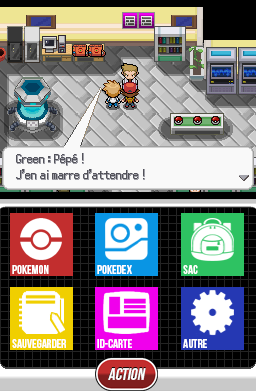
Hi this is new menu of Pkmn BRFG !Related content


Comments: 21

J'étais pas sûr, même si les captures étaient en français ")
👍: 0 ⏩: 1

Merci beaucoup ! Non actuellement on bosse sur une nouvelle démo qui correspondrait beaucoup plus aux screens tests que tu peux voir sur cette page, mais on a un emploi du temps serré entre les études et le boulot donc ça tourne au ralenti ... J'espère pouvoir la sortir dans quelques mois.
👍: 0 ⏩: 1
Oui je comprends, donc je vous souhaite une bonne continuation à tous! Et je viendrai voir, de temps en temps, les actualités et si une démo est sortie
 (Smile)")
👍: 0 ⏩: 0

")

Yes, in english but before in french !
👍: 0 ⏩: 1

Wow this is really goood! Can you change the squares to be more curved so it looks professional?
👍: 0 ⏩: 0


I love your icons' style: the font is awesome and it fits so good. Also, the "Action" button looks awesome, and of course, the font is awesome too.
👍: 0 ⏩: 1
You're really a font saver. I consider that font, or at least that style of font, to be useless and ugly. But now seeing what you did with it, it looks awesome.
👍: 0 ⏩: 1

 (Wink)")


i like the way it reminds me of Windows 8 and the new Metro Start menu.
well done
")
👍: 0 ⏩: 0

I like it. The white text goes well with those colors. To me that is.
👍: 0 ⏩: 0

Nice to see the vibrant colors, though it may help to make the text black since the white text is a little hard to read.
👍: 0 ⏩: 0