HOME | DD
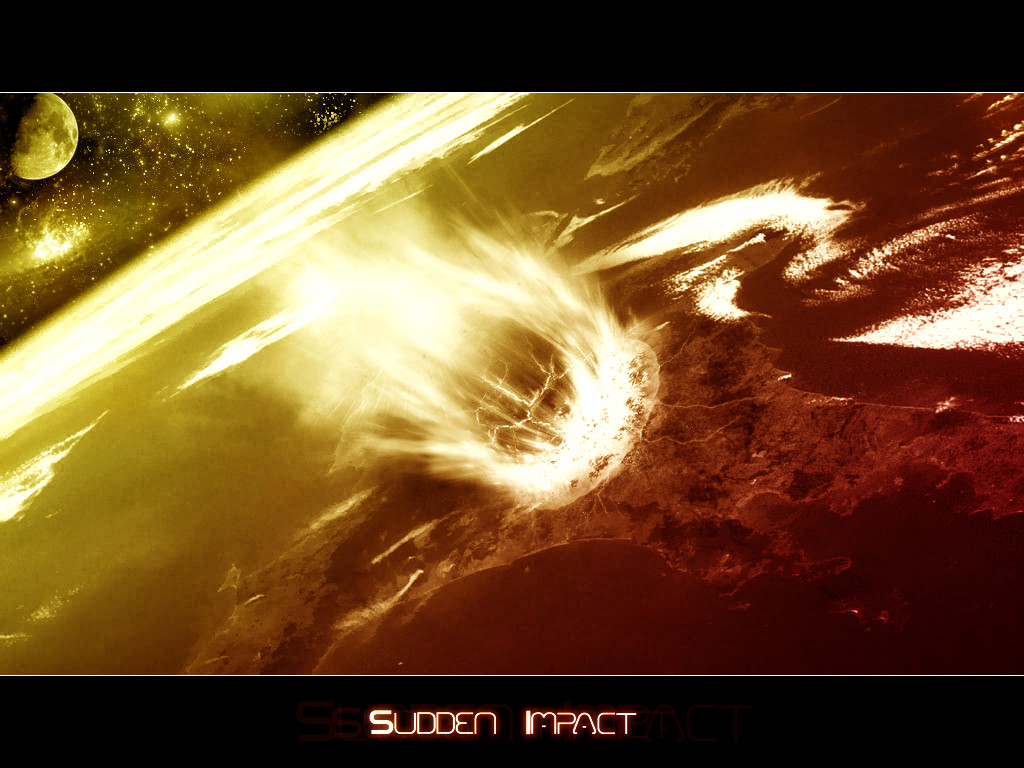
 BbOyFLip96 — Sudden Impact I
Published: 2004-08-11 08:57:26 +0000 UTC; Views: 2012; Favourites: 36; Downloads: 676
Redirect to original
Description
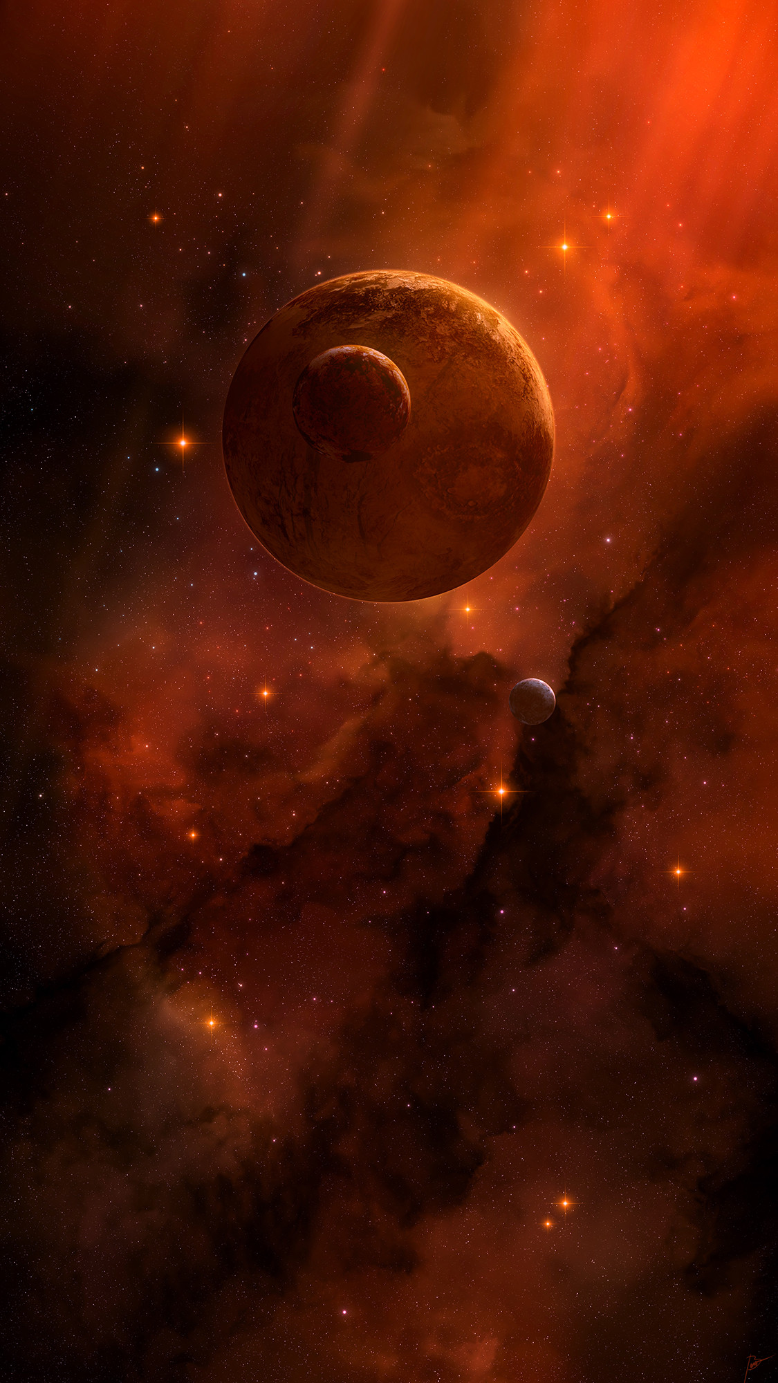
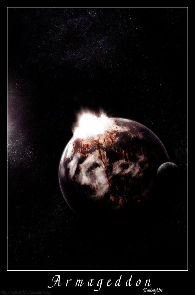
Hey guys, havent been around lately... Was bored trying to catch up... Well heres another Photomanipulation... Hope you all like it...This is the original Picture: [link]
Hope you all like it... I think I should of done better... but oh well theres always next time... Plus I might make second version.. maybe.. Comments, Rating,
 are highy appreciated...
Related content


Comments: 36


oooo .... very nice
i lve planetary artwork
especially these kinds +fav
👍: 0 ⏩: 0

hey crazy... what's krack a'lackin. nice job there, but your work is about as good as your df skills, which is no where compared to mine
 (Wink)")
👍: 0 ⏩: 0


 (Smile)")


MAn thats crazily intense.....this is one of the best impact scenes i've seen in along time. KIller job bro!!

👍: 0 ⏩: 0

Thank you everyone for your honest comment & especially for those who
👍: 0 ⏩: 0

work itself is great!! but the text....u keep usin the same font lately on ur work :/ but the work itself it good
👍: 0 ⏩: 0


holy crap man, thats amazing, im definatelly going to need to learn how to do that
👍: 0 ⏩: 0

I am also busy with photo manip, but i must say this is one of the best i have seen.
so you deserved a
👍: 0 ⏩: 0

Very nice, brushing is amazing as always, really like the brushing around the impact area...
I really don't like the text though, that kind of spoils it a little IMO. A clean white font might look better, but this is just IMO.
👍: 0 ⏩: 0


great technique, you should be proud
My only concern is that the abstract elements of this piece stand on their own well enough that it's a bit disappointing that it resolves into a recognizable space scene. Don't get me wrong, it looks great! But because it's an iomage of something so specific, I feel like other possibilities using the same technique have been overlooked. But that's just me shooting my mouth off. After all, I only have to take off my glasses and everything turns into World of Abstraction v2.0
👍: 0 ⏩: 0


WOW again, very nice space piece that comet is sick.
👍: 0 ⏩: 0


👍: 0 ⏩: 0


