HOME | DD
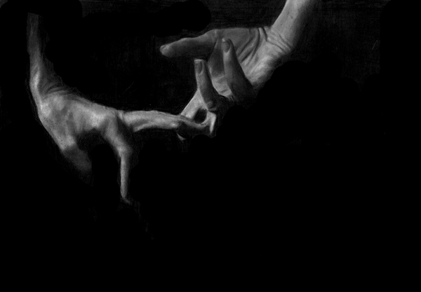
 beanboski — reaching

Published: 2006-03-24 11:01:12 +0000 UTC; Views: 3093; Favourites: 54; Downloads: 284
Redirect to original
Description
not sure if i love or hate this, if any one has any better ideas on how to frame it, let me knowRelated content


Comments: 73

We're always trying to reach for something but it seems we hardly ever make it. I personally like the traces of light coming from your fingers and the fact you decided to darken all the surrounding area.
This will be featured on my next journal!
👍: 0 ⏩: 1
 (Smile)")

Amazing shot. 
👍: 0 ⏩: 1

thanks man, big ole dark room, one strong but small source of light(a garden light) and relatively low exposure.
👍: 0 ⏩: 0

I rather like this one! Where did you place the source of light to light up both inside hands? (I mean without any of it or of the background for that matter showing)?
👍: 0 ⏩: 1
i took this pic horizontally and flipped on its side in photoshop
i used a garden halogeon light for lighting. shot it in a long room in the pitch black darkness with a low exposure so all u can see is my hands.
glad u like it
👍: 0 ⏩: 0


👍: 0 ⏩: 0

What are you reaching for? This is definately a strong emotional photo. It's screaming...pretty damn loud.
It also could mean so many different things to so many different people.
Congratulations on a successful conceptual photo :]
The only critique I have is the font near the bottom. It looks mspaint-ish & your photography is definately beyond that calibur of work ")
👍: 0 ⏩: 0

Great use of light and I love the motion shown. Very well done. I think the framing is perfect.
👍: 0 ⏩: 0

")


That´s very interesting photo shot. i love the contrast between black and white and the lighting is so good over there. i love the idea and the photo at all. good job.
👍: 0 ⏩: 0

Thats a great picture, good job on the lighting. I like the motion in it, it's so simple but pure.
The frame looks right to me.
👍: 0 ⏩: 1

i think the frame looks great!
love the contrast
wonderful and interesting concept
awesome
👍: 0 ⏩: 0

I wish the hands were less centered....I'd move them down-left, to give a sense of motion. Not sure if you mean that sort of framing, or the wooden box sore though
👍: 0 ⏩: 1
yeah thanks what i meant thank u for your idea, i need to try another version of this me thinks
👍: 0 ⏩: 1
always worth it to keep experimenting - even if you hate the result, if you can set aside personal feelings and analyze it, you learn from what went wrong.....
👍: 0 ⏩: 0

very nice contrast. I really love the concept and the delivery. nice work.
👍: 0 ⏩: 1

nice shot, there something i want to tell about this one but i can't write it in words, i just love it.
👍: 0 ⏩: 0

Wonderful photograph! I think the framing is perfect, and its simplicity is elegantly excellent.
Cheers.
👍: 0 ⏩: 0

i think its simplicity is its strength in this makes the motion of the hands more powerfull looking, ver very cool pic.
👍: 0 ⏩: 1


I like this sooo much! I cant express ,But its so neat
👍: 0 ⏩: 0


Ive always found adding captions or titles on the actual piece kills it. Gives the game away straight away. You have to make the viewer work to get the true meaning of the photo. Or sometimes the real beauty of art is that there is no "real" meaning and most of the enjoyment comes from trying to figure it out, or make up your own meaning.
Dont get me wrong, its an amazing shot. Im not too sure on the blur marks on the tips of the fingers. Kinda looks like the hands are withdrawing rather then reaching for something. It'd look alot better with a white frame.
👍: 0 ⏩: 1
thank you very much for your words, i am plannin on makin a few changes to it at some point, i dodnt usually title my pictures either. but thank you!
👍: 0 ⏩: 1
Hey no problem. I didnt want to sound like im right up my own arse.
👍: 0 ⏩: 1
I am........but thats not the point
👍: 0 ⏩: 0


👍: 0 ⏩: 0

great lighting and shadows, the human hand is so magnificent +fav. great work.
👍: 0 ⏩: 0

Great photo indeed!!!
And I like the way it is framed, why are you not convinced about it?
👍: 0 ⏩: 1
i think the frame weakens the overall image, but im not sure i might keep it this way, it seems to be gettin a good response set out like this ,thank u for your comments and the fave
👍: 0 ⏩: 1
In my opinion it is a good frame. I usually don't like very much frames, but with photos with a completely black background a light frame can drive the sight.
You're welcome!
👍: 0 ⏩: 0

Hi
Your work has been chosen for a feature at *PhotoLust !
If, for any reason, you don't want your work to be featured in the *PhotoLust journal for today simply send a note and I'll take it down straight away.

👍: 0 ⏩: 1
thank you! thats awesome thank you
👍: 0 ⏩: 0
| Next =>