HOME | DD
 bearmantooth — Tryout p2 and 3
Published: 2006-10-18 02:58:54 +0000 UTC; Views: 2329; Favourites: 42; Downloads: 405
Redirect to original
Description
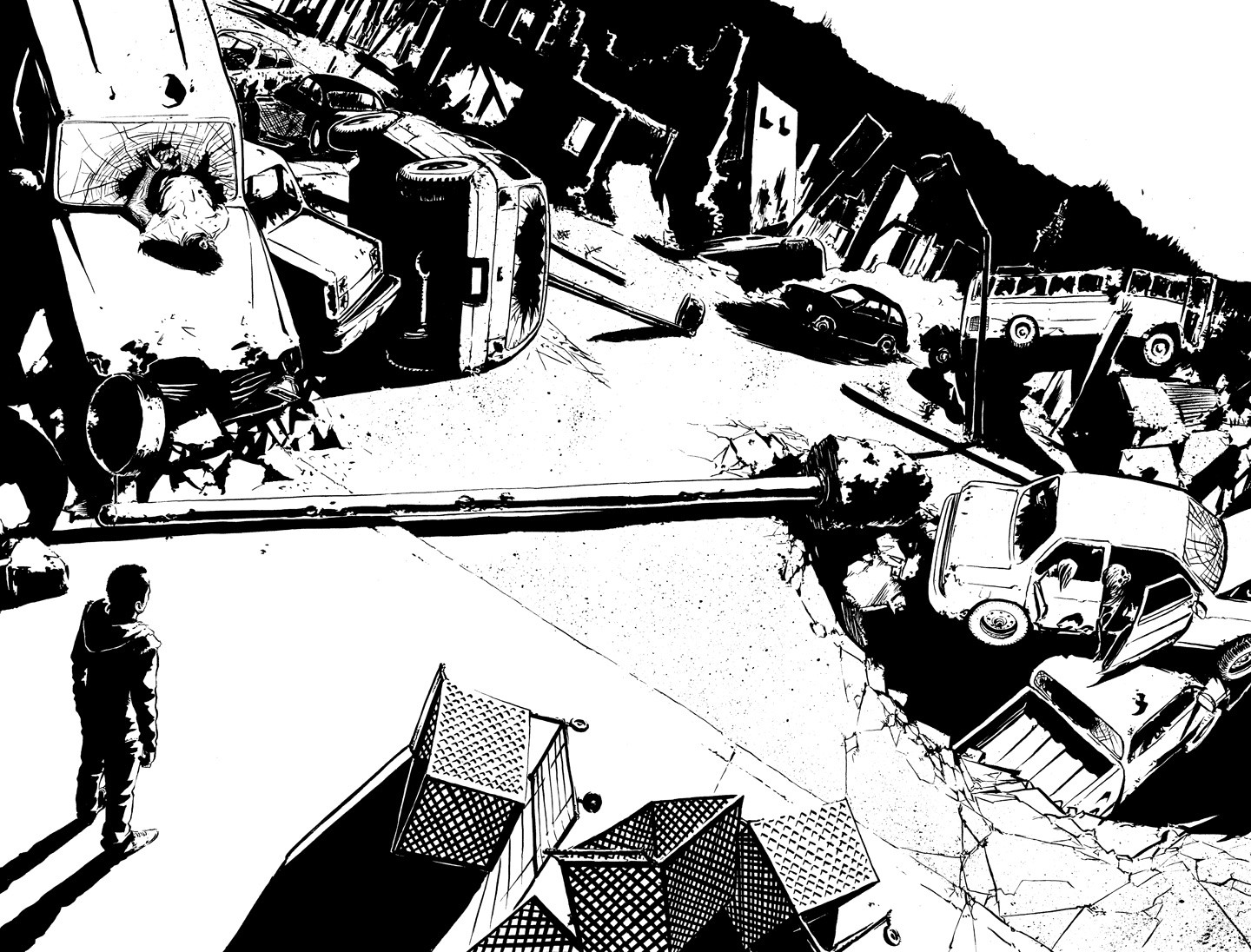
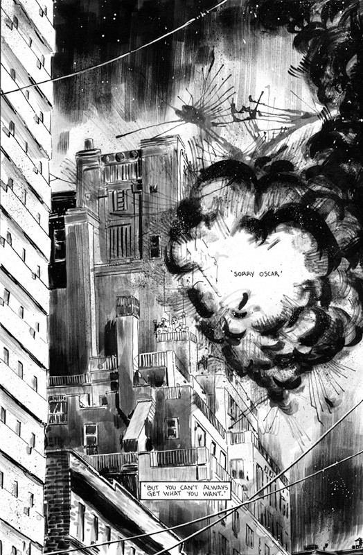
I've been working on a submission to ONI Press. I looked at Alex Toth as an example for working with black and white. I like the roughness but also his amazing quality. I can't compare, but it was a great influence.Related content


Comments: 65

haha, thank you! yeah, here's hoping.
yeah, that was a great scene from Watchmen. so visually powerful.
👍: 0 ⏩: 0


Dude, I'd hire you in a heartbeat. this piece shows a lot of what you understand and, better yet, can execute in terms of light/shadow, perspective and just detail in general. one of my fav's I've seen today, great work!
👍: 0 ⏩: 1
thanks. yeah, i think i was originally looking at Travis Charest as an influence, but thank god i came to my senses and started looking at Alex Toth. He is amazing with a brush, and black and white contrast.
👍: 0 ⏩: 1
totally. he will be missed. charest is a god in himself though. I've lost track of him recently, hearing last that he had moved over to France or something. Anywho, love the piece. have a good one!
👍: 0 ⏩: 0

Beautiful, this scene just looks so natural. Kind of has a Walking Dead vibe to it, but I can't explain why. Maybe the sheer dread in the scene.
IMO They'd be crazy to turn you down.
👍: 0 ⏩: 1
Thank you very much. I hope you are right. I was directed to explore my style more, and I wasn't planning on it, but upon learning that this was for black and white publication I decided that I need to get crazy with the black and white contrast.
👍: 0 ⏩: 0

Wow all those downed cars...I can't wait to get into how to draw them in Gildersleeve's class. If I had done this it would look like

👍: 0 ⏩: 1
haha, whatever. i'm sure you would have done a great job. yeah. dave's class was great. perfect amount of work to get good quality. like one to two pages a week.
👍: 0 ⏩: 0

great piece.
that twisted composition and perspective is beautiful controlled and contorted by the horizontal street-light post. Really makes you dizzy at full-view.
I love it. Nice controlled inking as well, works best with the large white spaces.
This makes great b/w art, you gonna color it for your pitch?
👍: 0 ⏩: 1
thanks. it's for a black and white book. once I get all five pages pencilled and inked I think I'll try gray toning it. I've never done that before but I would like to give it a shot. I'm not sure if i want to go really graphic with the tones or go all out with value and effects.
👍: 0 ⏩: 1
there's a moodiness in your inking that might get washed out with too much greytone variation.
should be great either way though.
👍: 0 ⏩: 0
<= Prev |