HOME | DD
 BeautifulEscapsim — Fausts-cave
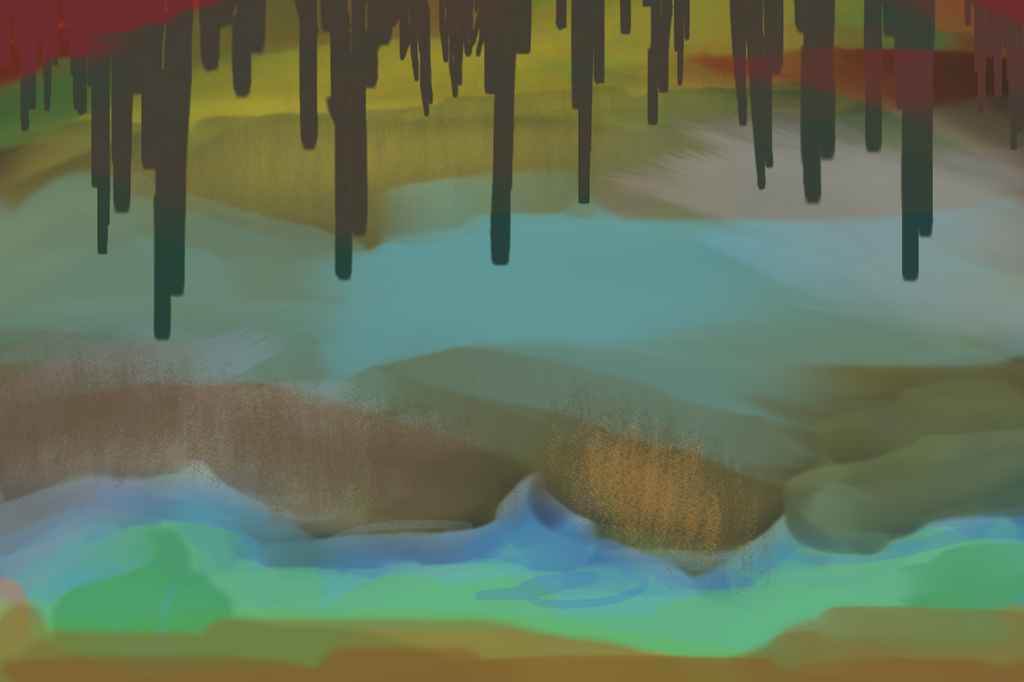
Published: 2018-03-23 15:06:49 +0000 UTC; Views: 217; Favourites: 16; Downloads: 0
Redirect to original
Description
Done with a trackpad in Photoshop, like 8-12 hours?Still working on abstractions, still feeling a little lost, and still feeling like I'm expanding my boundaries as an artist.
Related content


Comments: 11

Hello! I’m here from with some constructive criticism.
First of all, I really like the color scheme you chose! While this piece is abstract rather than an actual depiction of a cave, I feel like the somewhat diluted, earthy colors make the title fit. All of the colors are distinct from one another, yet also blend nicely at the edges thanks to the low opacity.
When you’re more accustomed to realism, which seems to be the primary focus of your gallery, it’s easy to accidentally slip into painting an object rather than something completely abstract. While this piece is clearly abstract, it also does resemble a cave thanks to the stalactite-like shapes along the top. It works well for this piece, but next time you do abstract art, I’d suggest trying to stay away from any resemblance to real life.
Being able to see the brushstrokes gives the piece a soft, soothing look. I also like how some sections of this painting are more textured than others. Overall, I like the design and style of the piece.
However, I do think the execution could be neater, for lack of a better word. The red overlapping with the “stalactite” section at the top looks odd when all the rest of the colors are behind it. In addition, the line where the blue meets the green has a scribbled look in some places. It could be just my preference, but I’d like it to have a crisper, cleaner look.
I’m not sure what your artistic process is, but looking at your collection of abstract pieces, it seems to me like you’re mostly experimenting with colors and textures until you get results that you like. That works, but while your pieces are visually pleasing, they aren’t extremely memorable, which I think has a lot to do with how simple they are. You used a lot of different colors for this one, but there are really only two parts: the background, and the darker part at the top of the painting. Next time, I think you should try to create a more complex piece. Instead of just stopping when it looks nice, keep pushing it until you come up with something really unique.
If you’re having some trouble pushing your boundaries and doing abstract art, I’ve found that it helps to try painting visual representations of emotions instead of just playing around with different techniques. It’s also useful to focus predominantly on color and texture as opposed to shape.
Overall, though, I think you did a good job with this piece! It’s really pretty and interesting to look at. Keep working on abstract pieces like this!
👍: 0 ⏩: 1

Thanks so much for taking the time to comment! I know that abstractions are not most people's fortes, and they can be much more difficult to critique than concrete realism. In concrete realism, it's a lot easier to say, "change this and it'll look more natural." I also really appreciate you taking a peek at my abstractions and gallery as a whole, because that always changes how I critique things. Thank you.
A bit about my process: I tend to focus on composition and movement more than anything. Everything I do in color, line, etc. is theoretically to service a balanced, non-symmetrical, compelling composition (though there are some where I was playing around with brushes and happened to get a result I liked). I find I lose track of composition in this piece, because it's just so complicated, and what I ended up with had nothing to do with what I conceptualized. I think maybe I should have started with a sketch.
In this one, I was trying for something that looked more textured and scribbly than my other works, but I agree with you that the execution wasn't as effective as it could have been. The textures don't seem to totally complement each other, and I think the red and the complex overlapping make the top too "heavy" visually; that is, distracting/weird. If I were to repaint a similar piece based on your feedback, I think I'd pick a couple of textures and a smaller color palette. Whatever I'm doing (scribbles, textures, etc) I think I need to do it across the composition or in such a way that creates movement/rhythm/"weight" that complements the rest of the composition, while this piece doesn't reflect that level of thoughtfulness.
Regarding painting something real vs. something abstract: the name came after. I didn't have a cave in mind, and I mostly don't have an object in mind when painting. However, in Crumbling (the purple one with a blue top and pink bottom), I actually did work off some physical objects for shape concepts. Believe it or not, though, to my knowledge, the idea that abstraction should be completely divorced from any subject matter is a fairly new idea dating from the start of the 20th century – popularized by artists such as Mondrian and especially Pollock.
I also appreciate your idea about attempting to draw emotions! I think I'll try that one of the next times I paint an abstraction.
👍: 0 ⏩: 1
You're welcome!
I also usually try to focus primarily on composition when I paint, and abstract art often deviates from the idea in my head in the process, so I understand where you're coming from. There was one time I tried to paint a visual representation of happiness, but the result came out looking more like surprise.
I didn't realize that abstraction as completely separate from any subject matter was such a new concept! That kind of thing is really interesting to learn, so thanks.
")
👍: 0 ⏩: 1
Haha, that's pretty cool! I get the same result from expressions in my portraits sometimes. Can't wait to see what it looks like when I try to represent an emotion in an abstraction, though!
I'm glad you found it interesting! I love art history, so I always think it's fun to share
👍: 0 ⏩: 0

Nice picture but id doesn't look like a cave, it needs a bit more details, Usually caves are darker the more you go inside, so making the center part should improve it more. But hey, at least you tried Good job !
👍: 0 ⏩: 1
Thanks for the feedback, but it's not supposed to look like a cave - or anything else, actually. It's an abstraction, which I did say in category and description.
👍: 0 ⏩: 1
As for the (possibly confusing) title, I like my titles to be evocative and fun, and I thought a fantasy/mythology reference was fitting for the darker/less saturated colors here.
👍: 0 ⏩: 1
You're welcome, I apologize for not reading the description, reading it changes my view of the picture, I never understood Abstract art so I probably should just shutup lol, good art though I admire the time spent to make it !
👍: 0 ⏩: 1
Thanks! and sorry for the confusion ^^
👍: 0 ⏩: 1
No problem. You're very kind !
👍: 0 ⏩: 1