HOME | DD
 bIacksmith — Happiness' Last Call

Published: 2014-12-23 02:16:02 +0000 UTC; Views: 907; Favourites: 58; Downloads: 0
Redirect to original
Description
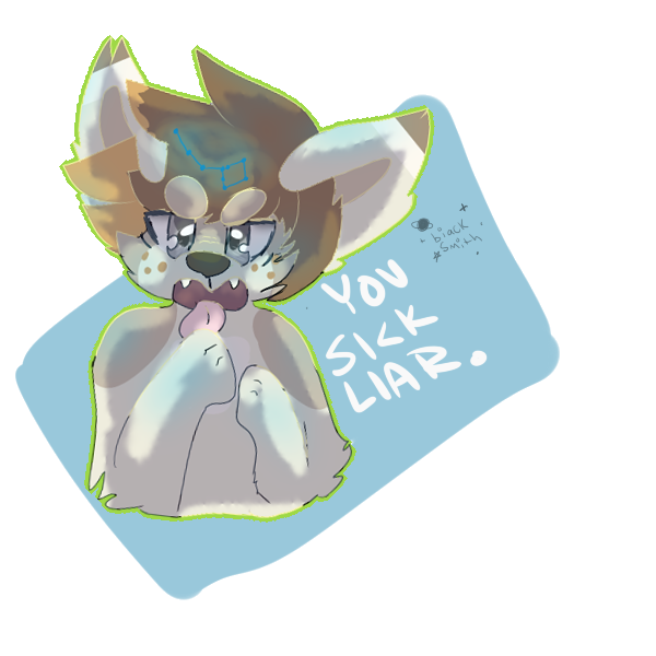
EDIT::: GUYSSSSSSS THE SHADING IS SUPPOSED TO BE WEIRD HFRUIJKEDJFM**NOT VENT! NOT VENT!**
i actually really like this!
i would love a critique! ;7;
Related content


Comments: 26

Overall
Vision
Originality
Technique
Impact
Hi there! Thanks for asking me to critique your stuff! e.deviantart.net/emoticons/b/b… " width="15" height="15" alt="
")
Honestly, I really like the picture! It's really cool, and I don't see this stuff that often. I think the background looks fine as it is, the red and blue work very well, and the blue isn't as bright, so it doesn't hurt your eyes. The black and white on both sides work very well since it's handwritten!
I think your character definitely should be centered more since there is a straight line down the middle. If it's centered, I think it's more balanced? Although you can argue since the background is already "balanced" then the character doesn't need to be centered e.deviantart.net/emoticons/let… " width="15" height="15" alt="
")
I would love to see the character a big bigger as well. It's too small and too high up in my opinion.
Hope this helps! ♥
👍: 0 ⏩: 0


Originality
Technique
Hey, who taught Poe to draw?
[Vision]
No shitty static this time, thank the heavens. Everything is nice and clear. Easy to read; like a book. Something about this already bothers me though; why is the head tilted? No, don't throw the "You mean the line dividing their face, asshole?" quotes at me, you know very well what I mean. The head tilting just a bit is just a tad.... disturbing. And now that you mention it, the eyes and ears are drawn as if he/she was standing straight, not tilted to the right (his/her right) every so slightly. And what's with that weird pin thing at the bottom of the neck?
[Originality]
Obviously, things like this are springing up everywhere. (Even got blocked by someone through a minor misunderstanding over an image like this, but that's a different story) The eye. You must think the eye is original, right?
NOPE.
That eye, even though it is a nice feature, is definitely NOT original. Or at least the idea that it's evil, and out of proportion compared to another, normal eye. An early use of such a feature was in literature, in the short story "The Tell-Tale Heart" by Edgar Allan Poe. The story featured a man with a "vulture-eye", which was described to be abnormally large and hideous.
Yeah... if it's not obvious, no decent points here. Oh, and try to make a signature that's harder to copy. It's the whole reason why we have cursive.
Woo! It's getting really laggy; gotta copy and paste my work onto Firefox so Chrome will stop hogging more and more processing power.
[Technique]
Again, the tilted pose and the irregular anatomy. The lines are neat, that's for sure. But the shading was done a bit poorly. Give physics some thought. You can't shading all around the neck, unless you have a light source in front of him. But even then, you wouldn't have shading there at that point because the light would be coming into contact with everything on the front half of his body. Also, the eye. It looks like it was just pasted in. And the text. Why did you write it? Couldn't you just insert text, and choose an appropriate front? For example, you could type "What is love?", then choose a font that's cheerful, or that flows easily, like some cursive font. For "What is hate?" you could use a font with shaky letters or something, you know?
[Impact]
What is love, what is hate?
Love is happiness, hate is sadness.
Alright, seems straightforward. No stupid symbolism getting in the way. Works for me!
The only issue I have here is why, of all things, did you use QUESTION MARKS for "hate"? Why not skulls, or broken hearts, or lightning? Something that evokes fear and/or sorrow, not curiosity. When I see that question mark, I would say "Sherlock Holmes," not "Evil Ashton."
Just a little something to consider.
[Conclusion]
Final Grade: 82.5%
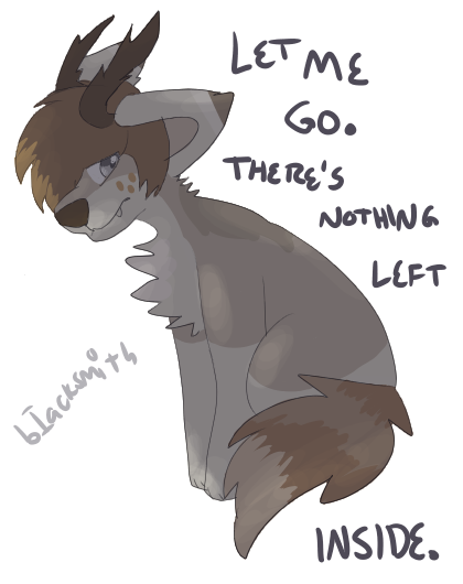
Definitely better than the last image.
Bloody hell, that was terrible.
But honestly, why are you asking us to critique something like THIS?
It's simple. Nothing much to grade.
Why not something like the first image? Don't kill me, I know Pepsuki died
That one was a much better critiquing experience.
Anyway, this image was done very well. Looking forward to the next image.a.deviantart.net/avatars/e/d/e… " alt=" " title="edgeybowplz" />
👍: 0 ⏩: 1

Eeey, I love "The Tell-Tale Heart!"
Great short story~
👍: 0 ⏩: 1
👍: 0 ⏩: 0

Overall
Originality
Technique
I don't know if this will be accepted but I'll write one anyways
I really like how you shaded this, but the darker side looks a little strange, because it's wAY to dark. Johndavelolno the fluff and hair is pretty good, but the hair on he darker side is a to circular. And the darker side's ear is a little strange looking, but over all it is very good! Ashton you have improved a lot! e.deviantart.net/emoticons/b/b… " width="15" height="15" alt="
The eye on the right side is fabulous e.deviantart.net/emoticons/b/b… " width="15" height="15" alt="
Your hand writing is very good, and the horns are done well.
👍: 0 ⏩: 1
"...but the hair on he darker side is a to circular. And the darker side's ear is a little strange looking..."
Was that not the point?
👍: 0 ⏩: 0
winter-blanket [2014-12-23 02:31:17 +0000 UTC]
Vision
Technique
Impact
It's so cute and original! I don't even know where to start. e.deviantart.net/emoticons/b/b… " width="15" height="15" alt="
e.deviantart.net/emoticons/b/b… " width="15" height="15" alt="
👍: 0 ⏩: 1
just letting You know, the left eye is supposed to look a little weird~ nwn
👍: 0 ⏩: 1

Overall
Vision
Technique
Impact
I think that this would really have an impact on anyone! Vent or not.
It itself is extremely original (from what I know) and that you have every reason to be proud of this.
Although the Blue and Red background to me seems somewhat plain, (even if you may have wanted it like this) you could possibly add something to it? Perhaps shading or decor/props.
The character itself fits in well with the drawing, and has well done shading...
Perhaps the lines and colouring on it could have been a bit neater.
Either way it looks amazing! You did well!
👍: 0 ⏩: 0


 (Smile)")
"The Tell-Tale Heart"
Vulture eye... it was big...
Like the eye in the image.....
No? Okay....
👍: 0 ⏩: 1

ohmy thank you! this isn't actually a new style though, just messing around and seeing what i like ;7;
👍: 0 ⏩: 0
