HOME | DD
 BiffTech — ODST Chronicles

Published: 2011-07-10 23:08:46 +0000 UTC; Views: 1614; Favourites: 62; Downloads: 14
Redirect to original
Description
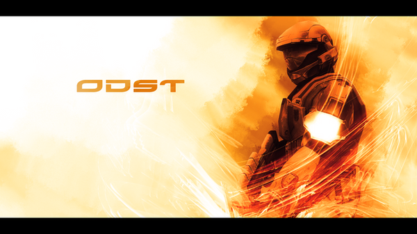
Did this for the finals of the Sig Labs KO Tourney... The brief was to design a movie poster, either fictional or real...Related content


Comments: 32


Jayne is walking menacingly towards Mal with a large gun]
Jayne: Six men came to kill me one time. And the best of 'em carried this. It's a Callahan full-bore auto-lock. Customized trigger, double cartridge thorough gauge. It is my very favourite gun.
[he holds the gun out to Mal]
Mal: [exclaims in Chinese] You offering me a trade?
Jayne: A trade? Hell, it's theft. This the best gun made by man. It has *extreme* sentimental value. It's miles more worthy 'n what you got!
Mal: What I got? She has a name.
Jayne: So does this. I call it Vera.
Mal: Well, my days of not takin' ya seriously are certainly comin' to a middle.
-"Our Mrs Reynolds"
👍: 0 ⏩: 0

 (Cool)")

cant w8 for buck,mickey,romeo,rookie,and dare
👍: 0 ⏩: 0


Thank you very much for the comment
👍: 0 ⏩: 0

Thanks very much... it was one of the things I paid a lot of attention to, I hope
👍: 0 ⏩: 0

Joss Whedon sweet! It'll be canceled though
")
👍: 0 ⏩: 1
lol it'd be nice if it was for real
👍: 0 ⏩: 0

very nice work indeed. I would have likes the fonts to have been brighter and bolder in the titles and the tagline.
👍: 0 ⏩: 1
Yup... font work never was my strong point, & i'll happily admit to that  (Smile)")
👍: 0 ⏩: 0


Nice one matey! Only thing I'm not overly keen on is the ODST: Chronicles text... I think something more Halo-ish/future font type would of fitted better, but it certainly doesn't kill the poster!
Good luck!
👍: 0 ⏩: 1
Yup... seeing as I used the credits from Serentiy, that was the font I opted for when it came to the title as well
👍: 0 ⏩: 0

He didn't add teeth... I thought you played ODST? <_<
Anywho, the text at the bottom... "The Future is worth fighting for."... is quite noticeably offcenter. I doubt this is intentional?
👍: 0 ⏩: 2

I did, just been a long time since I played ODST.
👍: 0 ⏩: 0
Yup... the teeth are part of the render from an ODST character
As far as the alignment is concerned... It was kind of the lesser of two evils. Seeing as the whole credits section is a "one piece" I just used the most obvious alignment option open to me... which was the small text
Thanks for the comments though
👍: 0 ⏩: 0


You should change the font of ODST:CHRONICLES to something more bold and futuristic, that aside - looks legit ")
👍: 0 ⏩: 1

I personally think this font is perfect because it's uncommon compared to the usual fonts you can find for this kind of poster. It shows the rought and beastly side of ODSTs imo.
👍: 0 ⏩: 2
Yes, but there's a reason all these fonts are used, it matches the style perfectly. All the other fonts and stuff fit perfectly, it's just the main title one sorta sticks out a little. That's what I think anyway
👍: 0 ⏩: 1
Cheers for the comment Cheesy... i'll take on board what you've said, because I know you know what you're talking about when it comes to fonts
👍: 0 ⏩: 1
Cheers for the comments guys
I know my font/text work isn't great... it never has been tbh lol. The only reason I added it to this piece of work was because I had to. I used the font from the film title "Serenity". It seemed fitting, as they were the credits I used for the bottom of the poster
👍: 0 ⏩: 0

Lol the buckles on his crotch look like smiley faces XD
That aside, I go see this if it were real, looks bad ass
👍: 0 ⏩: 1
lol I never noticed that. & thanks very much for the comment
👍: 0 ⏩: 0