HOME | DD
 BigRob1031 — M18-before and after

Published: 2011-04-09 00:58:28 +0000 UTC; Views: 742; Favourites: 16; Downloads: 0
Redirect to original
Description
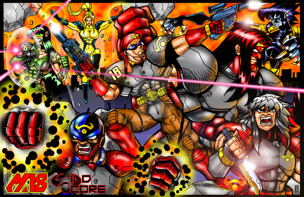
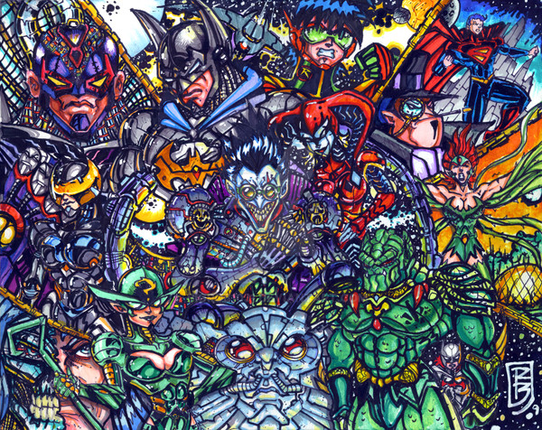
Here's a comparison to the old M18 vrs the new oneRelated content


Comments: 17

both look good to me, I like the reflection effect in the old one, it is sick!
👍: 0 ⏩: 1


heehee!!! WASSSSSSSSSSSSSSSSSSSSSSSSSSSUP MAH SISTAAAAAAAH??????
👍: 0 ⏩: 1

notta whole lotta.
holy crap. did you see this new emotion that DA added??? LOLOLOLOL

👍: 0 ⏩: 1

")

Very cool! The old one has a really awesome retro feel to it, I love that!
👍: 0 ⏩: 1

Very nice. I kinda like the line details in the original a little more ( but that's probably cause it's like my style) But the colors are rockin in the new one.
👍: 0 ⏩: 1

They both look fantastic big guy, nice work bro................................Rick
 (Wink)")
👍: 0 ⏩: 1