HOME | DD
 Binkatong — Shading Test Comparison

Published: 2012-02-06 15:48:47 +0000 UTC; Views: 1117; Favourites: 17; Downloads: 7
Redirect to original
Description
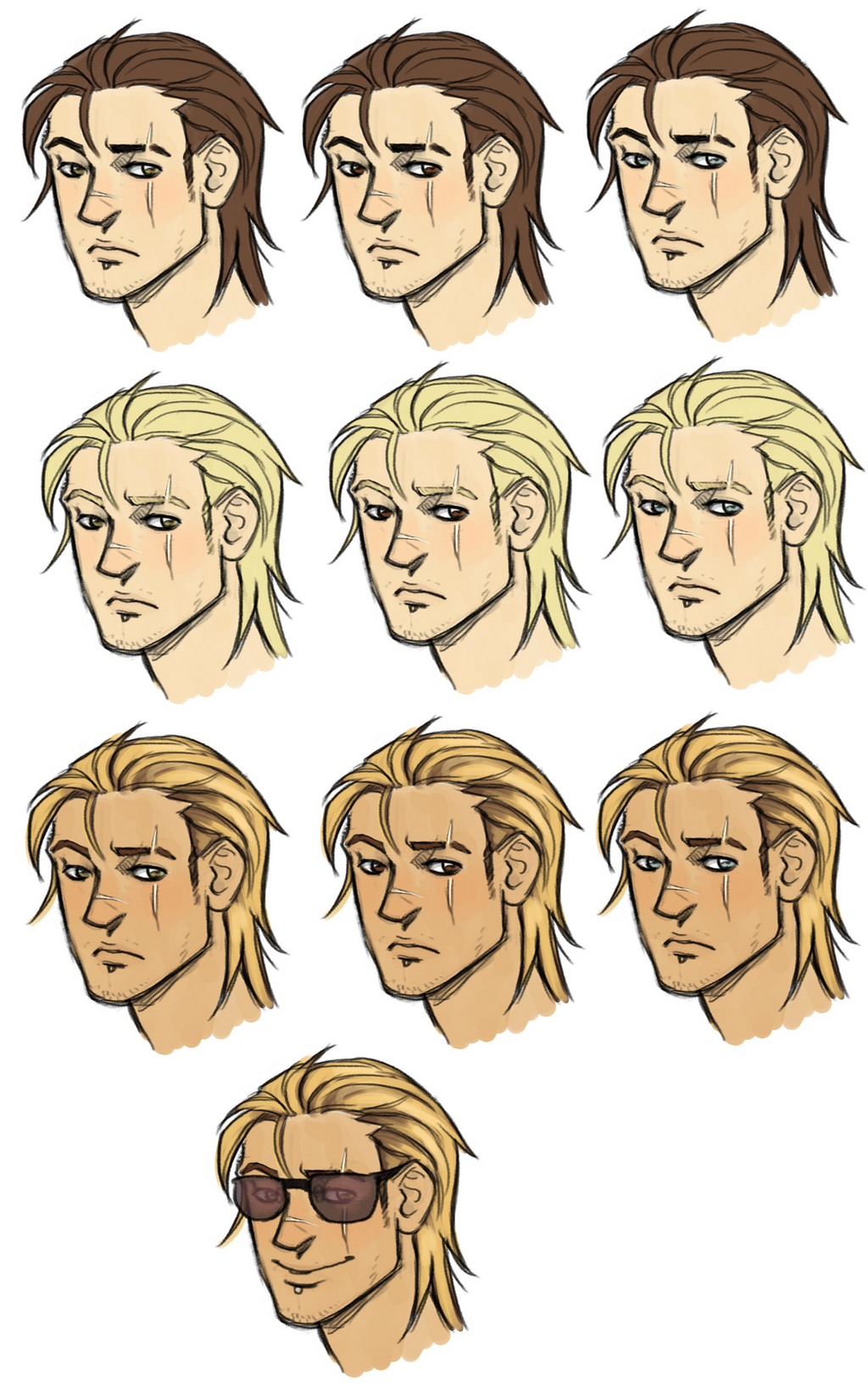
Alright, so I've decided to finally sit down and figure out how the heck I should shade in photoshop. On Kevin. I'll be adding more as I do more. Please tell me what you think of the different methods, I need input.
From left to right, top to bottom:
1. Semi-transparent line art set on multiply, shaded with a hard brush with opacity set to pen pressure.
2. Exactly the same as 1, but with a Gaussian blur applied.
3. Hyper-simplified Ben 10 style cel shading, with darker lineart.
4. Detailed cel shading, same lineart as 1.
Kevin (c) MoA
Related content


Comments: 8

")


👍: 0 ⏩: 0


