HOME | DD
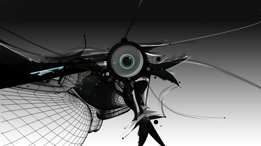
 binqker — Unconstructed

Published: 2006-09-13 09:27:24 +0000 UTC; Views: 1676; Favourites: 33; Downloads: 17
Redirect to original
Description
just messing around... and tell me what you think.Related content


Comments: 16

Nice work! Very inspirational. I like ur use of the graphics and paint splatters. The texture on the background seemz a bit much. Seemz a little 2 buzy. But i like the overall content! U inspire me!!
👍: 0 ⏩: 1

Absolutely fucking amazing bro.
I do have one criticism for your work though. Take it as you'd like to. I noticed that when I saw the thumbnail, my eye was directed mostly towards the left side. Upon viewing it in larger scale, I felt that my eyes were constantly moving around the whole vector setup, trying to comprehend everything else that was happening. The piece is so busy, with so much happening everywhere in the design. Yes, the whole structure of the vectors are directly centered in the middle of the image. However, with so much going on around the edges of the vectors, one can't focus on the whole object in entirety. They have to analyze it in sections. For example, I found at least 4 different types of font, spread out in different areas of your work. Not only are they so spread out, they attract attention themseves; but they also contradict each others' styles.
My advice to you? Try to set up a single anchor and work around that.
I'm definitely not knocking your shit. In fact, I'm impressed with your prowess in Illustrator, as well as your abstract style displayed in this particular piece.
Keep up the good work. I want to see more of your work as you progress in the design field. You have a knack for layouts. You just need to direct your viewers' attentions to one particular point in your artwork. Just something I picked up through experience in print design.
👍: 0 ⏩: 0

that looks awesome...
very nice piece...
hopefully i'll be able to make such art some day
 (Smile)")
👍: 0 ⏩: 1

hey thanks for liking it man...
👍: 0 ⏩: 0

the 2dimensional letters were from illustrator. and the rest are photoshop.
👍: 0 ⏩: 0


Hi There!
You have just earned yourself an O.D.D.(^oibyrd's daily devs) feature 
ODDS (oibyrd's daily deviations) are to honor the sometimes overlooked artists of dA that I personally think deserve some exposure and also, to introduce the more popular artists to the new/overlooked deviants. I prefer to showcase ALL artwork that I love (and that includes popular artists with a fair amount of traffic to their work) in order to create a non-biased feature of the talent on dA. *PLZ DO KEEP IN MIND - some of the features are quite popular and obviously don't need extra help - however - I enjoy posting them because they inspire other artists. Please click the link below to see your work featured and to view other featured artists . If you prefer not to be a featured artist, just send me a note and I will remove you from the list. Cheers! Sandi xoxo
my art account -> ^oibyrd
the link to your feature -> [link]


👍: 0 ⏩: 0
very sleek, professional looking design 
👍: 0 ⏩: 0

yeah im sure you will, ehe.... thanks for the good comments guys.
👍: 0 ⏩: 0

me too!
yes, its a nice work! The overlayed (?) blue color is very incomer
👍: 0 ⏩: 0
