HOME | DD
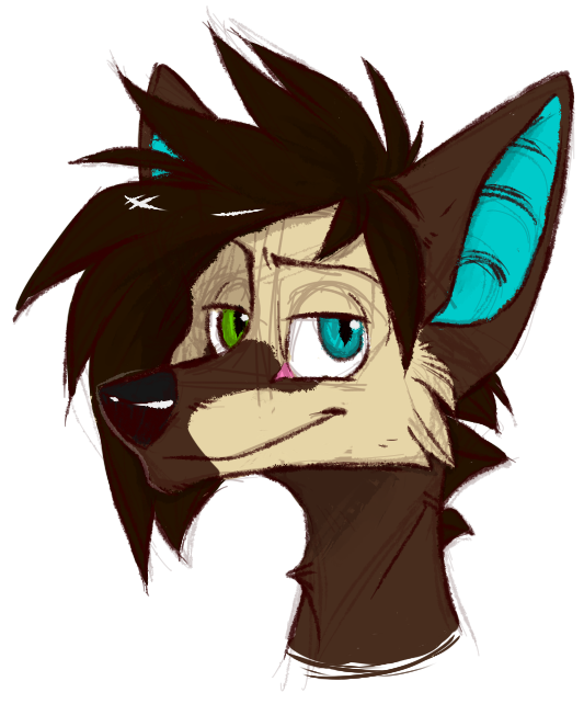
 BioHermistry — Shading Style Examples
Published: 2016-08-06 15:47:14 +0000 UTC; Views: 559; Favourites: 29; Downloads: 0
Redirect to original
Description
Lately I've been thinking about my ways of shading and found out I have no 'good' way and I keep changing it. Sometimes one way of shading looks nice on some things, but terrible on other.You might spend hours on this one part to get it right just to realize it completely doesn't fit you or your work.
Good for drawings with no background doesn't mean it would be good in a comic, where backgrounds and light sources are as important as the characters.
Speaking of comics - yes, I'm slowly planning on doing a comic some day. High school would be a huge pain in the butt for next two years and starting such thing would be impossible, but it wouldn't hurt to try and pull my improvement in this direction
Enough talk, let's get to the point
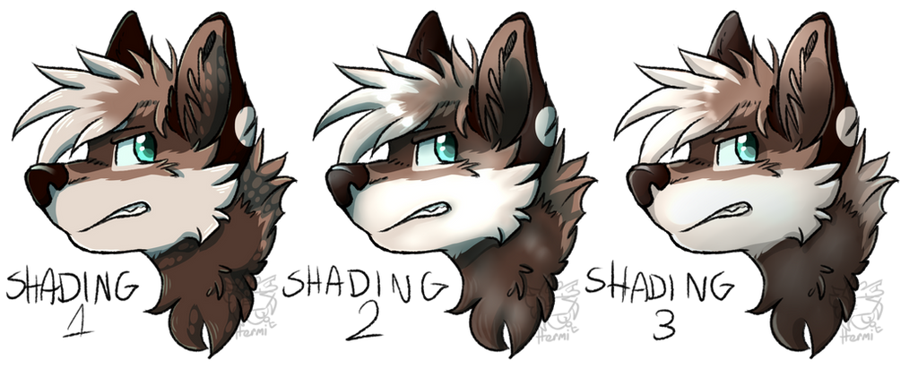
Shading 1 aka the Fluffy Fur Shading
- Two layers of shading + simple highlights (1 layer)
- Cel-shading, none or occasional blurring
- Either coloured or grayscale
- Good for fur, feral animals, flat/smooth areas and rather simple designs
- Useless for human-like hair, can mess up the colours a little
Shading 2 aka the Almost Realistic Shading
- Two layers of shading + complex highlights (3 layers)
- Mix of cel and smooth shading
- Either coloured or grayscale
- Good for clothing, hair, anthro character, short fur and any designs
- Not the best on fluffy areas though I haven't really tested out this downside yet
Shading 3 aka the Experimental Shading
- Kind of a mix between 1 and 2
- One layer of shading + medium highlights (2 layers) + optional gradient/double shading
- Cel-shading, some blurring if necessary on certain areas
- Either coloured or grayscale
- Still looking for defined upsides and downsides. I find it the easiest to do now, though
Which is your favourite? Which would you find the hardest to get right? Which should I work more on?
Comment below and enjoy.
All artworks belong to me. The character on the picture is Stag (design by Komainu on Lioden)
Related content


Comments: 24

Na przykładach pasuje mi 1 i 3, ale na przykładach innych artów, to okazuje się że w sumie nie lubię 1 i nie umiem wybrać czy wolę 2 czy 3 xD
👍: 0 ⏩: 1

1 już przestałam robić, 2 mi się nie chce, skupiłam się na 3 oraz na jakichś eksperymentalnych albo uproszczonych XD
👍: 0 ⏩: 0

drukowałabym 8)))
3 dośc ciekawie wygląda huehue
ale i tak kocham te kuleczki na 1
i 2 to dla mnie takie wow bo tak bardzo widać skille do których potrzebny jest tablet
👍: 0 ⏩: 1
mhhhhhh 8)
właśnie ostatnio się bawię 3
kuleczki :'D
tabletowe skillsy są mocne XD
👍: 0 ⏩: 0

3 chyba wykorzystam w komiksie :')
2 się fajnie robi ale za długo, na arty dobry tho
a 1 to był pierwszy eksperyment i na wilczkach wygląda noicu
👍: 0 ⏩: 0
te 2 szejdy prawie jak moje xD
ja ce wincej w takich
ja lubię tkaie xD
👍: 0 ⏩: 1

Zawsze podobało mi się cieniowanie takie jak w jedynce. Tylko, że nie potrafię tych plamek dobrze postawić nigdy xD
👍: 0 ⏩: 1
ja też nie XD
raz wychodzi, pięć kolejnych dupa jasiu
👍: 0 ⏩: 1
A jednak teraz wyszło
Czyli jak w przypadku moich rysunków
 (Wink)")
")
👍: 0 ⏩: 0

3 i 2, 1 to taki trochę z dupy(ten róż na bieli pyszczka)
👍: 0 ⏩: 1
Nadal nie wiem o czym mówisz, ona ma taki kolor futra
👍: 0 ⏩: 1
Na innych ma taki bielszy

👍: 0 ⏩: 2
bo na innych ma oświetlone, naprawdę nie widać gdzie są efekty a gdzie nie?
👍: 0 ⏩: 1
Nie no widać xD Tylko ten efekt dziwnie wygląda na bieli, nie wiem jak to nazwać ;;
👍: 0 ⏩: 1
tam nie ma żadnej bieli, ona ma beżowy pyszczek a oświetlenie robi z niego biały XD
👍: 0 ⏩: 1

Podoba mi sie pierwszy, ale wolę włosy z drugiego XD
👍: 0 ⏩: 1