HOME | DD
 Birgitte-Gustavsen — Scream I
Published: 2011-11-02 02:38:15 +0000 UTC; Views: 8640; Favourites: 273; Downloads: 48
Redirect to original
Description
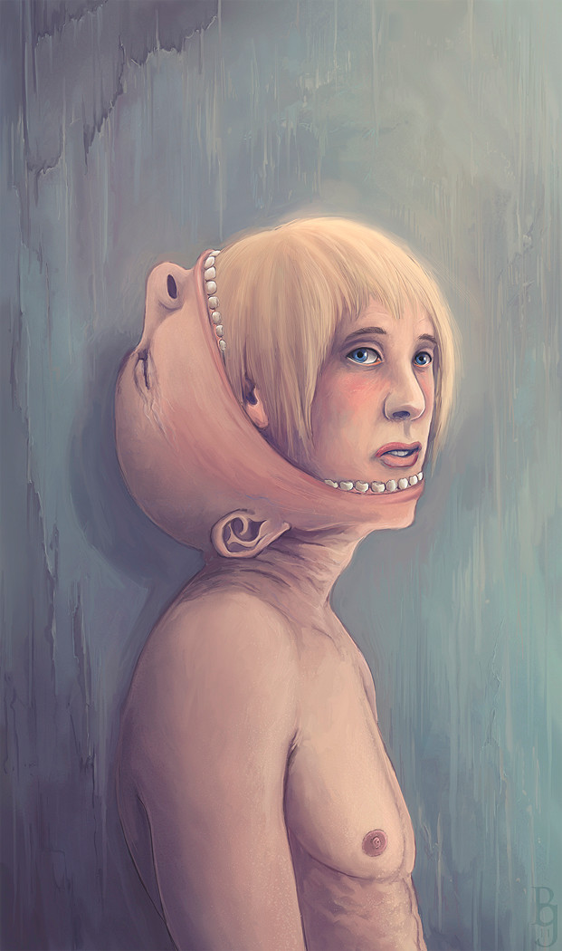
(C) 2011 All Rights Reserved, Birgitte Gustavsen-----------
Geh. This took a lot longer than what you would expect from a bust portrait...with a twist mind. I think I've reached the wall in terms of what I can do for this image for now, maybe with practice and some distance I may make it better. I hope to return to it one day, so if anyone feels like giving constructive feedback or critique, you are very welcome
")
I would be particularly interested in anything that would help making the skin more lively, the faces more expressive, and that chest more realistic

The fact that I had to colour it three times probably has a lot to answer for the slow progress.
In the first I had two strong light sources from right and left, and couldn't get it to look alright.
Then I went experimental and tried in in black and white with intention of colouring it though that way. Which is when I discovered that overlay and multiply colouring really disagrees with my colouring needs.
This is it's current look. I wish I could get a meatier look on the skin, but for now this may be the limit to my current abilities.
This is the worked out version from these concepts [link]
I've filed this under surreal rather than horror/macabre, because despite what a fair few will call creepiness, I don't actually mean for it to be that way. It's just that the concept in my mind had a limited number of ways to be expressed, and I wanted to avoid using conventional masks, which left me with this.
It's not that terribly complicated, the face you show the world may not always, or quite often, reflect the feeling inside. It can feel a bit deceptive, but it's not always possible to do what you want or even what you need. If I screamed even a fraction of the times I've felt like it, there would be a lot of worried people in the world.
Related content


Comments: 449


I actually think the skin looks great. Maybe when you go back you can make the highlights a tad brighter, for a better contrast?
👍: 0 ⏩: 0

it somehow reminds me of the giants in the manga shingeki no kyojin
👍: 0 ⏩: 0


After having this one pop up two or three times for me, I absolutely have to favorite it. It grows on me each time I see it.
👍: 0 ⏩: 0

I LOVE YOU for making this and having such an interesting concept!
👍: 0 ⏩: 1

Why thank you
And sorry for the late reply

👍: 0 ⏩: 0

this is interesting.has the whole in someone else's skin feel to it. i like it
👍: 0 ⏩: 0

Wow! This is scary!
But awesome drawing skills
Great job
👍: 0 ⏩: 1
Glad you think so, thanks
👍: 0 ⏩: 0

I like the concept, and you've got a good technique!
But I see some minor mistakes in the proportions, especially in the faces. The blond guy seems to have his chin a tad low, particularly since his mouth is partly open. The nose has a slightly strange shape as well as the nostril isn't very highlighted, I think you should shade a little more around the side of the nose to make a more naturally shaped nostril
The ear is also a tad misplaced, it should be ending in height with the eyes, while the earlobe should be in line with the sides of the mouth. Just for future reference
About the chest, I was looking at it and thought long and hard about what exactly could be changed... and got to the conclusion that it might be the sharp line. When I covered it with my finger it looked smoother and more natural  (Smile)")
This is a really cool picture, and you used the textures so well!
I hope this comment will be helpful to you and that I wasn't just rambling about nothing xD Keep up the amazing work!

👍: 0 ⏩: 1
Sorry about the late reply. I've fallen off the DA wagon a while there, so I'm more late than usual too. I suspect I may as well make my apologies for this my signature 
Anyway, thank you for writing some great critique
And again, sorry about the delay, especially when it comes to such scrumptious comments as this
 (Wink)")
👍: 0 ⏩: 1
No problem at all!
I'm just glad to help

👍: 0 ⏩: 0

This is so freaky o_O I like the way you've coloured it, though. The texture is spot on
👍: 0 ⏩: 0

Interesting, but creepy concept o.o
👍: 0 ⏩: 1

Thanks
👍: 0 ⏩: 1

Wow, fraky and really creative! Outstanding work, great!
👍: 0 ⏩: 1

scary + awesome= scary awesome ....so on retrospect this is scary awesome keep up the good work
👍: 0 ⏩: 0

Glad you found it interesting, thanks
👍: 0 ⏩: 0

This is so creepy but it's really good, nice work.
👍: 0 ⏩: 1

Interesting drawing i had to do a double take to see what was going on here
👍: 0 ⏩: 1
Glad that you found it worth a second look, thanks
👍: 0 ⏩: 0

I love the name, adds another dimension to the piece.
👍: 0 ⏩: 1

waaaa
its such an interesting concept!
it reminds me that we all have hidden personas that we hide away from the rest of the world
👍: 0 ⏩: 1
Thanks, it was sort of what I was aiming for
👍: 0 ⏩: 0

hmm its odd but the work is wonderfully done
👍: 0 ⏩: 1

Interesting concept, although creepy. But that's okay! Creepy is refreshing
👍: 0 ⏩: 1

wow I love it ! it may be creepy for some people but this picture makes me smile =/
👍: 0 ⏩: 1
Well, that is kind of you to say
👍: 0 ⏩: 0

Woah, what a concept. Makes you think. Well done!
👍: 0 ⏩: 1
I'm glad you find it thought inductive. Thank you
👍: 0 ⏩: 1
You are very welocme
👍: 0 ⏩: 0


Wow, very nice idea. You did it perfectly in my opinion
👍: 0 ⏩: 1
That's very kind of you to say, though I think there is room for a lot of improvement myself
👍: 0 ⏩: 0

Thank you
👍: 0 ⏩: 0

<= Prev | | Next =>