HOME | DD
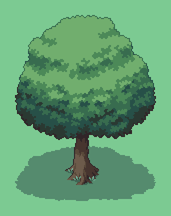
 BizmasterStudios — Learning to pixel grass....
#grass #pixelart #oldschoolvideogame
Published: 2015-11-30 18:27:36 +0000 UTC; Views: 448; Favourites: 6; Downloads: 0
Redirect to original
Description
Trying to make a grass texture for a tileset. I haven't done any taller grasses yet, and some assets might need some grass shoots at the bottom, so they blend in better, but I am working on it")
I started with the first one, but it seemed too bright for what I wanted. Do you think the second (on the right) is an improvement? Tell me what you think! Would like any pointers!
Related content


Comments: 14

I really like the one on the left, I know that you think that it is bright but It also shows more contrast, I think that if you add the contrast to the one on the right with a darker color you would achieve it
 (Smile)")
👍: 0 ⏩: 0

I like the right one best, I feel the left is too bright. Grass is so hard to get right, it drives me insane. @.@
👍: 0 ⏩: 1

Insane for sure!...starting t think about one colour, and then grass clumps to break it up. So much pixel practice. And none of it I am truly happy with yet :S haha
👍: 0 ⏩: 1
I knowww if i focus on it too much I swear I only see grass XD I usually over complicate it too.
👍: 0 ⏩: 0

Things like grass can be pretty tricky to pull off... too many details to capture imo, but it's possible. There are RPG games on the SNES (Final Fantasy, Chrono Trigger, Act Raiser, etc) that shows how to pull it off well but I'm not sure to tell how they actually did it, so I suggest seeing screenshots of those games, and study a little bit to get an understanding.
As for your attempt, it looks okay. I would like to say the first one is better in that you can actually see the grass but it looks too bright, the second one is better for lower contrast but it's probably a little too much imo. I think you should look for a middle term there.
👍: 0 ⏩: 1
Thanks for the feedback
👍: 0 ⏩: 0

Grass is definitely tough.
I think something that really makes grass look better is adding variations, since a single grass tile generally looks too stale no matter how well it is made.
Take these for example:
snes.in/ss-translations/seiken…
pixeljoint.com/pixelart/82885.…
pixeljoint.com/files/icons/ful…
www.vgmaps.com/Atlas/GBA/Legen…
GantekaFuture also has a great point about more minimalist styles of grass, where the ground is mostly blank with tufts here and there to suggest grass. This is my favorite type of grass tile.
Another idea to note is that you can sometimes solve the grass repetition problems by simply making your environments have less open grass fields.
👍: 0 ⏩: 1
Some great examples in there thanks!
👍: 0 ⏩: 0

I prefer the first one because it's brighter and more defined - the second looks a bit low on contrast.
👍: 0 ⏩: 2
Thanks for commenting
👍: 0 ⏩: 1
No worries. You'll get there if you keep at it - if you're looking for a source of reference, Links' Awakening on the Game Boy is a good start.
👍: 0 ⏩: 0
It's probably too bright, but the second does look undefined....back to the drawing board haha
👍: 0 ⏩: 0

Grass is tough, man. While the second attempt is better (in that the brightness level isn't as harsh), it has basically become green with a bit of noise. Because of this, it no longer really matches the style of your sign, in that the sign is mostly a solid color with no noise. Anyway, you could try something like the Legend of Zelda: Link to the Past approach and have the grass/ground be mostly a solid flat color and have highlights/details be more sparse here and there. When making a tileset for a world, you'll be able to blend edges of terrain easier and add variety and detail where you want pretty easily too. If you don't want to go that route, I'd recommend giving the grass some texture so you can see some fronds. This can usually be tricky, since its going to end up being a very commonly used tile and any weird tiling problems or odd patterns will get noticed by players.
I hope some of this helps, I'm not exactly pro at doing sprite work.
👍: 0 ⏩: 1
Helps heaps. Once you said something about the "noise", it made a lot of sense
Have been trying to find some learning material on this, but there is very little!
I figured others thoughts, and practice makes perfect might be the best approach!
Thanks for giving me your thoughts!
👍: 0 ⏩: 0