HOME | DD
 BizmasterStudios — TreePractice4

#plantlife #tree #pixelpractice #pixelart
Published: 2016-02-03 17:36:45 +0000 UTC; Views: 271; Favourites: 8; Downloads: 0
Redirect to original
Description
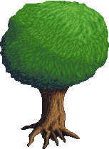
Completely redone. Gone for a vibrant look. Smaller amount of detail, but still a bit of texture.Edited: Cleaned up the shape and shading a little.
Another Edit: Probably the last edit on this one for now. I need to practice and learn a bit more for sure. I am going to try something more simplistic next I think. Get used to the way light effects certain shapes.
Much has been learned on this little project


Related content
Comments: 14

Thank you 
You are seeing a pixel that was retouched many times haha!
I changed the main file 4 times I think!
👍: 0 ⏩: 1

Hahaha a lot of work! you should be so patient ^^
👍: 0 ⏩: 0

What a beautiful little tree... could also be used on a browser game oder something similar. It really looks quite professional! How about adding some fruits (red apples for example). Well done!
👍: 0 ⏩: 1

Thankyou 
👍: 0 ⏩: 0

It seems to be lacking depth, maybe you're progressing to the detail stage too early? Try making some very simple shading at first to emphasize the form, then apply detail.
Also, the edges seem a bit blurry.
👍: 0 ⏩: 1

Really didn't realize how bad it looked till I got up the next morning :S
I must learn not to post pixels when I am super tired...and to have a fresh look at my art....this one is getting redone haha
👍: 0 ⏩: 1

Holy cow, looks loads better! I think it still suffers from a lack of overall shape though. It kind of looks like a bunch of bushes with a trunk coming out of it.
👍: 0 ⏩: 1

Good point!
Need to bring it out in the centre of the tree to make it look more spherical.
The bottom looks a bit....shaped? A bit flat....
I am trying to get into the habit of actually fixing my pixels up, and finishing them now.....too many pixels I do are average, and never get re-touched or improved again haha
👍: 0 ⏩: 0

It looks nice, although it's kind of hard to see, maybe a 2x zoom would help it?
👍: 0 ⏩: 1

Probs going to redo it, and make it bigger. Not happy with this one haha
Posted before I had a fresh look at it!
👍: 0 ⏩: 1

Looks a lot better! A little constructive criticism that i have is that it looks a bit too flat. I think volume is one of the most important things in art and it's not exactly easy to learn, but it's essential if you want get better.
👍: 0 ⏩: 1

Thanks 
👍: 0 ⏩: 0


