HOME | DD
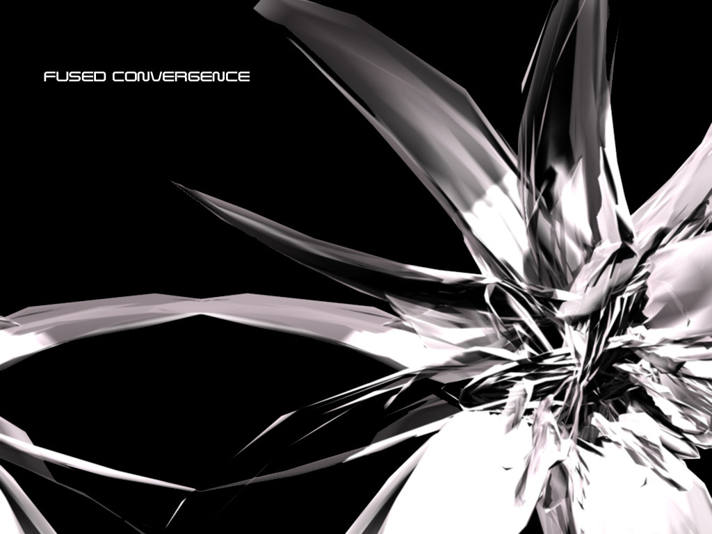
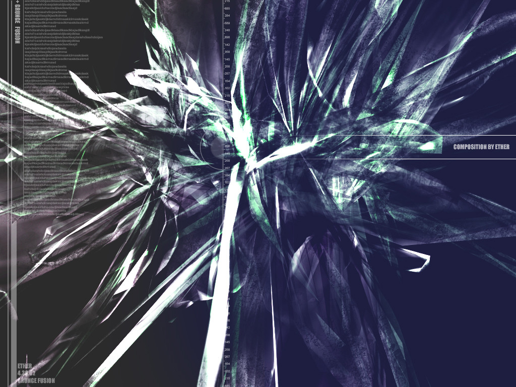
 bl4z3d — fUSED cONVERGENCE
Published: 2002-03-29 14:59:12 +0000 UTC; Views: 584; Favourites: 0; Downloads: 140
Redirect to original
Description
again i need comment just anything would be fine, its beta so im gonna make it better i jut need you peepz comments anything would be fineRelated content


Comments: 9

whooo...i think it's lovely...minus the text though!
👍: 0 ⏩: 0

Preeeetttty cool! Maybe add some fading lines above and under the text like in Simplictic Architecture. Again, the hazy/blurry thing is an issue.... make sure you have it set to render with no blur, that's all I could think of....
-----
------
ktmkyd
If you are thinking about sending a note
saying thanks for commenting, do
something much more helpful, and comment on something of mine
👍: 0 ⏩: 0

Very nice renders man! just need some filled space and some colours
👍: 0 ⏩: 0

it looked better on thumb.. still nice tho
-----
kwanstudios.. making the difference!
¤ - kwan studios: http://www.kwanstudios.com
¤ - digitexturia: http://www.digitexturia.com
¤ - nitrocorp: http://www.nitrocorp.org
¤ - latest deviation: https://www.deviantart.com/view.php?id=24 5674
👍: 0 ⏩: 0

Very cool piece. I like the chrome feel.
-----
Its not how far you go Its how go you far
👍: 0 ⏩: 0

its pretty cool..make sure u put some 2d and minimalism..and then id add some specs of color and lighting into it...but thats what id do make sure u hit me with a comment or sumtin when ur finished. nice job so far.
👍: 0 ⏩: 0

i agree the image seems a bit foggy, and ya might wanna fade the text a bit so its closer to the color of the outer leaves...other than that it looks pretty cool
-----
we all die, the only question is with how much pain...
👍: 0 ⏩: 0

Wow, love the contrasting colors! I think it looks good the way it is
"I want to spawn epiphanies in every generation."
~harlequin02~
👍: 0 ⏩: 0

The thumbnail looks a lot better than the full. It's a bit hazy looking. also the 'fused convergence' type kind of sticks out. ...in a not-so-good way.
-----
just like clockwork.
👍: 0 ⏩: 0