HOME | DD
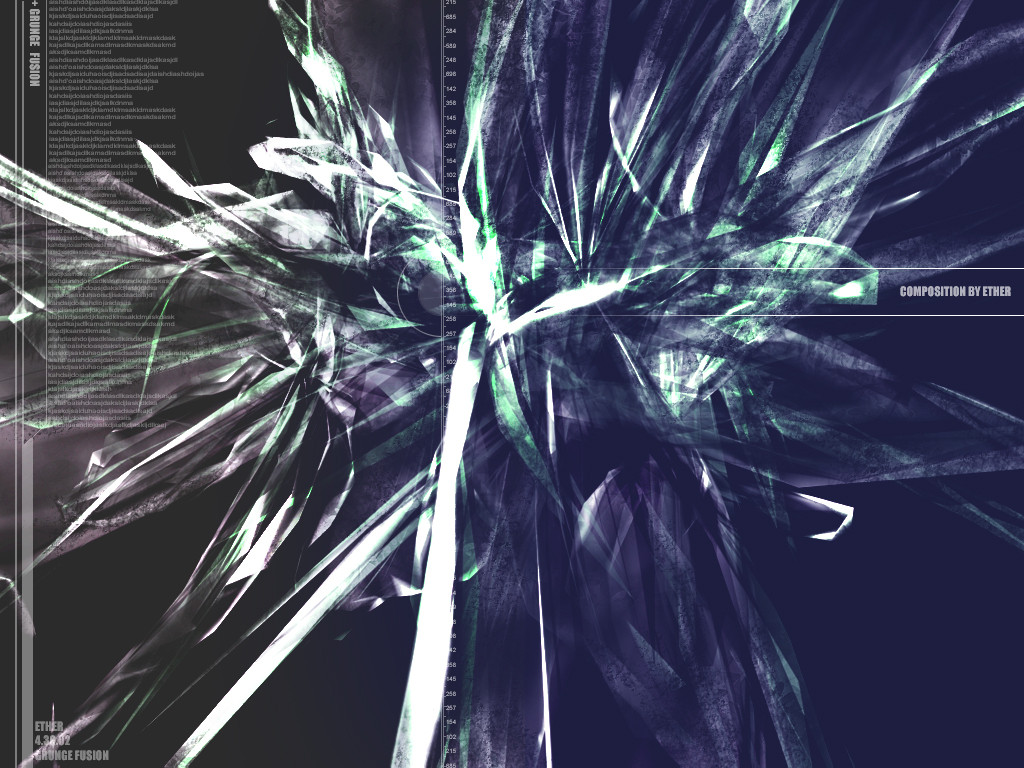
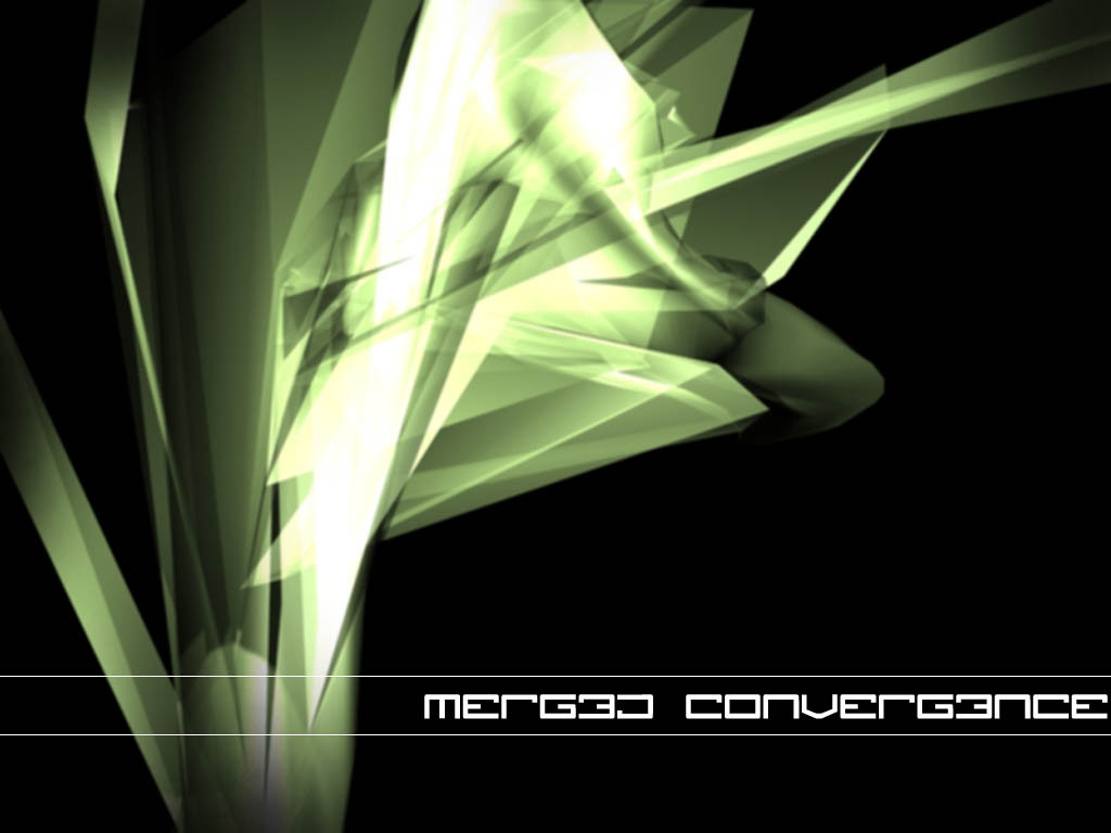
 bl4z3d — grunge fusion
Published: 2002-04-30 22:26:30 +0000 UTC; Views: 414; Favourites: 0; Downloads: 42
Redirect to original
Description
what should i change? add? new colour scheme? i dunnoRelated content


Comments: 10

i like the texture there, the typo needs some work
-----
-
++ WastedYouth Programmer - [link] ++
++ deviantMAG Staff (Software Reviews) - [link] ++
👍: 0 ⏩: 0

Very nice, I love the grunge effect of the abstract form, very nice choice of colors as well. Great job
👍: 0 ⏩: 0

Im not going to say the typography sucks...it does need improvement...but thats minor. I think the color should have the same hue...but thats me. Other than that the rest looks Awsome...Good job man
👍: 0 ⏩: 0

Looks good, but the typography sucks. You can tell it's a bunch of "kjfghjjgjhhkjkljlkjlklklkh". You might want to make the text smaller, or transparent somewhat.
-----
___________
+ + + + +
👍: 0 ⏩: 0

yeh cyber crash is right, too many grunge and spiky abstract walls out there but it still looks good
-----
signature???
👍: 0 ⏩: 0

Trendy has been done millions of times, grungy has been done millions of times, the combination has been done millions of times too but it's still considered 'cool and alternative'. Anyway, you're not doing anything new but technically it's pretty good.
-----
you dont need eyes to see
you need vision
cyber|crash
abstract thought - visualised --> [link]
👍: 0 ⏩: 0

nice design there. You see abstract 3d everywhere, but the type is nice and subtle. good job
-----
-------
[link]
Latest Deviation: [link]
👍: 0 ⏩: 0

pretty cool, try and make some sick 2d around it, like wicked in depth like multiple levels on interfaces and multiple interfaces overlapping each other at different perspectives and shit.
-----
= [link]
👍: 0 ⏩: 0

I like your deviation it's purty cool come check out my place.
[link]
especially check out dimensional stars part 2.
👍: 0 ⏩: 0

that's pretty sweet. I like the faded effect / worth out look.. very well done.
👍: 0 ⏩: 0