HOME | DD
 blackeagleonline — DownUnder

Published: 2005-06-20 19:40:44 +0000 UTC; Views: 1263; Favourites: 26; Downloads: 674
Redirect to original
Description
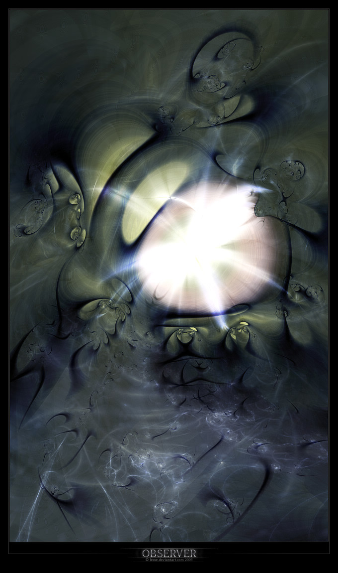
My is lost,
 the last few blood cells are floating through my body,
thats the only things that left,
everything else has been destroyed,
i lost my love,
and im going Down Under.
Let me get reborned, and have a better life....
This should be for the artgroup Bohemica, but the pack is gonna be released 10th of july, and i just heard im leaving on the 6th of july on holiday, and i dont feel like waiting till i come back...so they can take this in the pack.... or not...
Photoshop7 only
Much thanks to for helping me out, cheers m8!
Related content


Comments: 30

__.
some textures are from =resurgere , aren't they ? Maybe did you forget to mention credit, maybe am I wrong : ). If I am, excuse me... Nice picture
👍: 0 ⏩: 0


unbelievably great, Really nice colours (or at least lack of...), composition and general greatness of those curves, textures really add to it, some sharpening and blurring would really add some atmosphere to it imo, and maybe the odd glow too, gj
~Zeal
👍: 0 ⏩: 1


thnx again man 
👍: 0 ⏩: 0


wow looking really cool!! great use of style!
👍: 0 ⏩: 0


love it, Typo's very cool. love the combination of red and greyish fits vvery well  (Wink)")
👍: 0 ⏩: 0

I love it. Love the style, it's very mysterious feeling. I keep wondering 'what the hell is this thing'. Keep it up!
👍: 0 ⏩: 0

yeah m8! Really nice idea on this one..also very great skill! Nice work m(! Love it

👍: 0 ⏩: 0

m8..
hi long time ago...
looks very smooth and fresh like it!!!
hope its all fine at u...
greetz ya
👍: 0 ⏩: 0

Dang man, I like it. The picture is dull, but at the same time, it jumps off the page at you. It's real different from anything ive seen you do. More, emotional and thought filled. Wonderful job Eric.
👍: 0 ⏩: 0

I really love it. It's different, but still very far out.
👍: 0 ⏩: 0


Eric your doing it again, your getting better and better and better... I cant keep up.
congrats.
👍: 0 ⏩: 0

its good m8. like the whole... "organic" feel it has. good job.
👍: 0 ⏩: 0


")
👍: 0 ⏩: 0

I like it. The very select touches of colour break up the image nicely, and the overall flow to the forms is good, reminds me of the heart; loosely anyway. The lightning is really cool too, and I love the typo, very clean. :-]
👍: 0 ⏩: 1
cheers m8
👍: 0 ⏩: 0

very nize, the typo rocks like hell man
but (this is personally) i don't like those thunder strikes, or how its called
👍: 0 ⏩: 0
very nize, the typo rocks like hell man
but (this is personally) i don't like those thunder strikes, or how its called
👍: 0 ⏩: 0
very nize, the typo rocks like hell man
but (this is personally) i don't like those thunder strikes, or how its called
👍: 0 ⏩: 0

I like it mate,and different for a change,the only part i dislike is the 'twirl' near the center,have a nice holiday mate
 (Smile)")
👍: 0 ⏩: 1
haha thnx m8
")
👍: 0 ⏩: 2
will do m8, thanks for the advice
👍: 0 ⏩: 0

came out really nice. develop this style, its sexy.
👍: 0 ⏩: 0