HOME | DD
 blackeagleonline — Reaffix

Published: 2005-08-11 08:52:32 +0000 UTC; Views: 4128; Favourites: 92; Downloads: 1577
Redirect to original
Description
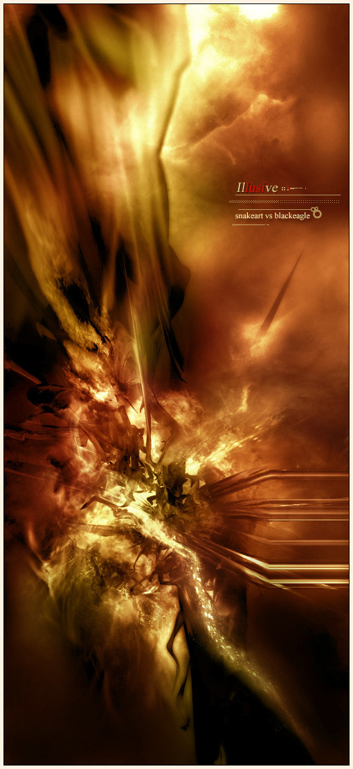
For the 2nd time in history:=strukt & ~blackeagleonline
bring you another shexy hardc0re luvin abstracteh piece
Be sure to check out his gallery and go give him a freakin dev watch!
stock: sxc.hu
ktnx

Related content


Comments: 48


")


Thats damn hot...love the style m8! Great Job of both!
👍: 0 ⏩: 0


shit guys, one of the best 3dabst. I have seen in looong looooong time
👍: 0 ⏩: 0


freakin sexy black
awesome render,colors,and lighin
👍: 0 ⏩: 0

Another unique/original 3D Abstract, I hope to see this one go as far as your previous ones  (Wink)")
👍: 0 ⏩: 0


 (Smile)")


Oh wow. That is really sweet, definately love the style. Man this is fresh very nice work!
👍: 0 ⏩: 0

well done. I like everything. Not often I say this for abstract renders
👍: 0 ⏩: 0


very detailed and wonderful! ^_^ great job on both of you guys! yay for strukt too!
👍: 0 ⏩: 0


I like chaos that rules on this work and metal material on the render but you add too much depth on the render. It would be better with copied render and moved to the front. Nice work, I like it.
👍: 0 ⏩: 0

hmm it doesnt look bad....i guess as abstract goes it loox good
👍: 0 ⏩: 0

")


nice work. the render doesn't seem to fit into it very well. great colors.
and this may be a personal preference but I hate it when the title of a piece is the main focus. at least it becomes that for me...// can't take my eye off of it!! ahahaahhh...
sorry for that.
great job guys!
👍: 0 ⏩: 0


beautifull work .
some parts though need to be edited , they are over blured , and then over sharp
👍: 0 ⏩: 0


looks cool, if you wanna collab add me to ur msn-list syntical@hotmail.com
👍: 0 ⏩: 0

Awesome work you two  (Cool)")

👍: 0 ⏩: 0

SIck, but it would be like 100 times better if it wasn't ontop of that stock... seriously, it'd ROCK if the render was surrounded by some organic forms.. bah, maybe it's just cuz i'm tired, and can't think right now. xD
👍: 0 ⏩: 0


