HOME | DD
 blackvragor — Pen Work: PA intro

Published: 2007-09-23 22:17:10 +0000 UTC; Views: 1374; Favourites: 16; Downloads: 41
Redirect to original
Description
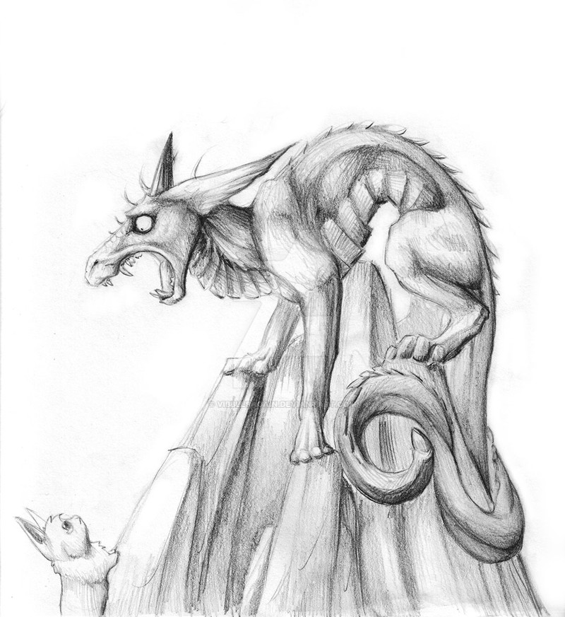
I needed a smaller pen tip for this to look real nice but I was simply practicing a bit of pen work. The sky scene is a disaster, though, I didn't really bother to finish it.Millenium is nice when you apply in large amounts and overlap.
This was an intro to the Pure Angel section. One day I may gain the paitence to draw a graphic novel...one day.

Related content


Comments: 17

Very very nice! did you imagine all this? Is very beautiful
 (Smile)")
👍: 0 ⏩: 1

yes, and thank you!
👍: 0 ⏩: 1
You're welcome, you are very talented...
 (Cool)")
👍: 0 ⏩: 0


nice hatching I must say. A bit much of it perhaps, unless thats the look you were going for. Then I digress...
Yes, millennium pens look great with an extra inking, so well that I rarely adjust the contrast on my inkings, because well I don't need too lol
Have you ever thought of trying gray scale shading with some watered down ink on a brush? I think your stuff would look bad ass like that.
👍: 0 ⏩: 0

You've got an amzing talent , so don't waste any time calling parts of your work " a disaster".
I love both of them.
👍: 0 ⏩: 0

The rain on the clouds makes it look a bit like a lake, surrounded by mountains, but one can easily overlook that.
I really like this one.
+fav
")
👍: 0 ⏩: 0


This work's photo or something? Its need a bit photoshop retouch. (scanner always better than photo)
👍: 0 ⏩: 1
it's a scanner image and has had photoshop alterations.
it simply a large image. I never use my Powershot on smaller works; only for the 18x24 pieces.
👍: 0 ⏩: 0


haha, actually it isn't about the humans. As a matter of fact, it's all about the things that cause humans trouble. Very twisted concept I'll need to write it down.
👍: 0 ⏩: 0

This picture is better than crystal meth home squiggity biscuit
👍: 0 ⏩: 1
VICTORY IS MINE!! No seriously though, it's real pretty, the landscape is awesome and I love the dragon. (it IS a dragon, right?)
👍: 0 ⏩: 0

graphic novels look like pains in the -
DRAGOOON. and i enjoy the sky scene because I myself fail at wanting to try/doing any of those.
👍: 0 ⏩: 0