HOME | DD
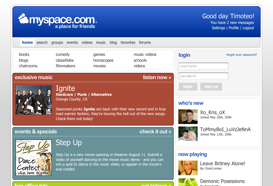
 BlakliteGraphics — Myspace Redesign: Updated v1.5
Published: 2006-05-28 17:02:00 +0000 UTC; Views: 59261; Favourites: 115; Downloads: 15228
Redirect to original
Description
If it were up to me.Check me out: [link]
UPDATE: Changed a few things... changed a lot of things, really. I don't like how I hate this layout but everyone loves it, so I tried to update while retaining it's original... stuff.
So I suppose it makes this Myspace Redesign 1.5. HA.
This layout is for sale. My last bid was $500. If you have a similar or higher offer, let me know!
Thanks y'all!
Related content


Comments: 193

i say send this to tom. its badass.
👍: 0 ⏩: 0

This layout shits all over the current design.... if this were the design, i would hate the site slightly less
👍: 0 ⏩: 0

Very nice! Very Mac-ish - smooth and aesthetically pleasing.
👍: 0 ⏩: 0

its cool. shame myspace doesnt look as sleek as this. its all crap and bulky.
👍: 0 ⏩: 0

Why not just send Tom that picture so he update that lame layout. Great job by the way.
👍: 0 ⏩: 0


your myspace page looks amazing! how did you achieve that kind of layout?
👍: 0 ⏩: 0

not bad at all, and i bet it would load faster as well
")
👍: 0 ⏩: 0

amen. this is so much clearner and less cluttery -ish.
great job on redesign.
👍: 0 ⏩: 0

yeah that would be much better!!! you should suggest that to Tom.
")
👍: 0 ⏩: 0


Dude, that's more than awesome. I'll be 
👍: 0 ⏩: 0


This is a great design. It's so clean and yet slick. The way they have it now is rather boring.
But don't forget all the room you need for their multi-million dollar ads.
👍: 0 ⏩: 0

Very nice... but the truth is that the bandwith would be a problem. Im guessing that some images are about 12kb... and at about a million users/day thats 11gb of transfers every day. Thats alot to pay for...
But anyway, i like it ^_^ Wanna work for me?
👍: 0 ⏩: 0


Yeah I'm there with you. Nice design, I like it alot!
👍: 0 ⏩: 0


I hate mySpace with a passion (mainly because of the design), and yet I'm on it daily.
This design would have me using mySpace with a smile on my face, rather than a frown. And also hopefully make it a much less frustrating site to navigate and use.
Top notch work buddy! 


👍: 0 ⏩: 0

actually, iv been inspired to design my own myspace page similar shit like yours.. i didnt know you could do that with it!... cheers for the insp... not many people have that effect on me.
👍: 0 ⏩: 0

They definately should use you as their designer - very nice layout! And your profile rocks too, the best myspace profile I've seen so far.
👍: 0 ⏩: 0

-Very- nice! I agree... suggest it to Tom. MySpace seriously needs a facelift... instead of basic colors, and crap.
👍: 0 ⏩: 0

This is way flippin' better than what they have right now. Way less clutter and, gasp, no sex-ads.
👍: 0 ⏩: 0

hey this is neat, u should try designing more features for myspace such as the groups page, and the default profile and what it looks like, ur very talented, i like it
👍: 0 ⏩: 0

You definitely should suggest this. I would visit MySpace JUST to look at it.
Go here:
[link]
Choose "Other" for the first option and "Feature Suggestion" for the second.
and that is all. k. <3
👍: 0 ⏩: 0

well done!
i guess this is what the site would look like, if the people who run it realise how stingy the old design looks.
👍: 0 ⏩: 0

This is too good for Myspace. dude, you know those people at Myspace are too lazy to change anything right now. lol. Facebook is the newest thing going on anyway!
👍: 0 ⏩: 0

Beatiful idea.It sure would make it more bearable.But the big problem with Myspace is the code.Well 'm not fond of the Myspace "philosophy" either.
👍: 0 ⏩: 0

muuuch better. doesnt it frustrate you to have made this nad jsut go ehhh ehhh cant u jsut make it like this!!
👍: 0 ⏩: 0

that would make myspace look sooooo much better dayum!
👍: 0 ⏩: 0

Also, your MySpace page layout is fantastic, quite impressivley different from everyone elses MySpace page.
👍: 0 ⏩: 0

I think I would find myspace less annoying if it looked like this.I wish it looked that clean and crisp.reason number 283 why I dislike myspace,even though I go on everyday.
👍: 0 ⏩: 0


I wish it were up to you. MySpace is way ugly right now, but I love your design.
👍: 0 ⏩: 0

SOoooooooooooooooooooo much nicer.
If only... *Dreams*
👍: 0 ⏩: 0


Great work! It's really better than the original one..
 (Wink)")
👍: 0 ⏩: 0

Not bad - much better than the current design.
Things I would change include: I would make the header's blue gradient continue downward & be the background for the inactive tabs...
I'd get rid of the giant Hello, and shrink the username.
On all of the various coloured content areas - I would either get rid of the gradient at the top, or change it into a vertical gradient - blending into the body text background.
and a couple of other things
👍: 0 ⏩: 0

Nice, it reminds me a bit of the default Wordpress layout, especially the banner at the top, but I like it. The current myspace layout is horrible.
👍: 0 ⏩: 0

looks nice!
your myspace profile rocks!!
it looks really minimal, and coool


👍: 0 ⏩: 0


That's awesome  (Smile)")
👍: 0 ⏩: 0
<= Prev | | Next =>