HOME | DD
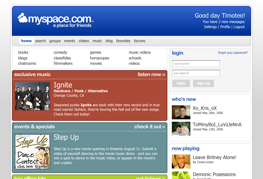
 BlakliteGraphics — Myspace Redesign: Updated v1.5
Published: 2006-05-28 17:02:00 +0000 UTC; Views: 59261; Favourites: 115; Downloads: 15228
Redirect to original
Description
If it were up to me.Check me out: [link]
UPDATE: Changed a few things... changed a lot of things, really. I don't like how I hate this layout but everyone loves it, so I tried to update while retaining it's original... stuff.
So I suppose it makes this Myspace Redesign 1.5. HA.
This layout is for sale. My last bid was $500. If you have a similar or higher offer, let me know!
Thanks y'all!
Related content


Comments: 193

That seems much easier on the eyes, and I was linked to your personal profile a couple days ago by a friend of mine, quoting, "This is the best myspace profile on myspace period."
👍: 0 ⏩: 0

Looks great. I think it's much better than the current design they're using.
It's more sleek with all the curved edges.
Nice work!
")
 (Wink)")
👍: 0 ⏩: 0

Great one! However I don't like the background.
👍: 0 ⏩: 0

Eee! I like it! It makes me jealous 'cause I did the same thing, but trashed it cuz I thought I was just bein' goofy, lol
Suggest it! Suggest it!
👍: 0 ⏩: 0

you know, instead of just rounding the boxes out and such and put on a modified UI, they should focus on making the site more reliable and work better first.
that's how i'd do it if "it were up to me"
this looks nice, but to me it isn't more than just changing how the boxes look into a more pastelized, new-age website look. which is nice, but they need to focus efforts somewhere else imho.
 (Smile)")
👍: 0 ⏩: 0

i like this alot, its too bad myspace only hires retired plumbers and monkeys to do their data architecture.
👍: 0 ⏩: 0

Wow.. I wish I could whore my deviantart skills on digg....
👍: 0 ⏩: 0

its nice, but you need space for advertisements.
very web 2.0
👍: 0 ⏩: 0

This is one awsome layout, congratulations youve done a great job and i like the music boxes and stuff i might use this as inspiartion for my new community site
👍: 0 ⏩: 0

Gotta agree MySpace is outdated and generally annoying... I really hate the comments system nothing like this DA reply thing no....
sorry i'll shut up
Well Done... +digg +fav!
👍: 0 ⏩: 0

Very nice.
You should post it so we all can use this on our profiles!
👍: 0 ⏩: 0

God yes! At this point ANYTHING would be better than that POS site design they currently have at mySpace right now. I enjoy mySpace, but completely unintuitive layout (and the fact that users cannot easily customize their profile pages) keeps me from spending too much time on their site.
Well done.
👍: 0 ⏩: 0


nice i like the looks, dont personal think my space is amazing (due to the fact its where chuck noris gets his list for people to kill) , but nice design! well made 10/10
👍: 0 ⏩: 0


Saw this on Digg, and think it looks excellent. Bravo!
👍: 0 ⏩: 0

Sweet! I love the web 2.0 look. It's about 14x better than the current "design."
👍: 0 ⏩: 0

AWESOME. Sheer brilliance man. Great work.
Only complaint: Get rid of the trend-whore scanlines.
")
👍: 0 ⏩: 0

It looks great! Anything is better than the current design.
I agree, try to send it to them.
👍: 0 ⏩: 0

It looks very Web 2.0 and about a million times better than the real site. I might even use MySpace if it was designed like this, instead of the hideous monstrosity that it is currently.

👍: 0 ⏩: 0

It's interesting, but I strongly suggest getting rid of the diagonal parallel lines in the background. Lots of people these days use LCD screens, and that sort of design becomes very irritating on the eyes.
The rest of it, however, looks great. I strongly suggest showing this to MySpace staff. I mean, it would only help things out a bit.
👍: 0 ⏩: 0

that is good.
i also like your myspace too.
please share how you did that to your myspace...
thanks
👍: 0 ⏩: 0

whoa ... that's good
digg is a nice way of getting pageviews on your gallery too
")
👍: 0 ⏩: 0

lol, Congrats on the Digg homepage thingy! You got my fav, and digg in this case
👍: 0 ⏩: 0


OMG u jst have to suggest this to Tom. I would love to see this design being used on the website
👍: 0 ⏩: 0


Slick as hell. The only thing I'd suggest is a different background in the books/blogs/chatrooms nav area.
👍: 0 ⏩: 0


WOOOOOOOOOOOOOOOOOOOOOOOOOOOOOOO! That would look sooooo much better!!!!!
👍: 0 ⏩: 0

This looks very professional, that's why I don't like Myspace, it seems untidy and unfinished to me, I only use it as my fav band are on there and I have got some juicy gossip from them.
👍: 0 ⏩: 0

I was never a fan of MySpace, but I love the new design for it.
Maybe you should try to send them the example so they can improve?
👍: 0 ⏩: 0

I'm not a myspace fan, but I really like this. Great job!
👍: 0 ⏩: 1

I'm not either. Hehe.
Thanks!
👍: 0 ⏩: 0

that looks way nice.
i say suggest it to tom. >D
👍: 0 ⏩: 1
thanks ^_^
I doubt he would reply by the end of this year. I could imagine he'd be pretty busy!
👍: 0 ⏩: 1
he might, though.
worth a try.. :]
👍: 0 ⏩: 0
<= Prev |