HOME | DD
 blekimaru — Zhou Yu
Published: 2014-06-21 17:46:33 +0000 UTC; Views: 894; Favourites: 20; Downloads: 0
Redirect to original
Description
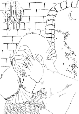
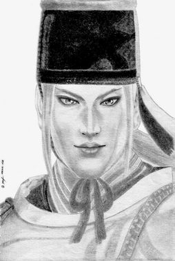
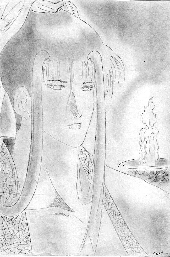
Zhou Yu ( Ryuuroden )plz dont address Zhou Yu as she, Zhou Yu is a man - a bishie from Ryuuroden
practicing on light source ----> FAILED
ok, lets me critique this -> eyes r unbalanced, bad hair shading
Related content
Comments: 58

greaaat job!! i like how u did the lines and background shading wow
👍: 0 ⏩: 1

wow he's beautiful! I like how you did the shedows and the candle!!
👍: 0 ⏩: 1

The facial features look a little weird. The bangs look nice, but like you said, the hair shading itself could use a little work 
👍: 0 ⏩: 1

thank u so much for ur advices i'll keep it in mind
yeah, im now still learning how to shade well i mean better shading on my drawings..
👍: 0 ⏩: 1

No problem! You're definitely on the right track!
👍: 0 ⏩: 0

I love the candle!
I see that your shadings got cleaner but lighter.
Maybe the only thing that bothers me is the hair. The long hair on his left should have at least be placed underneath his bangs or maybe you should not have drawn the bangs on his left for it to be proportion (if you get what I mean haha). Anyways Good Job
👍: 0 ⏩: 1

thank u so much girl
about his bang, yeah maybe its better to place his long hair underneath his bang, coz at first when he didnt have the left bang, it seemed weird..like something was missing or his hair wasnt "full"
👍: 0 ⏩: 1

I wouldn't say that the light source practice was a fail. Practice is for learning.
In my opinion, this is a pretty good piece, the shading is decent enough as well, even if it's not perfect. though I would suggest increasing the contrast between the light and dark areas a little bit.
👍: 0 ⏩: 1

thank u so much for ur advice, yup..im gonna keep that in mind..thanks once again
👍: 0 ⏩: 1

The lines are very fluid and well done but in my opinion you should darken all the shadows with lots of different pencils because this way you can do the lightening! 
👍: 0 ⏩: 1

thank u so so much for ur tips, its really helpful
👍: 0 ⏩: 1

I'm very happy it helped you!
👍: 0 ⏩: 0

Very nice work on the details. I think with the hair you have got to make it a little more darker in a ways so it can stand out from her clothes along with her face/skin complexion. But other than that, this is really good
👍: 0 ⏩: 1

thank u but im happy n sad at the same time does Zhou You really look like a female? coz ur not the first person who said so
btw Zhou Yu is a man - a pretty guy from Ryuuroden
but im curious at the same time can u tell me wat made u think Zhou Yu is a woman?
👍: 0 ⏩: 0

I'd say that it's just a tad too light.
I hold my pics up to a light every once in a while to help me darken things, as I have been told I draw a bit light.
Just my opinion though.
Hope it can help
👍: 0 ⏩: 1

wouw..thank u for stopping n giving me feedback, im appreciated it very much
the drawing is fine on the paper but after ive adjusted the contrast, brightness n so on, the result is waaay too far from the original one..
yeah..just leave it that way..try another shading style next time n thanks once again for ur tip
👍: 0 ⏩: 1

Yea, sometimes the computer contrast balances can make an image look way bad, and give it a chalky-ness, but again I think it's nice as it is.
The lightness adds an ambiance to it.
👍: 0 ⏩: 1

Oh wow! This is really cool! My advice is to darken the shadows a bit more ^-^
👍: 0 ⏩: 1

yup, worth to try....thanks a lot for ur advice
👍: 0 ⏩: 0

This is a nice picture and I like how he's looking at the candle.
The only thing is that I think you need to stop avoiding black. XD I used to be like that too, would always avoid going too dark but things look better with more contrast.
👍: 0 ⏩: 1

thank u ^^
i have to admit that this drawing is hard to adjust, on paper it looks fine but when come to adjust the brightness, contrast..all messed up
when i add more contrast, it looked like over xposed to sun *scorched* so this is so far yeaah..lookable, eventho im still not satisfied with the outcome
👍: 0 ⏩: 1

That does tend to happen. Have you tried messing around with saturation?
👍: 0 ⏩: 1

yup, ive tried it like u said n it didnt help either helpless
👍: 0 ⏩: 0

Looks good! Only I would try to make mouth a bit bigger. It's proportionally too small for the face.
And maybe try adding more details to hair? It seems a bit flat right now..
👍: 0 ⏩: 1

thank u for the suggestion
for the hair..yeah, i admit it, the shading failed..it did look flat *helpless*
👍: 0 ⏩: 1

Well It's not failed. I always have this kind of flat shading to my traditional works(wich none of them are uploaded here) and afterwards I go ower it and shade more adding details and stuff. So I wouldn't call it failure, I would call it an early step of shading
👍: 0 ⏩: 1

aaah.. such comforting words, love it hehee..
got to be positive thinking, mm..? yup, totally agree with u, its just an early step of shading
👍: 0 ⏩: 1

It's important to always stay positive!
👍: 0 ⏩: 0

The contrast thingy has been pointed out before, so I'll just look at the shading, as this was meant as shading practise, right?
In general is your shading good, most areas you've shaded should be dark and vice versa. You might want to darken the edges of the shaded areas where the shadow begins - as there is always light from the light source reflecting from the walls (for example) on your character, the darkest part of the shadow is where it meets the light, like in this photograph or look it up in this elaborate tutorial a few slides from 'Light Sources'.
You did a great job on the lips and I'm jealous of your skills with clothing folds!
👍: 0 ⏩: 1

wouw..thanks a lot for showing me references, its really help ..yeah, im still in process of trial n error of my drawings
so u will find many things go wrong or weird in some cases
thanks again for ur feedback, lets improve together
👍: 0 ⏩: 1

You're welcome! And same here, trial and error is just the way art works, I guess!
Keep it up!
👍: 0 ⏩: 1

the brownish paper looks awesome with this drawing. I realy love the dark hair and her face.
She has some beautiful eyes and lips
👍: 0 ⏩: 1

hehe...thank u very much
and ehem..actually Zhou Yu is a man does his face look too feminine? hehee... hes just a pretty guy
👍: 0 ⏩: 0

I actually think you already have an understanding of lighting
Perhaps some more contrast can help.
👍: 0 ⏩: 1

yes, u r right..thanks a lot
👍: 0 ⏩: 1

Nice job with the linework, as usual, and I like how you did his hair. Maybe you should adjust the contrast though, since right now, the picture's somewhat hard to see since the pencil seems a bit light.
As for the light source--right now, it's a bit hard to see and maybe you feel you'ved failed (I don't think so at all 
Also, I think one of his eyes is higher than the other (the left one is higher than the one on our right).
👍: 0 ⏩: 1

thank u thank u
ok, ive adjusted the contrast here....how is it? maan...i really dont know how to edit my drawing using photoshop, i spent 2 days tried to figured out how it worked..i like my old software better
n yes, u r right about his eyes..im gonna critique myself hahaa...
btw u changed ur avatar, who is that? actually i missed ur old avatar -> a guy wearing big white feathery hat ( like shavkats hat )
👍: 0 ⏩: 1

It looks a bit better now, but the lines are still pretty faint. Is it possible for you to max out the contrast so the drawing's more visible, like in your previous pictures? In your previous pictures, the colours and lines were almost black, but here, they're light grey.
If you find Photoshop troublesome, you can just use online programs to edit your pictures, like pixlr (which I think is easier to understand, and you don't have to download anything at all).
Oh, my new avatar is my current character in Skyrim. I like the lighting of the ENB preset I installed for the game, so I used a screenshot as my new avatar.
👍: 0 ⏩: 1
| Next =>
