HOME | DD
 blind91 — logopack
Published: 2009-01-30 18:50:06 +0000 UTC; Views: 13248; Favourites: 47; Downloads: 252
Redirect to original
Description
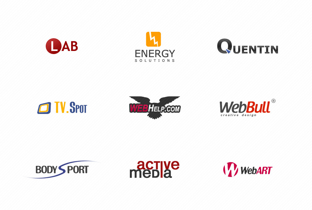
some logos i created in the last time. hope you like 'em")
would be very happy about comments and maybe some


Related content


Comments: 26


I featured your work here [link] - Hope you don't mind  (Smile)")
👍: 0 ⏩: 0


Hey! It's alot to critique so I'll do my best!
1. Lab seems a little boring. If it's dealing with some sort of chemical company then this has a lot of potential visually, its a shame that all you did was a circle.
2. Energy Solutions is nice, simple and clean icon. Solutions is a bit small so scalability may or may not be an issue.
3. Quentin is also nice, but I am not getting a sense of what the company's industry or qualities are. Sure it's aesthetic, but design has to be functional, and it's not bringing that across right now.
4. TV. Spot is the strongest logo out of the box in my opinion. Use of complimentary colors have been used well, the icon is simple and strong, especially on the set angle you have.
5. I would fiddle around with the colors, right now the red is being lost set within the black. But I really like the use of the eagle to symbolize help, I think it would be a unique quality to the industry.
6. What??? Thats the best you can do?? Bull set in red? Also it's reminding me so much of WebMD, with the use of color to separate the words. Definitely know you can do more with this, in seeing the other logos.
7. This logo seems too familiar with me. Perhaps it feels too much like Beachbody's logo mark, but i feel theres a more similar logo out there that im just not thinking of right now....
Though again, the words are 'body' and 'sport', but very iconic and expandable words. Tap into your creativity and churn some real special ones out! :-D
8. The words are a little too tight for me, I would change the leading a bit more. Also, I'm not understanding why both 'i's are connected other then it looks different and kinda cool :-P. Again, 'active' and 'media' are associated with a large and varied range of images, so you should take advantage of that. I like the direction of your font, but perhaps you can fiddle with the colors more; dark gray and red doesnt really reflect the excitement of media entertainment.
9. same as WebBull.
Overall, I think you have a good sense of aesthetics, which is awesome, some designers out there dont even have that. But it also seems like your concepts are piggy backing on the rehashed aesthetics of now, and Im not seeing alot of unique indiviuality. Also in the future, i would love to see descriptions about the companies and what you are trying to accomplish with your design. More info makes for more constructive crits! Love seeing so many logos though, Ill be looking for your next batch!
👍: 0 ⏩: 1

thanks for so much critique! really appreciate that.
now i know why I'm usually not designing logos but websites
👍: 0 ⏩: 1
lol, of course! Yeah, logos are definitely hard to tackle, glad you gave it shot, you should try again sometime!
👍: 0 ⏩: 1
I'll do and I'll remember your critique for ( maybe ) better results!
👍: 0 ⏩: 0

love the webhelp and energy logo but the font of energy could be another then Segoe
👍: 0 ⏩: 1
thank you .. "Segoe"? don't know this font .. must be mistaking
👍: 0 ⏩: 1
")


 (Wink)")