HOME | DD
 blindguy — tannedblonde

Published: 2002-07-10 16:21:46 +0000 UTC; Views: 133; Favourites: 1; Downloads: 4
Redirect to original
Description
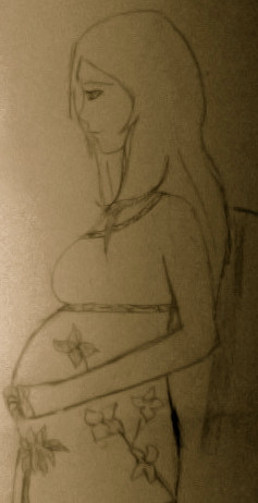
This here is my second attempt at photoshop!!!! I am still learning as i just got it the other day!!! anyway enjoy!!!Related content


Comments: 6

cool! i can understand why its difficult to actually create something from scratch in photoshop.. i have yet to do that.. heh.
i think the face and hair look awesome.. my attention is really drawn to the eyes and lips.
granted, the head's a little large, but it doesnt really impede on the piece itself, esp. since this is only your 2nd shot (and a very good 2nd shot, i might add!)
👍: 0 ⏩: 0

I don't know what's your drawing style but you could use lil structures to improve proportions (ya know, for the head you begin with a circle, then divide it.....)
👍: 0 ⏩: 0

Great work. The technique you used is very good. The details in the eyes and lips in particular are very good. The proportions are off, but it gives the image an interesting look. I think her chin needs a little more definition, to enhance the beautiful work on her face. I really like the vivid colors and the facial expression.
👍: 0 ⏩: 0

It's not bad blind guy...better then the last one...I think the eyes are kinda far apart and the nose is kinda long and the chin is too small.. basically the features are too big for the face if you ask me.I like the way she just stares at you though..but, it does have a sorta more"cartoony" feel to it more then real life. hey it's supposed to be from the Lacome ad with the gold right?
👍: 0 ⏩: 0

Great job! I like how colored and shaded everything. The hair is nicely done. I can't wait to see more things that you make from photoshop!
peace out!
👍: 0 ⏩: 0

Hair, lips and eyes are even a step better than in your last one. But there're still some small problems. First I don't know if the blurry look down her neck is intended. Next her nose seems too streched and the transition between her neck and her breasts needs still a bit more work. Anyway the face looks much better than ur last work. Especially the reflections at her lips and out of her eyes look impressive. Also the proportions are except the part I mentioned very well done. Keep it up this way and it'll become perfect.
👍: 0 ⏩: 0