HOME | DD
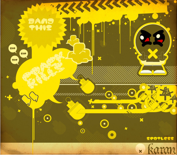
 blindn — .fresh

Published: 2006-07-02 12:17:29 +0000 UTC; Views: 8097; Favourites: 161; Downloads: 386
Redirect to original
Description
for the FRESH comp over atRelated content


Comments: 61

")


I voted for you, twic, cause I have two accounts!
👍: 0 ⏩: 1


Really nice work_ Your work on the big writing "Fresh" is...how to say that..so fresh!I like the background too +fav
👍: 0 ⏩: 0


 (Wink)")

hi i'm a graphic design student and i like your works very much especially this one. (Smile)")
👍: 0 ⏩: 1

this is fresh indeed
👍: 0 ⏩: 0

wicked mate, congrats on the 2nd place, think it kicks mines ass, but ah well! Love the way you worked your little geezer sig in there too. Very nice!
👍: 0 ⏩: 1

peace man, big ups to you, it was a dope peice you did!
👍: 0 ⏩: 0


you're image is SUCH an inspiration!! *screams and faints*
👍: 0 ⏩: 1
that's fantastic considering your sig!
")
👍: 0 ⏩: 1

keep seein this in ppls faves an thinkin dope! is it in my faves? haha
👍: 0 ⏩: 1


yessur!
Nice and vibrant, fresher than a kfc fresh wipe, ice cold like the opposite of hardgays heart!
👍: 0 ⏩: 1

those guys revolutionised street art...its kinda hard to make street art without doing something they have already done.
👍: 0 ⏩: 0

Dam..my niggy..thats dope..really fresh...
u da man!!
👍: 0 ⏩: 1

Very tight design. Totally makes me think of Summer ... think I'll get a popsicle.
👍: 0 ⏩: 0


dude this is great. awesome colors and i like the way this looks like a crumpled flyer of some sort. nice...
👍: 0 ⏩: 0


That shadow font is looking good, and those bright colors will definitely make it stand out.
👍: 0 ⏩: 0

how did you made the cranked paper effect? or is it scanned?
👍: 0 ⏩: 1


wow thats nice! luv the colours
hey there´s ur icon!

👍: 0 ⏩: 1
yup
👍: 0 ⏩: 0
| Next =>