HOME | DD
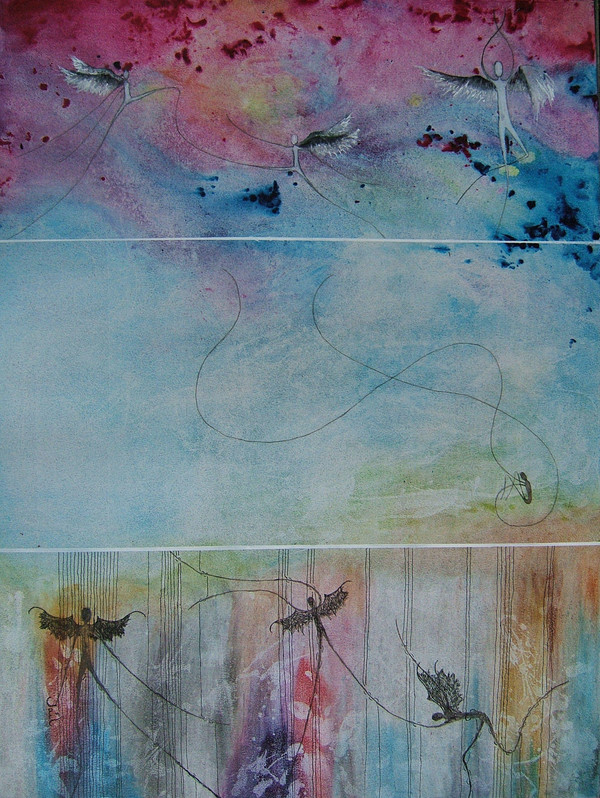
 bluefire313 — Child's View of Mortality 2
Published: 2007-08-07 10:59:21 +0000 UTC; Views: 1027; Favourites: 18; Downloads: 15
Redirect to original
Description
Same idea as in the first painting.....[link]I don't like this one as much, but others like it more.

Related content


Comments: 62

It was really messy
sometimes I'm afraid to ask the artist what they use..... my comments are shorter then.
👍: 0 ⏩: 1

Well, don't be!
That way, you'd learn more bout what techniques and stuff and you yourself'll be able ta apply it into yer stuff.
And that's what makes a great artist.
Well, in my opinion anyways... <.<
👍: 0 ⏩: 1
Yeah me too......artist need to experiment and stay open to new ideas
👍: 0 ⏩: 1

Well, I like both ")
👍: 0 ⏩: 1
Thanks.....
That's why I like the first one better too...... I like free space too, but many don't and that is why they like the number 2. Number 2 has a better child in the middle panel.......but the painting is a bit too crowded.
I have a habit of including alot of colour......this time it was done on purpose though.
Thanks for the comment
👍: 0 ⏩: 1


This one has always been my fav! It's so great to see it again.
👍: 0 ⏩: 1
What ever....see my scraps.....give me ideas....
👍: 0 ⏩: 0
<= Prev |