HOME | DD
 bluefire313 — Child's View of Mortality 2
Published: 2007-08-07 10:59:21 +0000 UTC; Views: 1027; Favourites: 18; Downloads: 15
Redirect to original
Description
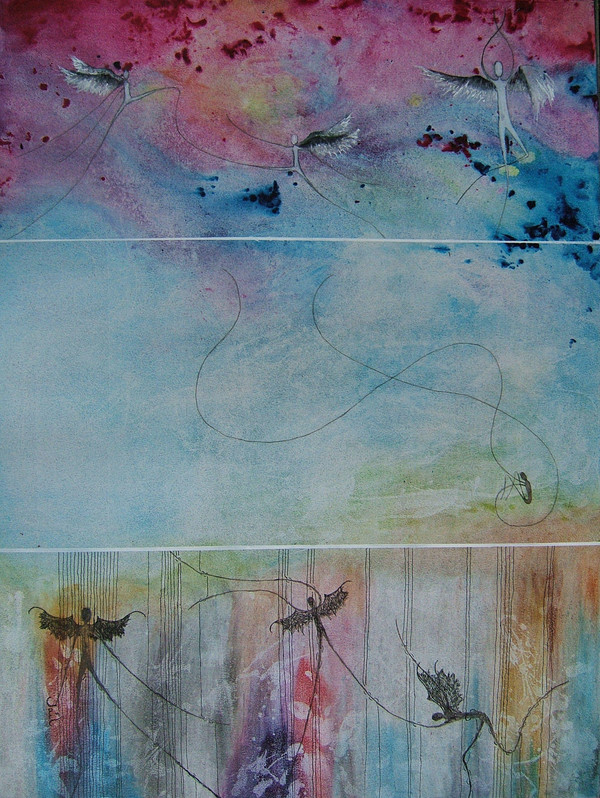
Same idea as in the first painting.....[link]I don't like this one as much, but others like it more.

Related content


Comments: 62

I love the style of this painting, it is very unique. Abstract. I don't really know how to critique traditional art, but I can say this is very well done!
👍: 0 ⏩: 1

I am greatful for your comment ....it took me a while to get a style but yes I do have one and I glad of it.....even if it is a bit girly lol. Should send you a e-mail of dragons I did for my boyfriend.....
And I find if you walk into an art style you don't know comment on what you do.....colour, composition, mood.
 (Wink)")
👍: 0 ⏩: 1
Why not put dragons up on here?! You could put them in your scraps or something. Plus I dont' think your style is girly. I will get better at commenting over time xD
👍: 0 ⏩: 1
practice makes perfect......
I have a bad habit of adding too much colour....lol, making a rainbow.
Can't because to get the dragon shape I had to use a picture of dragons from a book (my fav book actually) and the author doesn't want any fan art....I respect her
👍: 0 ⏩: 1
meh...still I changed it alot....so it more or less is mine....
👍: 0 ⏩: 0

Interesting painting. What medium? Ink?
It could go in "Conceptual" section...
I am not sure to understand it fully, but I appreciate it leaves room for imagination.
Note: when you refer to another work ("the first painting"), I suggest you give a link to it.
👍: 0 ⏩: 2
Arrrgh....
👍: 0 ⏩: 1
Neither me! Perhaps I made it up involuntarily, as I saw some ThumbShare threads about conceptual art, I might have mixed up stuff. Sorry for that.
👍: 0 ⏩: 1

👍: 0 ⏩: 1
Found it in Mixed Media or Illustrations...
But the final gallery would be the same... o_O
👍: 0 ⏩: 1
k......might try again when I have time.
👍: 0 ⏩: 0
Paint and pen
Thanks....I don't really know where anything should go.....
And must make link ")
👍: 0 ⏩: 1
What kind of paint? Acrylic? Watercolor?
I see you added the link, I will take a look. Yet, it was a hint because people (like me) are lazy (or, rather, busy: so much to see, so little time), while adding a link is a simple way to increase the page view...
👍: 0 ⏩: 1
👍: 0 ⏩: 0

I commented on the other one as well, but for some reason I like the other one more than this. I think I prefer the vertical 3, instead of 3 horizontal. Although it might be more understandable for kids, 'cause heaven is above and hell is below.
Nice use of colors again
👍: 0 ⏩: 1
Sorry....I can't keep track of who I talk to anymore
Thanks for the comment.
👍: 0 ⏩: 1

the divides between the panels are much better here. It is again soft and beautiful. I also notice the heaven on top and hell on the bottom though, its nicely translated into the piece
👍: 0 ⏩: 1


Amazing work, I really don't think you need any critiquing on this. I love the individuality and uniqueness. On closer inspection I just have to fav it.
Keep up your amazing talent.

👍: 0 ⏩: 1
LOL...thanks. I'm glad you like it.
👍: 0 ⏩: 0

I like the colours and details more in this one, but I like the other one better overall. It almost made me cry reading the description and relating it with the picture. You linked the other ones images better, but they're both great!
👍: 0 ⏩: 1
I'm in the same boat.....this one others favs though that is why it is here. I touch to hear it effected you emotionally  (Smile)")
👍: 0 ⏩: 0

this is beautiful! the colours are gorgeous and i love how its divided up into three parts.

👍: 0 ⏩: 1

This is awesome.
I love their long legs and wings..
👍: 0 ⏩: 1

This is really lovely, and a great stylized representation of 'mortality'.
👍: 0 ⏩: 1


im simply in love with the colours, technique and originality of this piece. it's amazing.
well composed also.
i cannot describe how it makes me feel. i love the colours, and then how the angels are just black/black and white.
i think you've portrayed a heaven/earth/hell scene very well.
angels in heaven, non on earth, fallen angels in hell.
the heaven angels look so graceful and free, and the hell ones look fragiles/ragged and also more caught up on the strings rather than connected flowingly.
Gah! I bet none of that makes sense, but it's a still a wonderful piece
👍: 0 ⏩: 1
Makes perfect sense....you got it....and the strings are bars of jail....going with what my niece said "bad people go to jail when they die". Thanks for the critical comment....they are my fav
I'm glad you liked it!
👍: 0 ⏩: 0

Again, very very good! and the colours are very nice!
👍: 0 ⏩: 1

I dont like this one as much as the other because of the fact you didnt have that strong of a color variation between the 3 as you did in the previous, however i do like the deep color dots in the top, really adds a neat effect.
👍: 0 ⏩: 1
Yeah....i've never been as happy with this one, but others like it more
👍: 0 ⏩: 0


Woot! Sweet! @w@
Wish I could do watercolours... ;_;
👍: 0 ⏩: 1
Paint.....I was putting it on and then wiping it off.......the flicking water on that and wiping it off, to get that effect. But I find it hard to tell what people used sometimes......
👍: 0 ⏩: 1
Cool~! I do that when I paint too!
But I only paint for exams...
Pity really... D:
And yea... It can be hard finding wot people use... So ya have ta look reeeeal careful...
Or just read the artist's comment... XD
Hm hmm... I should try this when I'm free... Thanks!
👍: 0 ⏩: 1
| Next =>