HOME | DD
 blueink21 — Power

Published: 2004-03-26 09:09:58 +0000 UTC; Views: 93; Favourites: 0; Downloads: 64
Redirect to original
Description
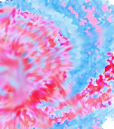
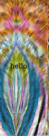
This piece is actually alot bigger in real life. At the moment it can be viewed in the Chase Gallery in Wadebridge Cornwall.Related content


Comments: 30

Wow, that's really cool, looks like it took forever too.

👍: 0 ⏩: 0

Thats realy cool! I like it that in the backrouned "words" is written, Insted of Other words. Cool!
Great work!
 (Smile)")
👍: 0 ⏩: 0

this is very cool and emotional like. I like how it is a picture instead of a manipulation. You did a great job at it.
👍: 0 ⏩: 0

The first word I saw was "funny"
The panel of judges agrees: 10/10!

👍: 0 ⏩: 1

that's really expressive, i like it, how did you do it?
👍: 0 ⏩: 2
well it came out great, all the work really pulled off
👍: 0 ⏩: 0

it took me ages i selected the words i wanted had them printed them out on see thru plastic i then used a projector to project the words up onto the board and painted them on using acrilic took me quite awhile.
👍: 0 ⏩: 0

I like the concept behind this wonderful piece. You actually made text more than what it normally is. Text at times can be very boring. In fact very uninteresting in essay form. It just looks like lines on the paper. You have transcended the expected use of the subject matter. I am not entirely sure but it appears that you have painted on all the words, which in my mind makes it a stronger piece. I love the fact that you can't read one word without another word fighting for the viewers attention. I also love that you changed the font style as well as size to increase the struggle, and tension in the piece. Even though the text in the background is smaller it too fights through the larger text, demanding attention of it's own. The only negative criticism I can offer isn't about the art at all. You should get a better photo of piece. The surrounding items in the room distract from the actual work itself. Other than that you have done a great job. You should do more works in this same style. Maybe just paint more period. Not just this style just paint for painting sake.
👍: 0 ⏩: 1
thank you so much, I did paint all the words on, it took me ages but I think it was worth it. Thank you so much that was a great comment, you seem to have completely understood my piece. I will try to get a better picture, that one was taken in the art rooms in poor lighting. Thank you again
👍: 0 ⏩: 1
Hey no problem. The amount of work that I know it took, was really well worth it. Great job!!!
👍: 0 ⏩: 0

")


wow! that was yours? i saw it in the art rooms but i never knew who did it! ")

👍: 0 ⏩: 0

OHHH OHHH OHHH OHHHH.... this is very awesomeness. Well done if only i could see real one to read all of it!
👍: 0 ⏩: 1
thank you, i loved your wind up girl friend one i love things like that very very good
👍: 0 ⏩: 1


this is quite immense, very powerful like the name suggests. it is quite eclectic, very different. *applaud*
👍: 0 ⏩: 0
this is quite immense, very powerful like the name suggests. it is quite eclectic, very different. *applaud*
👍: 0 ⏩: 0


i love it.. it reminded me of the artwork of radiohead´s latest cd hail to the thief ..
👍: 0 ⏩: 1
thank you sooo much, i needed some artwork to compare it to! and you found it for me! Thank you
👍: 0 ⏩: 1
hehe.. you´re welcome.. actually i didn´t "find it".. that´s my radiohead website.. heheh
👍: 0 ⏩: 0

you painted it? amazing... its really good, ill go hava look sometime
👍: 0 ⏩: 0

wuoaaaah...
so... I'm confused. Did you paint this? It's keen...
👍: 0 ⏩: 1
yea i did, i did as an art project in school, it's much bigger in real life! lol thanks for the comment
👍: 0 ⏩: 0