HOME | DD
 BlueJoshi — A test
Published: 2008-01-07 05:13:58 +0000 UTC; Views: 32; Favourites: 0; Downloads: 0
Redirect to original
Description
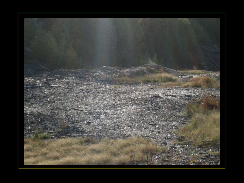
I really liked this shot, but it came out kinda poorly. So I'm using it for this!I know most people put their stuff in borders, but I... honestly don't know the 'rules' of doing that. Should it always be black? Should I go with white for some? Maybe shades of grey? Blue? Can it be decorated, and if so how much? I know I've seen pinstripes and thin boxes like what I've done here, but can I go father than that? What's the rule for titles? Centred, lower right corner? What if I have the upper left of the title superimposed over the image itself (with a bit of transparency), effectively making it a watermark of sorts?
..Y-yeah. :<
That's not dust getting kicked up, btw; it's smoke/water vapour from the mine fire down below. (Hi, Centralia!) It made some spots of the ground noticable warmer than the rest.
Related content


Comments: 4

I think you did good at borders here! And ^that guy seems to know what works, so do that. (Betcha could also find some HOW I DO BORDERS FAQ AND TIPS things around here if you wanted to!)
👍: 0 ⏩: 1

.. huh. Well I guess you're right. Please don't take offense to my ignorance, crinklykid!
👍: 0 ⏩: 0

do what looks good and does not distract from your picture, like simple borders like the one you made here
👍: 0 ⏩: 0