HOME | DD
 bluesphere — Peanut Winamp Skin. Nearly Fin
Published: 2005-08-21 02:38:43 +0000 UTC; Views: 12874; Favourites: 30; Downloads: 6208
Redirect to original
Description
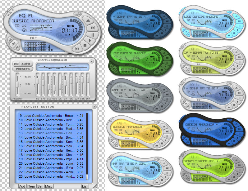
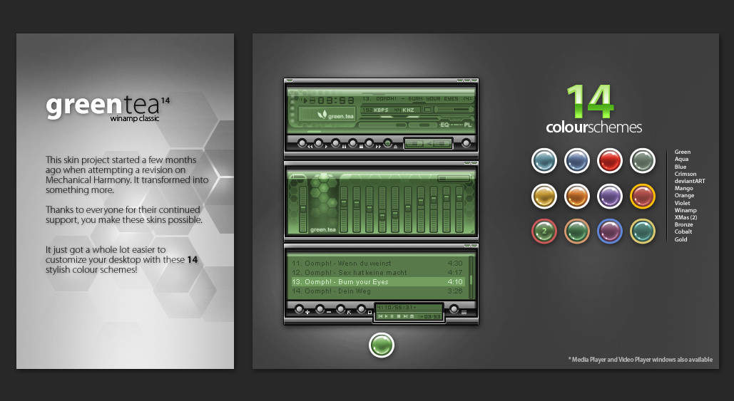
This is my first attempt at a Winamp skin, I started it last year and got discouraged when it came to programming the MAKI.There are alot of colour themes.
I like to think that it's good enough to post here if people could help me out? The container that holds the connected EQ draw I would like to scroll out when the user clicks on the button on the main windows "EQ" at the bottom and retract when they click there again. For the time being there is a seperate EQ also in a different layout. I gave up trying to get the hierarchies in the MAKI right. I don't want to learn MAKI! lol
After that I just need to make the display, as right now it's just a bunch of stuff slapped together. Though, the dial on the right with the timer in it will stay. I want it to look like an advanced mp3 player with an LCD screen. Heavily inspired by BOOM skin.
Ohh, it was designed using whatever version of winamp modern i'm using at any time, so I'm not sure about backwards compatibility. Turn desktop alpha on for the version with pretty shadows etc.
I have a pocket pc media player skin which i made in the same theme nearly finished, so you could have it matching your desktop player
Any help would be MUCH appreciated! Thanks (:
Time to get this baby on the go.
Related content


Comments: 15

Wow! This really caught my eye. Love the color schemes, but how do you change between all of them? I downloaded the skin and I'm just using the plain one. :'<
My only gripe with this is the kind of "grainy" edging the skin has. I don't know if that's just my computer acting funny or what, but I've had other modern skins before that were actually smooth on the sides. Hmm
Otherwise, a very innovative and cool new skin. Love volume button and the way the equalizer thing moves when my cursor touches it. Never seen any other skin do that before!
")
👍: 0 ⏩: 0


g'day! thanks for your response. if you could help me by making a script for that draw it would be great? after that id get around to finishing of the main display and making a shade mode for it. in the main container there is a bitmap called "
any ideas? p.s. .. i did some crazy shit with the drop shadows so that it only half shows when the layer is down and so that it all works out a bit better when desktop alpha is turned off.
thanks again (:
-darron
👍: 0 ⏩: 1

if you'd contact me on an instant messenger we could talk about anything instantly, would keep things as easy as possible
i'll help you for sure, as i promised
 (Smile)")
👍: 0 ⏩: 0

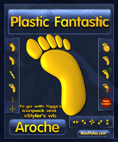
yeaa its really looks like a foot with 6 toes, and I like it. Good job
👍: 0 ⏩: 0

When I see it, i think less peanut and more foot with 6 toes... hehe... nice skin tho.
👍: 0 ⏩: 0

Pretty neat! Love the design, and the various device-like elements. But there are a few things I think could use work:
1) some of the text, like those on the EQ and PL (and their buttons) are a bit unclear.
2) the sliding eq panel (as you mentioned) seems to be following my cursor's movement...
3) the LCD display on the eq (showing the sliders' outlay) is a bit fuzzy, and the 1-pixel thickness line on it looks a little tacky imho.
4) The default PL bottom bar buttons, reminiscent of WA3 have always put me off. The embossing looks out of place, and the text isn't 100% properly centered. Any chance of using custom buttons?
5) Minor gripe -> there's a bit too much LCD bevel on the PL LCD, and it doesn't look as slick as the main window display.
Other than that, this skin rocks. Very cool design, and those vol +/- buttons are really neat too. Love it!
👍: 0 ⏩: 1
thanks for your feedback. it's exactly what i'm after! (:
i suppose the text is a bit hard to read, most if it is just part of the bitmaps but the things like the titles on the playlist are from a font i had to make so suit the skin, which unfortunately doesn't follow the skin color themes (can anyone do that?). it was done on lcd. i REALLY coloudn't be stuffed doing the code for a manual playlist etc. i just used the standardFrame code for it. this skin needs a shade mode, im thinking just some slim line like the winamp 5 default one, except not extendable.
thanks for your feedback (:
👍: 0 ⏩: 1
right-o. once again, great work!
👍: 0 ⏩: 0


I WANT IT!!
man, you should finish this, seriously
👍: 0 ⏩: 0

eyyy some ncie work there dude...
keep in comming...
should upload it to the net once its done...
ill download it and use it ")
👍: 0 ⏩: 0

Great job!! I love the different color options. And it looks nice too!
👍: 0 ⏩: 0
