HOME | DD
 BlueStreamBrony — Exploring The Galaxy [v3][LAST UPDATE/maybe not]
Published: 2015-03-03 16:18:02 +0000 UTC; Views: 570; Favourites: 16; Downloads: 0
Redirect to original
Description
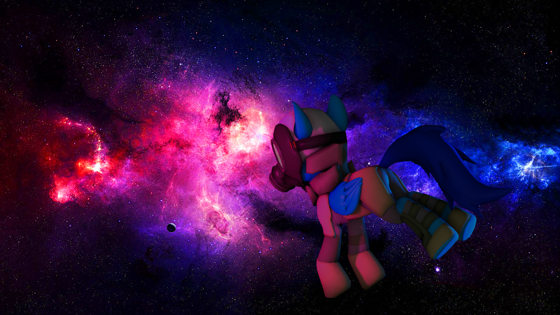
I had this idea while I was listening to this song on FurAffinity (the song is beautiful and relaxating ^3^)I used a green screen map first, and after I added a background using Photoshop (I played with the contrast and the luminosity too x3)
Enjoy~
Related content


Comments: 22


That's because I didn't have something else and that's just a little detail
👍: 0 ⏩: 0


SPAAAAAAACE !
I would say the same thing than Dreammaster231, I can easily see that it is a green screen effect, the lighting of the pony doesn't match with the space.
But nice job anyway
👍: 0 ⏩: 2
I finally done a third version ^^"
It is better ?
I posted all the versions in a GIF : bluestreambrony.deviantart.com…
👍: 0 ⏩: 0
Thank you :3
It's my first pic using a green screen after all ^^"
👍: 0 ⏩: 0

Going off what the doc said, it feels really flat to me, it seems more like the character is standing in front of a green screen(Even though he kinda is, but you get the point), rather than in the void of space.
partly because there's no reflection of light, Now with the current image that's a lil' easier said than done since there's no dominant light source, but next time id's suggest fining something with a like a star, or major light source to use Rim and bounce lights on. A fully dark character is uninteresting, and Makes the "3D" feel more 2D.
On top of that, I'd ai to ad more suspension in the characters posture, Again feels more like hes "Standing" in front of a green screen rather than actualy floating in space.
Outside of that, not bad for one of your first images.
👍: 0 ⏩: 1
Uploaded v2
What do you think ?
👍: 0 ⏩: 1
It still needs a lil' more work, but it's definitly better than the first image.
👍: 0 ⏩: 2
I finally done a third version ^^"
It is better ?
I posted all the versions in a GIF : bluestreambrony.deviantart.com…
👍: 0 ⏩: 1
Looks, better, and the brightness is, good, but pretty much what the doc said
The shadows doo clash, needs a bit more outline lights, but you are getting closer, just a little more and it'll be good enough to go post!
👍: 0 ⏩: 0
Thanks >W<
I don't know how I can improve it more ;~;
👍: 0 ⏩: 0

this is a really good picture mate! it could have a few improvments (in my opinion!) though.
I think it would look nicer if the character was titled at an odd angle, along with the background, removing any sense of gravity, cuz you know, space an' stuff.
It'd be lovely to see some rim lights hitting the sides of him with the appropriate colours (red/violet from the left, Electric/Royal Blue from the right.
Beautiful work with the after effects, i honestly don't have a clue beyond SFM exporting X3
i'd give it a 6/10. good job c:
👍: 0 ⏩: 2
Added some rim lights !
Whatcha think ?
👍: 0 ⏩: 1
that's a wonderful improvement mate! I can see quite a bit of potential in you.(not that i'm a master of SFM or any kind of art for that matter, far from it.)
what really helped me get off the ground were these tutorials
have a sift through them if you haven't come across them already.
these are by no means the "be all and end all" of tutorials.
👍: 0 ⏩: 2
I finally done a third version ^^"
It is better ?
I posted all the versions in a GIF : bluestreambrony.deviantart.com…
👍: 0 ⏩: 2
I forgot to mention,
here's a good example of a rim light Rim Light .
the stronger yellow/orange light striking the left side of Spike's face would be considered a rim light, and is what i think you should aim for with this picture, as the purple and blue lights are coming from behind the character relative to the camera.
👍: 0 ⏩: 0
Looking even better mate, but you have created a lot of harsh shadows.
In this context of space there isn't really any particularly strong light source, therefore no strong shadows.
try playing around with the lighting settings to make a softer looking shadow.
👍: 0 ⏩: 0
Thank you sooo much >W<
👍: 0 ⏩: 0
Thanks for your opinion I think I could improve it ^3^
👍: 0 ⏩: 0