HOME | DD
 BluishFeather — Different Colors...

Published: 2013-03-06 06:46:09 +0000 UTC; Views: 9710; Favourites: 91; Downloads: 83
Redirect to original
Description
1, 2, 3, and 4. These four numbers represent the ways I colored in my pictures before...1: The way I tried to color in the beginning: black lines and manual shading...
2: The way I colored when I started outlining nicely...
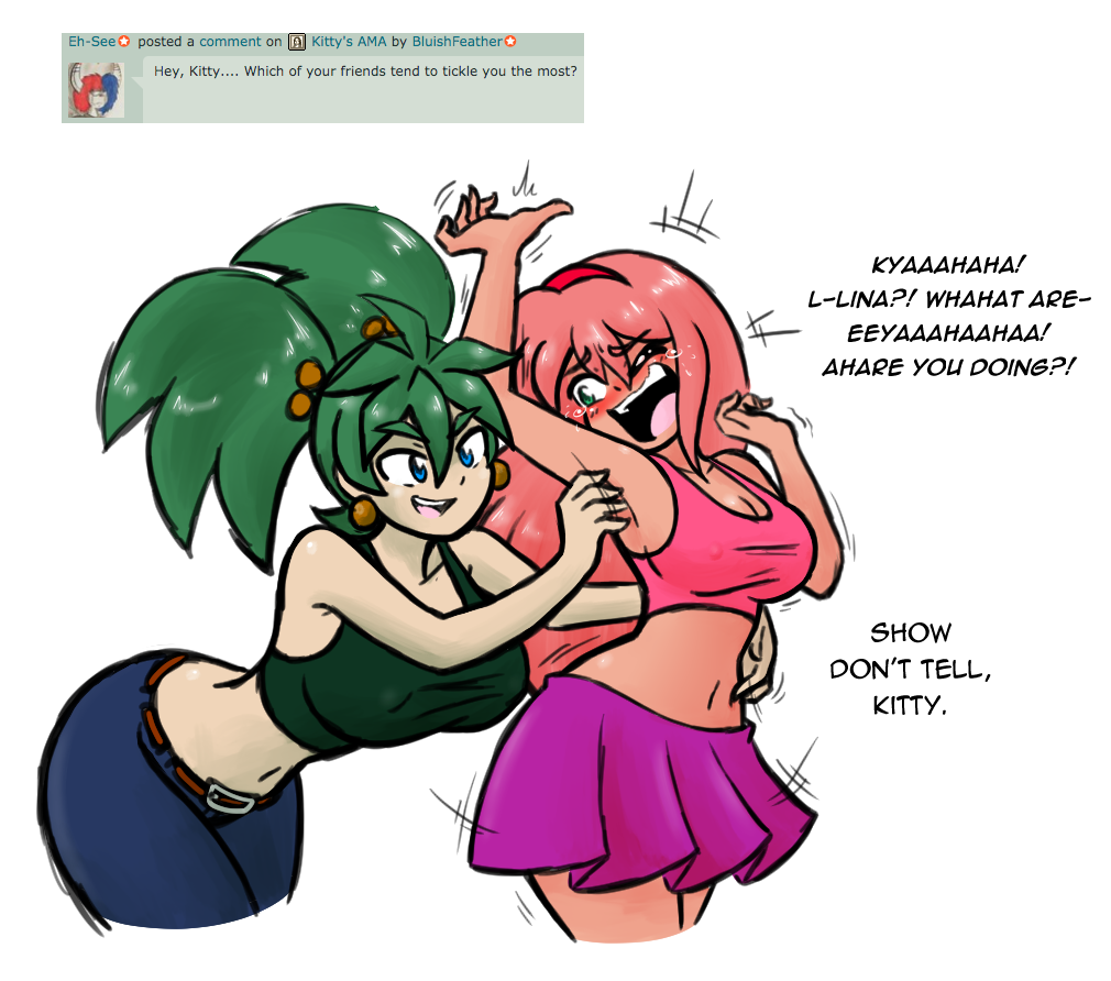
3: The way I colored Penny and Lina in that one pic...
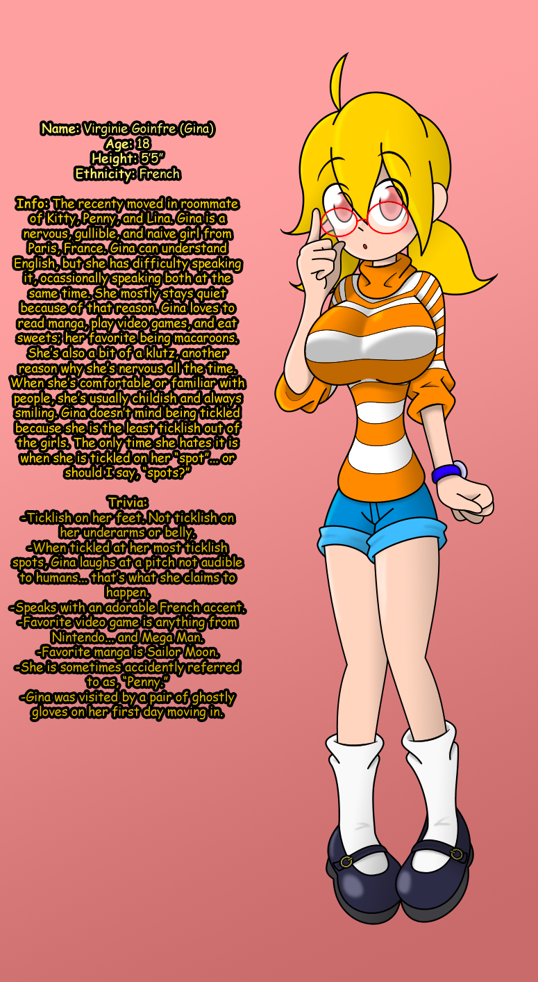
4: The way I recently colored in Gina, in that Valentine's pic...
Now for my viewers: Out of the four, which one is your favorite?
PICK ONE...
Related content


Comments: 38


Hmm, I can't decide, there all so nice and original! ")
 (Smile)")
👍: 0 ⏩: 0

Dude, its so cute... its hard to decide... xD
but i like more the 4
👍: 0 ⏩: 0

...Pick one?...
I like them all
But I think I'll go with three; the image feels softer than 1 and 2, and I feel like 4, because of the added shadows, looks kinda... weird. I don't know why, but then again, its just my opinion
")
")
👍: 0 ⏩: 0

All in all i would say 4, it seems more appealing to my eyes to such an extent that it's almost realistic, if anything the outlining for it could be darker but apart from that it's #4 for me.
👍: 0 ⏩: 1


In my opinion, I think option number 3 is the one that works and looks better.
👍: 0 ⏩: 0


Told ya, I like the colored outlines. But they could be a bit darker.
👍: 0 ⏩: 2
I think that's too dark, could be somewhere in the middle.
But, please don't worry too much about my comments! You're going well.
👍: 0 ⏩: 0
And your art evolved a lot, by the way!
👍: 0 ⏩: 1

In a good way, or in a bad way?
👍: 0 ⏩: 1
In the best way.
Seriously, I see a huge jump since your first submissions here.
Congrats!
👍: 0 ⏩: 1
O ok.
Really, was it that big of a jump?
Anyways, thank you for the feedback!
👍: 0 ⏩: 0


1 and 3 I find to be my favorite schemes.
Though 3 is the best one, in my opinion, so my vote goes to #3.
👍: 0 ⏩: 0


I love them all and kitty is my favorite of ur OC but if I had to pick theeeenn 1
👍: 0 ⏩: 0


Gah these are all really good ones... >_<
Gonna go with 4 here though cause you really pull off the colored lines in your style.
👍: 0 ⏩: 0


Faves. I loathe autocorrect.
👍: 0 ⏩: 0

from these I like shading styles 1 and 3. Specially since it fits for the inky style of the lines
👍: 0 ⏩: 0