HOME | DD
 Bobalob93 — Elizabeth Colours September 2017
#bioshock #colours #elizabeth #fanart #gelpen #promarkers #videogames #bioshockinfinite #annadewitt #elizabethcomstock
Published: 2017-09-14 09:40:25 +0000 UTC; Views: 544; Favourites: 12; Downloads: 2
Redirect to original
Description
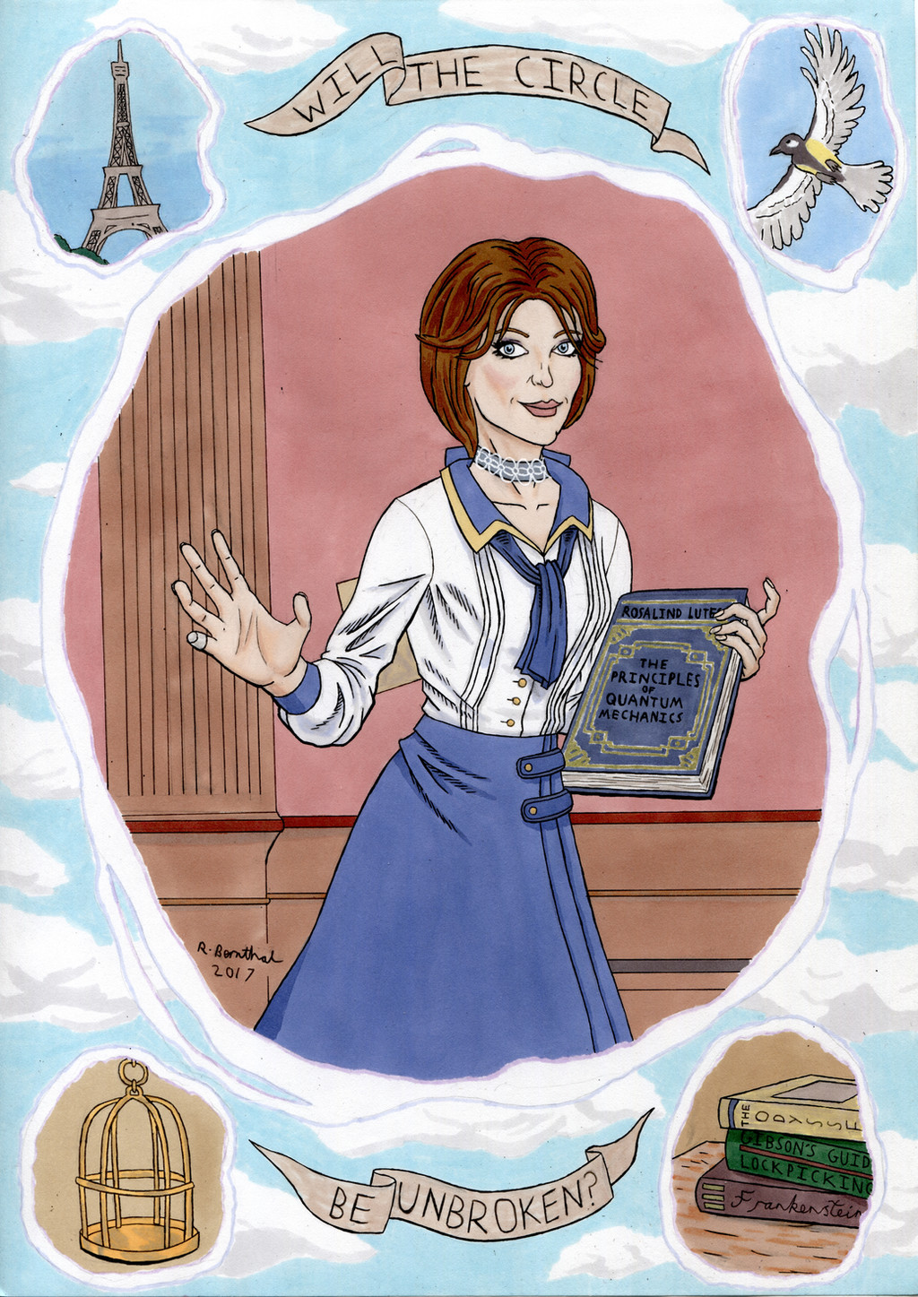
I'm kind of mixed on how this one has turned out. I think the colours on Elizabeth herself have come out ok, as has the background that I added in her main tear and the two tears at the bottom, but the sky background and the two top tears don't work quite as well.I think that the blues I used on her skirt, collar, tie and cuffs all match the colours on the in game model nicely enough, and that some parts of them have some decent shading on them. I think the shadows on her shirt work well too, as I used a few different layers of blues and greys to create the shadows, and I think I've managed to avoid making them overpower the rest of the white shirt. I tried layering up different pinks and peaches to create her skin tone, and I was bit worried that the pink I included in her cheek would be too much, but as I've added more shadows and evened out the skin tone it's come out better than I thought it would. For the gold details on the book I used a gold gel pen to outline them, then very carefully added the blue in afterwards. I was a bit worried about how that would turn out as well, but I think it's worked nicely. I also used a gel pen on her choker, though that was sort of reversed from the book, in that I made sure I'd finished all of the other colours first, then added the white lace details last. It's probably not as detailed as the lace on the in game character model, but I think it gets the point across without making it ending up a mess. And I decided to add a background in behind Elizabeth because I'd intended to just throw a single colour in there, but once I'd done the other background elements it seemed too bare, so I quickly Googled a look at the interior of her tower from in the game, and drew in a slightly simplified version.
As I said, I'm happy with how the bottom two tears look, as even though they're fairly simple, I think they stand out nicely as a whole from the sky background, whereas the top two kind of fade into the sky a bit too much. I probably should have added more cloud elements up there, but it is what it is. And speaking of the clouds, I added those by including the shadows of the clouds first, then the blue of the sky to suggest the shape of the top of them. I think it works, but it was only after I'd finished filming the video for this picture that I realised I should have tried to fade out the clouds by adding some Tipp-Ex then smearing it with some tissue. It might have looked cool, and added some transparency to the clouds, but it's not a massive issue.
So yeah, I like how some aspects of this have turned out, but I wish that other parts would have ended up looking better. Ah well, something to learn for next time.