HOME | DD
 BobbyG12 — NEW vs2
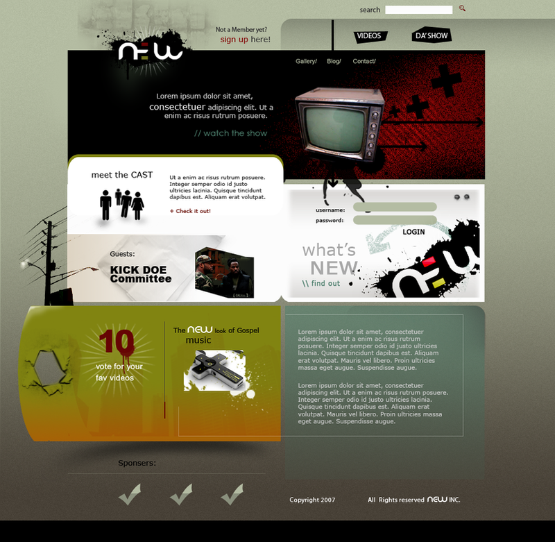
Published: 2007-05-05 00:50:45 +0000 UTC; Views: 2534; Favourites: 31; Downloads: 221
Redirect to original
Description
I thought the original was too abstract wanted to conform to people expectations a little more. lolRelated content


Comments: 11


Looks nice, but what is with those plus signs / x's. I've been seeing those everywhere lately.
👍: 0 ⏩: 0

 (Wink)")

it works as something pretty to look at but...as a site I'd actually visit repeatedly...I don't know.
I'm not getting a feel of the content.
What is "the show"?...oh wait... is it... hold on...
is it an african american urban gospel music video count down?
I think, if the imagery isn't going to be self explanatory then the descriptive text (lorem ipsum area at the bottom) should probably be up higher where I can read it without scrolling down.
If you're having a hard time selling it to the client try adding some "advertisey" text, preferably something they used in some of their other material.
And people shouldn't have to click an uninformative box just to find out "what's new". This is the front page isn't it? It should already be telling me what's new. And the username/password should be placed elsewhere so there's more room for actual 'what's new' content. And people hate when their first impression of a site is "yeah, there aint jack for me on this site unless I sign up .... again". People already have enough passwords they can't remember.
.... but on the other hand, if this is just meant to show the look and feel/colors and not really an example of what the real final final site would be, then those people just will never get on board with this modern look...which would be stupid of them since the site is all about being NEW!
Also what will the internal pages look like. Sometimes I start a layout with the areas that I know return visitors will spend most of the time looking at. The content areas within the site. Then when I have a good idea of how the content will really be, I can then get ideas of how the guide the user to the content they want from the front page.
P.S.
I would hate to have to do the CSS behind this layout.
👍: 0 ⏩: 1

LOVE your critique. the CSS behind this wouldn't be so bad. I actually do CSS I like it. Thorough though thanx
👍: 0 ⏩: 1
I should get some css lessons from you then.
👍: 0 ⏩: 0

Looks pretty good. The only thing I could probably say about this would be to try more vibrant colours; but the design itself is well done.
👍: 0 ⏩: 1
it is brighter than the original but i must say in defense it supposed to be 'urban'
👍: 0 ⏩: 0


")
