HOME | DD
 Bobbyperux — CONCEPT ICONS .08
Published: 2007-12-22 15:03:20 +0000 UTC; Views: 129428; Favourites: 318; Downloads: 41042
Redirect to original
Description
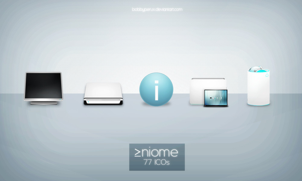
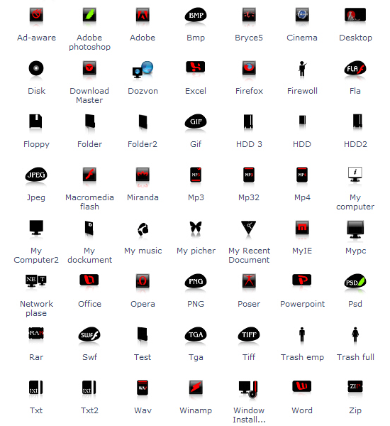
|About:A little sample of the icons I´m working on for public release during 2008. They will be released in the following order:
 March 2008: RELEASED as "affel". Available in PNG and ICO formats (bottom)
 July 2008: RELEASED as "misto". Available in PNG and ICO formats (middle).
 Not for public release, already bought: iMac based (top)
|Inside:
12 different icons in PNG format 256x256px.
|Other:
Please read the readme and enjoy the icons. Thanks for watching.
©2007 Roberto Abril Hidalgo | bobbyperux.deviantart.com
Related content


Comments: 75


All you have here is so nice..Great job bro Bobbyperux
👍: 0 ⏩: 0

 (Wink)")


Tio!!!!!!!!!!!!!!!!!!!!! es la segunda que te envio, no se si ya tienes algo, pero si no, puede estar bien pero dime algo pq si no te interesa tengo gente, que si, pero me apetecía, proponerselo a álguien del mundillo del diseño
👍: 0 ⏩: 1


nice , very nice
منتديات | منتدى | دردشة صوتية | دردشه |شات كتابي | |العاب فيديو | العاب فلاش
شات |دليل | دليل مواقع |السياحة | |برامج كمبيوتر | تحميل صور
👍: 0 ⏩: 0


Estan muy buenos... pero no entiendo porque no estan a 320 dpi? Digo, mas grandes de tamaño para poder usarlos 100% full..
👍: 0 ⏩: 1

Bueno, normalmente sucede que cuando diseño iconos no tengo en mente imprimirlos sino más bien usarlos en mi ordenador... no tendría mucho sentido usar un valor mayor de 72 dpi no crees?
👍: 0 ⏩: 1
Claro, usándolos solo para el ordenador no tiene sentido hacerlos a 320 dpi... pero yo por ejemplo, y creo que muchos mas imprimimos muchos de nuestros trabajos... y seria grandioso poder contar con tus iconos que son muy buenos!
👍: 0 ⏩: 0

nice , very nice
منتديات | منتدى | دردشة صوتية | دردشه |شات كتابي | |العاب فيديو | العاب فلاش
شات |دليل | دليل مواقع |السياحة | |برامج كمبيوتر | تحميل صور
👍: 0 ⏩: 0


Oh ! Kind of cool stuff here ! For your poll I would say I'd rather see the cinema display as a concept for a package but in a smoother way. I mean the shapes are a bit harsh to me compared to the iMac which sounds "smooth" to me ")
👍: 0 ⏩: 0

")

Están fantásticos, pero tendrían mejor aspecto sin la manzanita...
______________________________________
They're fantastic, but they would look better without the little apple...
👍: 0 ⏩: 0


Nice, very nice !
I prefer the last one (black and purple).
👍: 0 ⏩: 0

Congratulations, this piece has been featured in my journal ..
👍: 0 ⏩: 1


Great icons.
Personally, I'd either go for the second or third.
👍: 0 ⏩: 0


nice , very nice
منتديات | منتدى | دردشة صوتية | دردشه |شات كتابي | |العاب فيديو | العاب فلاش
شات |دليل | دليل مواقع |السياحة | |برامج كمبيوتر | تحميل صور
👍: 0 ⏩: 0

hmm dunno the first one has a oldyshh look to it...that i like!
👍: 0 ⏩: 0


muy bien!!! el inglés es bastante bueno! se entiende chachi... creo k no hay que corregir nada!
BRAVO!!!
👍: 0 ⏩: 1
En serio? wow, si me viera mi madre!!! 

👍: 0 ⏩: 1
jajajaj de nada majete!!! : )
diselo a tu mami! k se enorgullecerá! ^^!
:*
👍: 0 ⏩: 0


Beauties! Sorry about the you know what, Its almost done
👍: 0 ⏩: 1
No worries man, take your time  (Smile)")
👍: 0 ⏩: 0

I like the icons in black and purple
On GuiPulp.com: [link]
👍: 0 ⏩: 1
nice , very nice
منتديات | منتدى | دردشة صوتية | دردشه |شات كتابي | |العاب فيديو | العاب فلاش
شات |دليل | دليل مواقع |السياحة | |برامج كمبيوتر | تحميل صور
👍: 0 ⏩: 0
| Next =>