HOME | DD
 Bobbyperux — Onethree Vector Logos

Published: 2008-06-10 10:59:43 +0000 UTC; Views: 5076; Favourites: 26; Downloads: 0
Redirect to original
Description
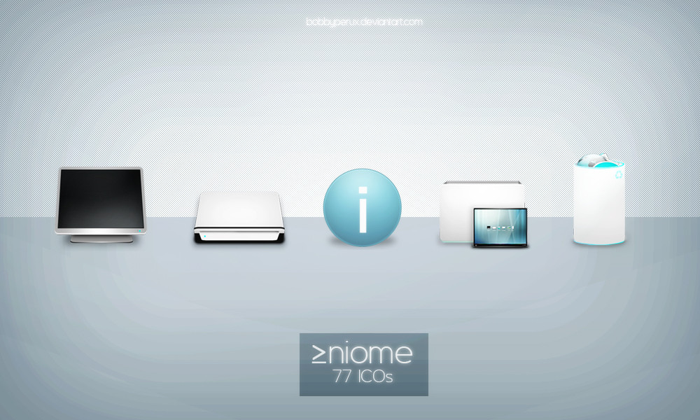
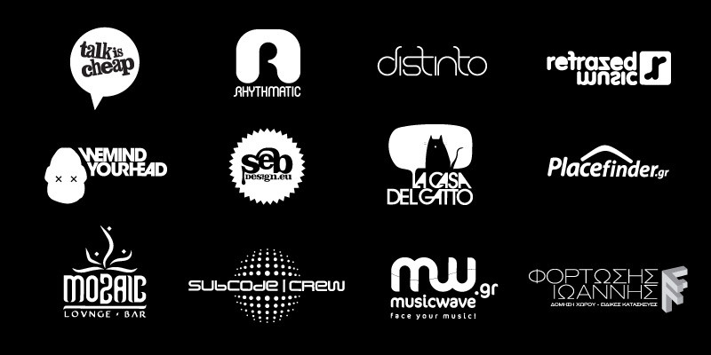
|About:My logo entries for the Onethree logo contest . More detailed models will follow if they choose one of these. Originals are 100% pure vector at 300dpi. No flashy colors.
© 2008 Roberto Abril Hidalgo | bobbyperux.deviantart.com
Related content


Comments: 40


Thanks for the fave man!. It is an honor
")
👍: 0 ⏩: 0

 (Smile)")

nice , very nice
منتديات | منتدى | دردشة صوتية | دردشه |شات كتابي | |العاب فيديو | العاب فلاش
شات |دليل | دليل مواقع |السياحة | |برامج كمبيوتر | تحميل صور
👍: 0 ⏩: 0


second one3 is the best mate.
simple and clean is the way to go.
good work.
👍: 0 ⏩: 0


love them all, but the best suited imo for the company is the second one
 (Wink)")
👍: 0 ⏩: 1

They all can be used. The second one is more " clean and professional because of its minimal detail and archfilled sweeping text.
👍: 0 ⏩: 1
yea but one is too aimed towards urban culture
👍: 0 ⏩: 0

*rushes to make one for the competition too* ugh it ends today! toodaloo

👍: 0 ⏩: 1
Haha yeah... uhmm K making logos! that could be awesome mate, 

👍: 0 ⏩: 1
toodaloo is just another way of saying goodbye.
LOL dammit my logo is driving me nuts
👍: 0 ⏩: 1
Oky doky thanks one more time for your English lessons mate haha.
Yeah making logos is a complex process imo, you need to make a looooot of scratches and drawings before you find something worth it, sometimes the simplest is the most complex. You have to concentrate a lot of meaning in a single image but hey, you know you´re good
Cheers!

👍: 0 ⏩: 1
damn I'm good. I am really good...pfff it helped. Thank you.
I never think highly of myself but I will remember your words. Thank you
👍: 0 ⏩: 0


Is it just me, or is "three" spelled wrong in #3? It looks like "trhee" to me.
👍: 0 ⏩: 1
Nope it was me... :/ it´s fixed now
👍: 0 ⏩: 1
whew! I thought I was going crazy
👍: 0 ⏩: 0


nice , very nice
منتديات | منتدى | دردشة صوتية | دردشه |شات كتابي | |العاب فيديو | العاب فلاش
شات |دليل | دليل مواقع |السياحة | |برامج كمبيوتر | تحميل صور
👍: 0 ⏩: 0

