HOME | DD
 Bobbyperux — The Theory

Published: 2009-07-19 00:57:52 +0000 UTC; Views: 16999; Favourites: 359; Downloads: 0
Redirect to original
Description
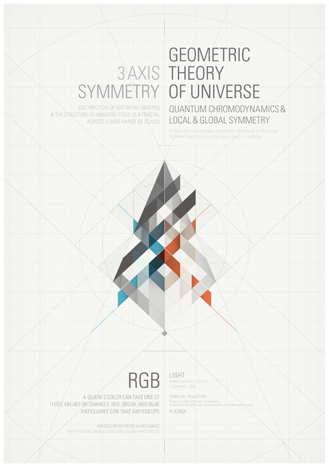
|About:First of a series of posters I´m working on. Orginal size is A3.
The Color Theory
The foundations of pre-20th-century color theory were built around “ pure” or ideal colors, characterized by sensory experiences rather than attributes of the physical world. This has led to a number of inaccuracies in traditional color theory principles that are not always remedied in modern formulations.
he most important problem has been a confusion between the behavior of light mixtures, called additive color, and the behavior of paint or ink or dye or pigment mixtures, called subtractive color. This problem arises because the absorption of light by material substances follows different rules from the perception of light by the eye.
Many historical “ color theorists” have assumed that three “ pure” primary colors can mix all possible colors, and that any failure of specific paints or inks to match this ideal performance is due to the impurity or imperfection of the colorants. In reality, only imaginary “ primary colors” used in colorimetry can " mix" or quantify all visible (perceptually possible) colors; but to do this the colors are defined as lying outside the range of visible colors: they cannot be seen.
Any three real “ primary” colors of light, paint or ink can mix only a limited range of colors, called a gamut, which is always smaller (contains fewer colors) than the full range of colors humans can perceive.
© 2009 Roberto Abril Hidalgo | bobbyperux.deviantart.com | teskostudio.com
Related content


Comments: 59


Ah ! As a photographer and digital artist, I was perfectly aware of the physical realities of color mix, additive and subtractive. So it frustrated me to no end when I took painting lessons about colors - hoping to learn the technically of producing precise shades with paint- and the lessons were about this theorical color circle and primaries mix that is so inaccurate. Plus, the lessons took place under artificial fluorescent lightning, that is a poor light with a deficient spectrum.
Your poster is graphically interesting but also I hope it will diffuse the knowledge about real color theory, useful for everyone of us.
Something else I find also very interesting is subjective perception of colors ; the proximity of a color to another can change it in the mind and perception.
There is also the cultural feeling about colors. As artist we ought to have a solid knowledge about all tree aspects of colors...Physical truth, subjective perception by the eyes, mind-cultural associations.
👍: 0 ⏩: 0


Ostia cuanto tiempo! Q tal todo?
 (Smile)")
👍: 0 ⏩: 0


Superb work, is there a specific name for the diagram you used or sources of inspiration? I see some of these around the web but cant find any information the actual diagrams ")
👍: 0 ⏩: 0


this reminds me of LA artist KOFIE. some of his early work, anyway.
[link]
but look at his new stuff now! crazy. i am fiending right now just looking at.
👍: 0 ⏩: 1
interesting stuff, thanks for the link man

👍: 0 ⏩: 0
hey bobby (is that your real name?)
just flipping through your stuff now that i found you.
this is really dope. the series of posters looks like it will be entirely solid. i always appreciate when people dig back into the fundemental principles and history and lay it down to school heads on whatsup.
do you have a name for the series? "Foundation"? right on.
I would really like to feature your posters somehow, something either web or maybe even in print form. some ideas to throw around? can we msg about this?
i'm out in San Francisco. yee!
👍: 0 ⏩: 1
Hi again
Thanks for your words. Yeah, this series are build around the concept of primary ideas behind the design principles and the way I dare with them myself. It is pretty subjective and just for fun. I called the series "exploration vs solution" but it is not finished yet. You now, still exploring.
Send me a message to teskostudio@gmail.com and I will send you my msn.
Cheers
👍: 0 ⏩: 0

Really nice. I live it. When u made it in more bog resolution?
👍: 0 ⏩: 1
Thanks, probably never. I lost all the files from my latest projects in a HD crash :/
👍: 0 ⏩: 1


This is so dope mate, when you release the poster let me know...I don't know about a A3 version but I would love a A4 so I can frame it & put it up with my other prints.
Let me know bruv, peace!
👍: 0 ⏩: 1
Sure man, I´ll keep you update about it.

👍: 0 ⏩: 1


I love it! Minimalistic and the colors work splendidly!
👍: 0 ⏩: 1


While the colours themselves fail to suit my needs, the concept is definitely there - i can tell you invested talent and time.
but i'm actually here to say that I'm one of the victims of misinformation on this area, and seeing things put together like this, helped me a tad to brake free of confusion. Thank you !
👍: 0 ⏩: 1


Uff, me encanta en serio, tiene una armonía...está todo en sintonía. Me encanta buen trabajo
")
👍: 0 ⏩: 1


 (Wink)")
Don´t know why actually, I´ve only edited one letter since yesterday when the description looked just fine and all tags seems to be on its right place
👍: 0 ⏩: 1

...what's that for?
it now sits there in your "Artist's Comments" surrounding the entire quote being visible and without function.

👍: 0 ⏩: 0
A6??
that's 4 times smaller than A4 actually.
i guess you meant A2, right?
either way, ...it's nice to see you're doing something completely different again.
i like the colors and impression of depth in that poster.
it even reminds me of something, but i don't know what.

👍: 0 ⏩: 1
| Next =>