HOME | DD
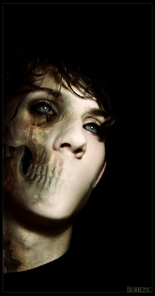
 boheme — bohemian identification 005

Published: 2003-08-17 18:02:42 +0000 UTC; Views: 1859; Favourites: 32; Downloads: 979
Redirect to original
Description
i was looking through my recent work, and realised how much this part of rifles [link] reflects my halves at the moment.a battle of sorts, i suppose. two sides, to every story...
and since i'm going through this relatively odd morbid phase... why not.
 (Wink)")
Related content


Comments: 56

Why did you cover your face up in the mugshot thread? D:
👍: 0 ⏩: 0


everything has two sides ...a ying and a yang ....hmmm just another thing i thought about while waiting for a train ...i seem to think about everything while waiting for ....trains
👍: 0 ⏩: 0


great pic
I love the lights.. And the pattern in the face fit perfect to the face profile.
good work
its goin to the Fav
👍: 0 ⏩: 0

i'm adding this because it's so honest and .. well, i'm just bewildered by it.. you deserve the credit.
👍: 0 ⏩: 0

")

This is absolutely amazing, so beautiful. I love the darkness to it, the sleekness to the designs, everything about it is so well-planned. Great job, wish I could have done it.
👍: 0 ⏩: 0

I love the manipulation and the sepia tone as well as all the blackness. The only thing that seems out of place is the text at the bottom. I like the actual message, but I don't like your choice of text. I feel it's too simple. I think it needs a more cursive font to go with the swirls on the face. Or maybe a kind of mixture of a two... like a plain typeface that turns into a more curvy one, kind of like how the normal face is taken over by the design.
👍: 0 ⏩: 0

wow this is incredible awesome, the " tatoos" are just so damn cool...
the only thing i dont like is the size, it sould be larger so you can see more details
")
👍: 0 ⏩: 0

trully fantastic. the quality and the colors are just PERFECT!
maybe just a liitle note about the font.. something more twirly (elfish if you prefer) would tie with the idea better.
anyways, one of the best id's i've seen. thank you

👍: 0 ⏩: 0


i dont like nothin this style, but in this maybe is good. Manip is OK
👍: 0 ⏩: 0


Damn that is BREATH-TAKING work!
What can i say?
👍: 0 ⏩: 0


lol! sorry again gonna have to add this to my favs  (Smile)")
👍: 0 ⏩: 0
sooo gooooooood omg i think ermmmm SPERM IN YOUR EYE
")
👍: 0 ⏩: 0

looks great. Everything is lovley, however my only piece of criticism is make both eyes grey or none. At that angle it gives it this wierd lopsided look. Besides that, everything perfect. keep it up.
👍: 0 ⏩: 1

thanks man...
but i must say the eyes are different for a very significant reason, but i see where you're coming from.
👍: 0 ⏩: 1
and what reason is that? I like to know artists' motive behind things *nudge*
👍: 0 ⏩: 0

This is beautiful!!!!!!!!I cant even dream of makin these effects!keep it up!
👍: 0 ⏩: 0

Great effects! I really like the style; very cool I.D. Awesome job!
"I want to spawn epiphanies in every generation."
~harlequin02~


👍: 0 ⏩: 0


👍: 0 ⏩: 0

Can't really say anything that hasn't already been said, but this is very brilliant work.
👍: 0 ⏩: 0

cant go wrong with phases
great manip as said prior
just.. well done
👍: 0 ⏩: 0


WOW!
thats about all I can say. Going back to stare at you a little more now.
👍: 0 ⏩: 0
the identity of one of our own.. a fine creature she is.. this is a splendid portrayal La..

👍: 0 ⏩: 0

insanely beautiful boheme!
what an excellant painting this would make.
it's really cool the way you didn't go strictly
half and half,...and sort of integrated the two
'sides' of you in each half.
and isn't that true of ourselves anyway? every
side of us seems to seep into each other at times.
if that makes sense.
wonderful work.
👍: 0 ⏩: 0


this looks really well done, and neato, pity is not bigger size
but great work.
👍: 0 ⏩: 0

I don't like her righte eye, but it is still great work
👍: 0 ⏩: 0


love how it's got this mystical feel to it. and nice going with the patterns and eyes
- apparently neurotic
👍: 0 ⏩: 0


beautiful! I really like how the design looks on the side of your face/eye. Plus all the negative black space. Perfect.
👍: 0 ⏩: 0

Wow!
That's incredible, darl - really really good.
There's a very intense sense of both beauty and turmoil in the two halves. It's peculiar, very attractive, very shocking, amazing.
I sound like such a damned suckup but La, this is amazing.
NIIIICE ID.
👍: 0 ⏩: 0

OMG!!!!!!!
this is a beautiful piece.....
i LOVE it
so dark......i love the model and her pose....
👍: 0 ⏩: 1
thanks...
it's me though, this is my ID
👍: 0 ⏩: 1


Nice ID, Love the manip on your face .. very interesting
👍: 0 ⏩: 0


Very sweet ID. You're really beautiful. I somehow missed the Rifles one but this one looks even better because of the color.
👍: 0 ⏩: 0


| Next =>