HOME | DD
 BonzlyDoo — Draftsmanship practice - Week 5
#around #bluth #character #don #pencil #test #turn #university
Published: 2018-03-14 05:03:28 +0000 UTC; Views: 559; Favourites: 6; Downloads: 0
Redirect to original
Description
It's week 5 and we get to design our own characters! How exciting.We were told in our assignment to base our characters off of someone we know, this is because characters tend to come across more genuine when you base them off of real life experiences (Keep that in mind).
Before I start I want to repeat something that Don said to us at the start of our lecture.
Art is HIGHLY subjective, and there is no right or wrong way to do it... But, whatever you are doing, the style that you chose should not intrude in the story that you are telling. Your style should not distract from the narrative that you are telling. Your style should not draw attention to the fact that your art is drawn. This is in reference to animating short films. For feature films, we were told; "You have to fully immerse your audience in just the storytelling." This is why artists in animation erase the pencil quality in their art, they erase the 'artist's handprint', in animation we tidy up our work. The reason for this is to emphasise the story. It's a little sad, but because people do this in animation it means that the audience is able to completely loose themselves in an animation, believe in the stories, and even forget that what they are watching is an animation for a short time. That's kind of amazing.
Writing your character
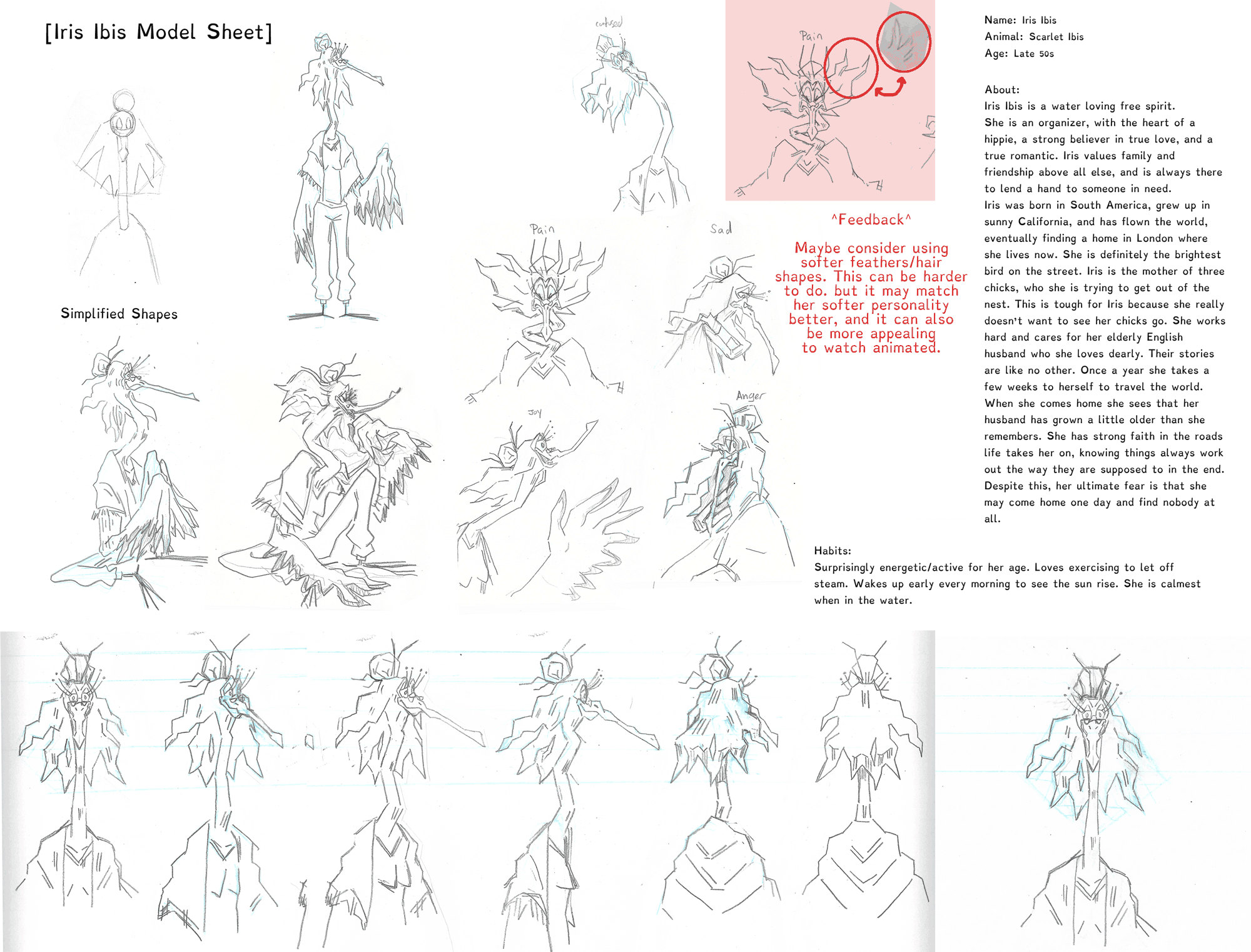
First of all we were given several animals to chose from, then told to caricature them, combining the animal with the personality of someone we know. With a little trial and error, bam, character! We were told to write a full bio of our character (which I have included to the right), including a synopsis of their name, personality, approximate age, fears, wants... all while keeping their original animal in mind, trying to fit that into their personality somehow. It's a useful exercise, and just goes to prove how quickly you can create a believable character.
Creating a character turn around
Here are a few questions that Don KEPT repeating to us. "Where is your character going?", "What do they want?" he wrote the word 'WANT' in big capital letters across the page. Any active character in a story, especially main characters should always (in theory) have a definable want, so that they have initiative and direction in a story. "What drives your character?" These are all different ways of saying "What does your character want in life?" Even if they aren't aware of it, you should be as a writer.
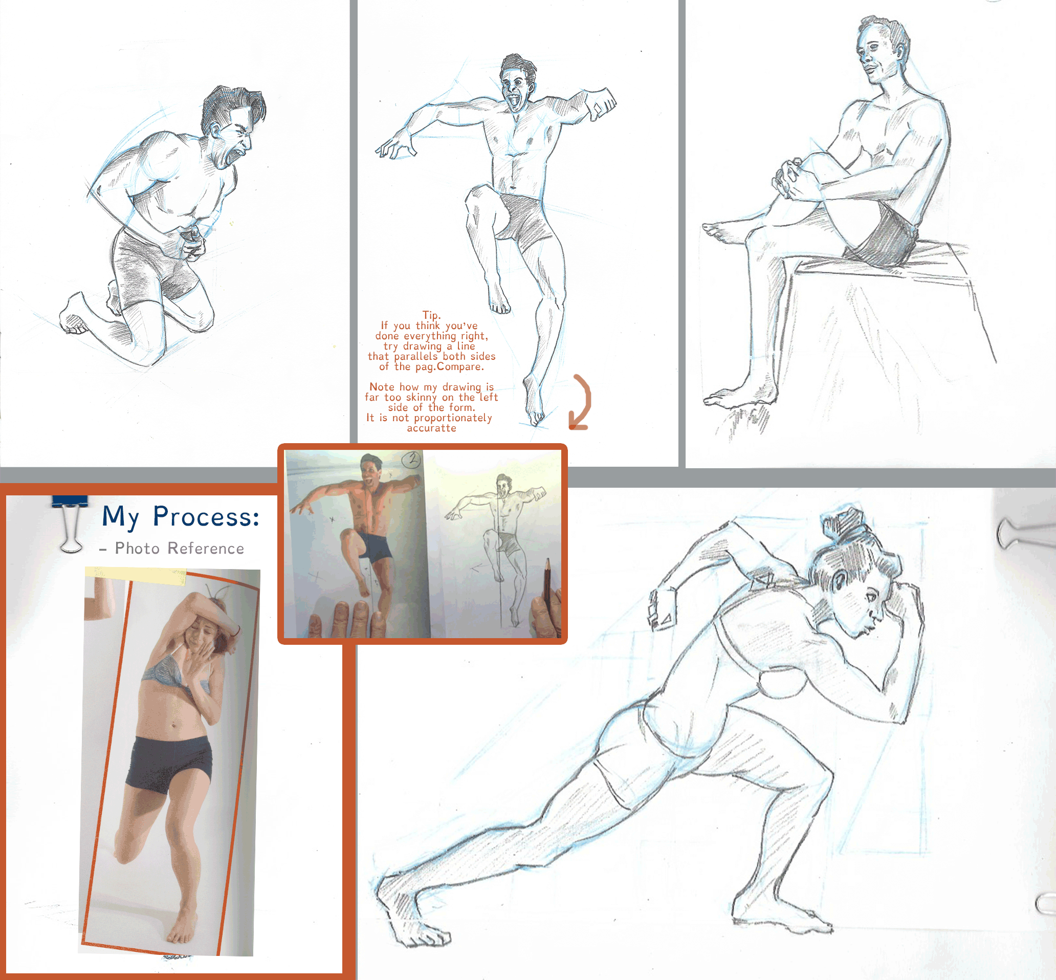
After the bio we were told to do a full head turn (which I think I've improved on since last time). In this way we are building a reference of our characters from all angles.
Here are a few tips I've learned while making character turn arounds.
1) Use basic shapes when drawing your character. Using this character as an example, the head and hair bun shapes are built on a basic circles, the neck is made out of basic pipe shapes, the hair can be broken down into measurable negative and positive jagged shapes. Know how many heads tall your character is, and keep that consistent. Doing this is crucial if you plan to animate your character. You MUST understand the shapes that make them up so that you can recreate them consistently. Consistency is key.
2) Draw lines across the page to keep your character consistent, the nose will ALWAYS match up with the line for the nose (at any angle) when you are drawing a neutral character turn around. The eyes will ALWAYS match up with the eye line, the crook of the neck, the hair, everything. In short, TRUST IN THE MATHS. The same goes for proportions, if you study old anatomy drawings. The universe is made by following some basic rules of maths, perspective can be deconstructed mathematically, this doesn't mean you have to know any equations, instead just keep in mind that there will always be a measurable pattern that a 2D image rotates to fake 3D space. Trust the maths!
3) Make sure your character makes sense anatomically, and is believable from every angle. It is a popular trend in animation sometimes to draw a form that only makes sense from one or two angles (The most obvious example that I can think of for this is Phineas and Ferb). This is not always desirable. Don emphasised in our class that an animator/designer should understand how the anatomy/shapes of the character fall together at any angle. Animation needs structure. Think in 360 degrees and you will be a better animator.
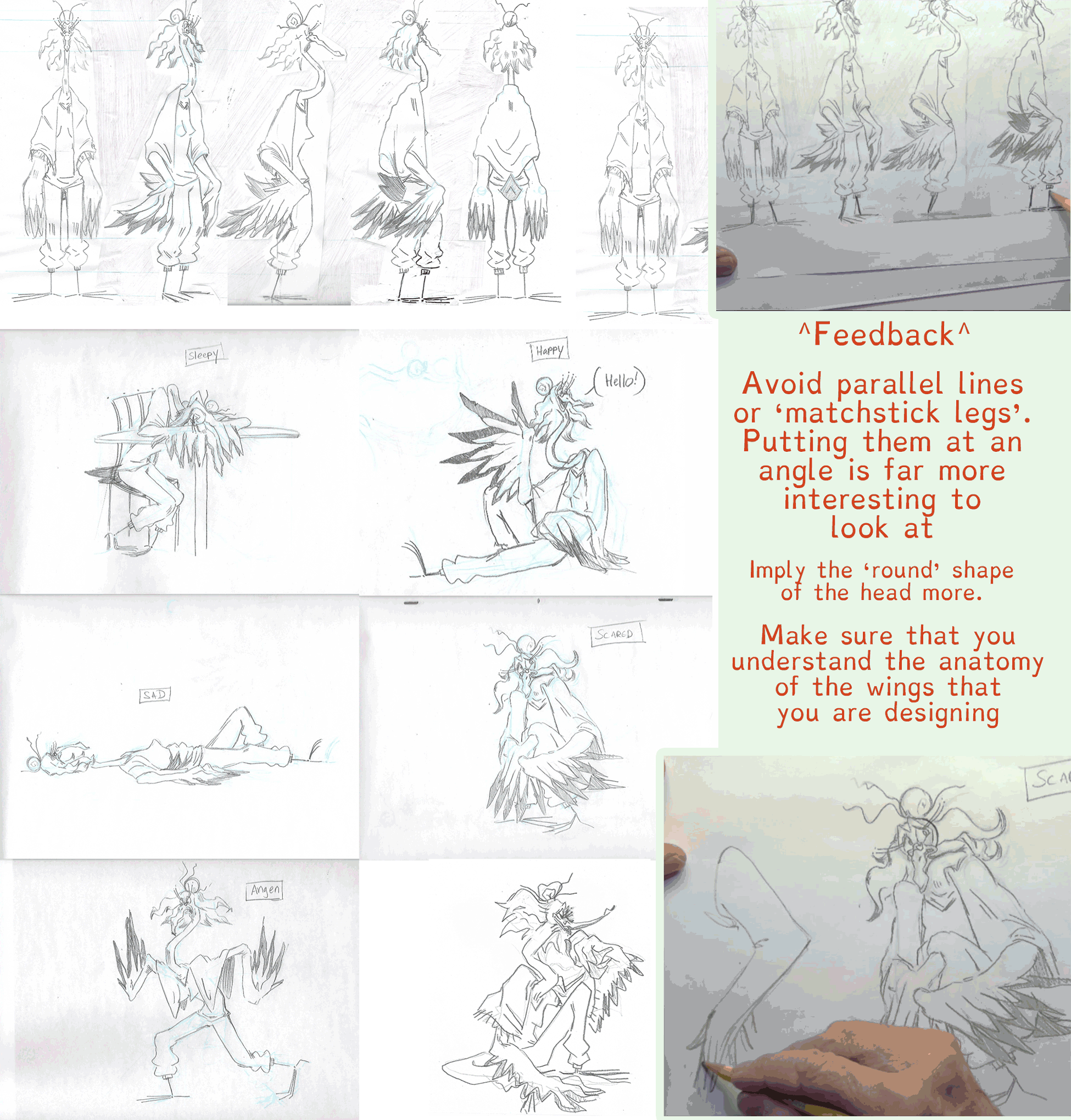
Drawing character expressions
Don is a classic artist, and he absolutely swears by the concept "A good pose needs a clear line of action". I'm coming to understand that CLARITY, and READABILITY are the absolute key desirable qualities of any animation. You want a clear pose, not a disjointed one. Consider how fast an animation frame goes by. If your key pose only lasts for a brief second, you need it to be as easily readable as possible. Having a strong line of action in your animation, one that carries the emotion of your character and helps communicate that emotion (or personality) clearly is a must. The reason this quality is equally desirable in model sheets, is because we use model sheets as reference for our future animations. A model sheet should be the ultimate example of the quality that is to be expected from the animation.
As mentioned before, using construction lines (i.e. the circle for the head) is a crucial habit to get in to. Even if you are drawing an exaggerated expression, the fetures will always proportionately fall into the shape of that circle. Sometimes we 'squash' or 'stretch features, and that construction circle may squash and stretch with it, but even so, the circle is still there under your character, and the proportions still fall in line with the way that the circle squashes and stretches.
Always try to find a good silhouette in your pose. Avoid things like 'stacking' limbs and 'twinning' when you draw. I will explain what these things mean. 'Stacking' is what happens when you draw one limbs that overlap each other, i.e if you have a bunny and if you draw their ears in a way that obscures the silhouette, and makes it less clear. As mentioned before, you need your image to be a easy to read as possible, a good, strong, clear silhouette is key for this. 'Twinning' is what happens when you have two limbs mimicking each other, i.e if both arms are up and in the same pose. Try making those arms at slightly different angles or heights. This tends to make the drawing a little more interesting to look at. Remember, subtle asymmetry is appealing.
Body language. Be aware of the balance of your character (where the centre of gravity is). Also be aware of the age and gender of your character. Characters have different body language at different ages. For the centre of gravity, be aware of where most of your character's weight falls, and how this affects the rest of the body, a good example for hit is, for girls the weight tends to be in the hips, for boys, the torso and upper body. Because of this, boys tend to find their balance, or even stand up from a seeted position in a different way than girls do (pay attention to this next time you are with your friends).
This next point is more about character design than anything else. If your character is inspired by another, make sure that your design has something that makes it UNIQUELY DIFFERENT than any of the characters you can think of from the media you like. You want your character to stand out and be memorable, so find something that helps them be more memorable.
T-T-T-T- That's all folks! I'll write to you all again next week with the things I learn.