HOME | DD

boopkit β€” egthw

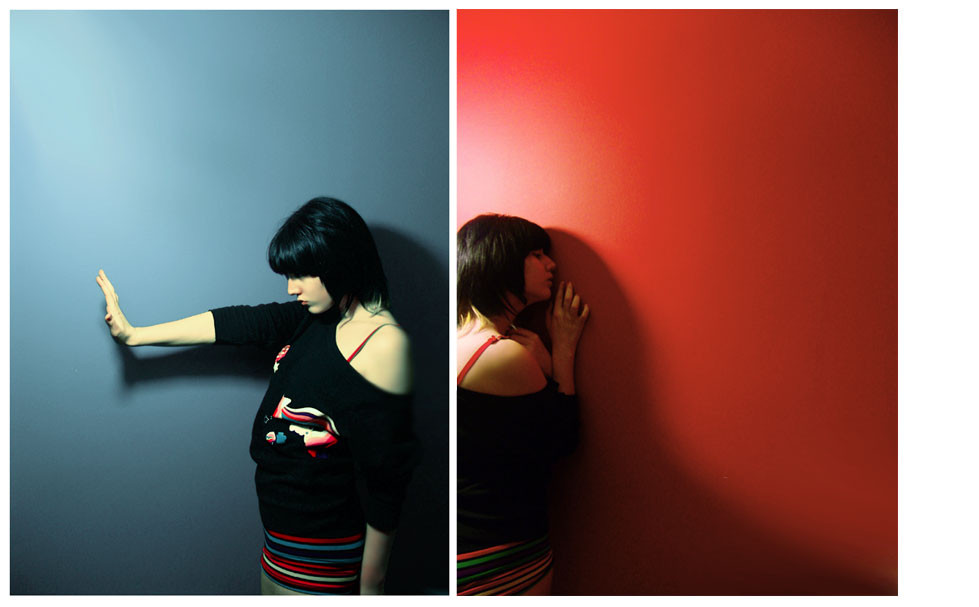
Published: 2005-01-03 15:53:56 +0000 UTC; Views: 3478; Favourites: 62; Downloads: 673
Redirect to original
Description ireallythoughtaboutwhattowritehere.
Related content
Comments: 65

Advertiser [2006-10-23 23:30:00 +0000 UTC]

i like your deviant and colors...

πŸ‘: 0 ⏩: 0

assimilated [2006-09-13 09:22:14 +0000 UTC]

I like the use of primary colours and modelling behaviour.

πŸ‘: 0 ⏩: 0

sywrysyneck [2006-05-15 21:43:35 +0000 UTC]

hos olmus

πŸ‘: 0 ⏩: 0

Angelophiliac [2006-04-02 00:52:05 +0000 UTC]

so Final Fantasy-ish

still not so bad..

teh master hath spoketh.

-end of transmission-

πŸ‘: 0 ⏩: 0

Zlatty [2005-12-04 18:57:14 +0000 UTC]

love the colors
very nice work

πŸ‘: 0 ⏩: 0

purehatred [2005-10-01 13:52:35 +0000 UTC]

greaaat||

πŸ‘: 0 ⏩: 0

7grims [2005-07-03 22:49:49 +0000 UTC]

love the coulor so intence.

πŸ‘: 0 ⏩: 0

diizy [2005-06-19 19:49:13 +0000 UTC]

nice, but the boreder on the right, kinda bothers me. almost a fav... close.. haha.

πŸ‘: 0 ⏩: 0

ThreeLibras [2005-05-09 07:19:26 +0000 UTC]

nice

πŸ‘: 0 ⏩: 0

MONOtipija [2005-04-25 04:14:05 +0000 UTC]

it remind me the Yeah Yeah Yeahs :}
colors and contrast are great*~

πŸ‘: 0 ⏩: 0

KoRnaKana [2005-04-11 00:01:20 +0000 UTC]

That's very symetrique

πŸ‘: 0 ⏩: 0

MotherSvea [2005-03-23 12:10:02 +0000 UTC]

this one is really cool!! i love the contrast between the two colors and the diffrent croppings...great!

πŸ‘: 0 ⏩: 0

Pedram [2005-03-17 01:04:54 +0000 UTC]

greAt ideA

πŸ‘: 0 ⏩: 0

shattered-reflection [2005-03-06 01:56:11 +0000 UTC]

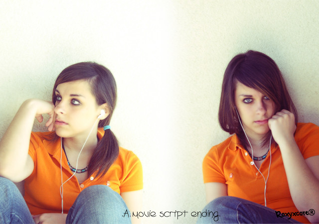
I love how on the blue side the girl seems strong and confronting and the red side seems hurt from confrontion. Its like strength and weakness but at the same time the blue could be protecting the red from more harm. There is so much there and the lay out and colours are superb. Its a brilliant idea!

πŸ‘: 0 ⏩: 1

boopkit In reply to shattered-reflection [2005-03-06 10:46:43 +0000 UTC]

thank you darling.

πŸ‘: 0 ⏩: 1

shattered-reflection In reply to boopkit [2005-03-08 12:56:42 +0000 UTC]

You welcome!

πŸ‘: 0 ⏩: 0

GoblinQueeen [2005-02-19 01:20:38 +0000 UTC]

Wonderful juxtaposition

πŸ‘: 0 ⏩: 1

boopkit In reply to GoblinQueeen [2005-02-19 11:34:44 +0000 UTC]

πŸ‘: 0 ⏩: 0

TaintedFaerie [2005-02-11 23:56:45 +0000 UTC]

I love the colors- the coldness and the warmpth is brilliant.

πŸ‘: 0 ⏩: 1

boopkit In reply to TaintedFaerie [2005-02-11 23:57:14 +0000 UTC]

thanx dear.

πŸ‘: 0 ⏩: 0

piervitbari [2005-02-11 12:51:01 +0000 UTC]

I meant thanks have submitted this piece

πŸ‘: 0 ⏩: 1

boopkit In reply to piervitbari [2005-02-11 13:09:10 +0000 UTC]

thanx for supporting, and appreciance.

πŸ‘: 0 ⏩: 0

piervitbari [2005-02-11 01:09:32 +0000 UTC]

oh THANK YOUUU!

πŸ‘: 0 ⏩: 1

boopkit In reply to piervitbari [2005-02-11 12:43:39 +0000 UTC]

hehe what for?

πŸ‘: 0 ⏩: 0

piervitbari [2005-02-11 00:46:50 +0000 UTC]

this piece is wonderful

SPECTACULAR ASYMMETRY


yEaH

πŸ‘: 0 ⏩: 1

boopkit In reply to piervitbari [2005-02-11 00:52:36 +0000 UTC]

thanx dear.

πŸ‘: 0 ⏩: 0

preservation [2005-02-08 11:46:32 +0000 UTC]

All your photographs are seriously awesome.
+devwatch, if you don't mind.

πŸ‘: 0 ⏩: 1

boopkit In reply to preservation [2005-02-08 11:54:23 +0000 UTC]

thank you darling.

πŸ‘: 0 ⏩: 1

preservation In reply to boopkit [2005-02-08 21:41:22 +0000 UTC]

You are very welcome.

πŸ‘: 0 ⏩: 0

PaLiAnCHo [2005-02-07 18:56:53 +0000 UTC]

basarili calisma

tebrik etmek duser

πŸ‘: 0 ⏩: 1

boopkit In reply to PaLiAnCHo [2005-02-07 23:22:51 +0000 UTC]

πŸ‘: 0 ⏩: 0

steinH [2005-02-07 14:43:18 +0000 UTC]

Lovely

πŸ‘: 0 ⏩: 1

boopkit In reply to steinH [2005-02-07 23:24:43 +0000 UTC]

thanx.

πŸ‘: 0 ⏩: 0

sketcher- [2005-02-07 11:10:35 +0000 UTC]

mmm. polis sireni.

πŸ‘: 0 ⏩: 1

boopkit In reply to sketcher- [2005-02-07 11:12:59 +0000 UTC]

dogrudur vallahi

πŸ‘: 0 ⏩: 0

chloroflu [2005-02-04 21:10:28 +0000 UTC]

evet,bu kozmik birlesim guzel olmushh


--
believe in fairies!

πŸ‘: 0 ⏩: 0

dkdance [2005-02-03 18:01:58 +0000 UTC]

great shot ! colors,light,composition...
2say it in one word

NICE !!!!

πŸ‘: 0 ⏩: 1

boopkit In reply to dkdance [2005-02-03 20:38:59 +0000 UTC]

πŸ‘: 0 ⏩: 0

mreby [2005-02-02 12:33:11 +0000 UTC]

//

πŸ‘: 0 ⏩: 1

boopkit In reply to mreby [2005-02-02 23:16:32 +0000 UTC]

πŸ‘: 0 ⏩: 0

j3concepts [2005-02-01 16:42:22 +0000 UTC]

excellent work. a definite fav!

πŸ‘: 0 ⏩: 1

boopkit In reply to j3concepts [2005-02-02 23:22:37 +0000 UTC]

thanx.

πŸ‘: 0 ⏩: 0

xakep [2005-01-31 21:05:22 +0000 UTC]

o duvarlar nasil temiz bu kadar. cok basarilisin gercekten ezik hissettim kendimi

πŸ‘: 0 ⏩: 0

B-positive [2005-01-27 08:32:06 +0000 UTC]

I love the contrast here

πŸ‘: 0 ⏩: 1

boopkit In reply to B-positive [2005-01-27 16:05:52 +0000 UTC]

thanks.

πŸ‘: 0 ⏩: 0

ariadnezenit [2005-01-27 01:18:50 +0000 UTC]

yumm.

yam yam yam.

kostΓΌm cilgini.

πŸ‘: 0 ⏩: 1

boopkit In reply to ariadnezenit [2005-01-27 06:12:14 +0000 UTC]

eha sponsorlarimiz mevcut tabi.

πŸ‘: 0 ⏩: 0

stupito [2005-01-20 20:15:36 +0000 UTC]

..en favorim..ozellikle soldaki.Her ikisinde de background dokusu,isik super (soldakinde daha super) photoshop var mi bu iste?

πŸ‘: 0 ⏩: 2

boopkit In reply to stupito [2005-01-21 04:40:30 +0000 UTC]

tabiki.

πŸ‘: 0 ⏩: 0

boopkit In reply to stupito [2005-01-21 04:37:30 +0000 UTC]

evet var.

πŸ‘: 0 ⏩: 0


| Next =>