HOME | DD
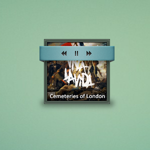
 Bow-N-Aero — Slick Windows

Published: 2011-05-05 17:52:25 +0000 UTC; Views: 6359; Favourites: 30; Downloads: 121
Redirect to original
Description
My newest Windows/Desktop concept.\Programs Used
~Photoshop CS5
~Gimp
\Credits
~Token Icon(s): ~brsev
\Update 1
~Darkened the Green.
~Added a second color variant.
~Added a Pop-Up preview.
~Brightened the Close button.
\Update 2
~Totally revamped the look
~Added a Taskbar and Start Menu
\Update 3
~Changed the main color
~Took out stripped bar and moved the Location Bar
~Added a Firefox preview
Critiques Greatly Appreciated!

Related content


Comments: 55

This isn't real. Made in photoshop.
👍: 0 ⏩: 1


i would love to make this into a Visual Style for 7...
if u don't mind

👍: 0 ⏩: 1
I would love for you to make it. I will note you the psd.
👍: 0 ⏩: 1
ok, bro...
I'll be waiting for the psd
 (Wink)")
👍: 0 ⏩: 2

Kiko, where is it?

👍: 0 ⏩: 0

Please, share with me the PSD. I want to change your skin to suit your style and theme Noche.
👍: 0 ⏩: 1
Sorry, I don't have the PSD anymore.
👍: 0 ⏩: 1


")

Dude, you can't let me see this and then don't have a release for it ")
 (Smile)")
👍: 0 ⏩: 2
The possibility of this being a theme is close to 0. It just wouldn't come out well. There's a better chance of this becoming a theme.
👍: 0 ⏩: 0

OMG OMG OMG I just got a concept for my program's design! Thank you!
👍: 0 ⏩: 1


nice mockup!
could I use the checkboxes in my next VS?(so yes can I have them seperated from the rest of the image please?)
👍: 0 ⏩: 2
Here: [link]
If you need a bigger canvas or what-not just let me know.
👍: 0 ⏩: 0
I would love for you to use them but unfortunately I re-did the check boxes. I can re-make them though. Do you want a psd or something else, and what size canvas?
👍: 0 ⏩: 0

hahahah looks fucking awesome - makes me sad that windows will never be like this :,(
👍: 0 ⏩: 1
Yeah, those guys over at Microsoft have no style.
👍: 0 ⏩: 1


Love it! Although I personally would use blue/orange for the buttons, with around the same saturation. That's just personal preference though ")
👍: 0 ⏩: 1
Thanks
Yeah, I was thinking the color was a little too pastely. I will be messing around with some more colors later on. Yeah, the close button color needs to be lightened also.
👍: 0 ⏩: 1
If you are releasing this as a Win7 VS, you should include different colors. And quite like the strength of the color, just not the color itself
👍: 0 ⏩: 1
I have no knowledge on creating Visual Styles. Would have to grab someone who does and ask them for some help.
👍: 0 ⏩: 1
Aw, thats too bad
👍: 0 ⏩: 1
Yeah, maybe I'll get to that at some point. I do plan on incorporating as much as I can into Rainmeter, I do know how to program the RM configs pretty well. Such as the taskbar I will be creating, that should be pretty simple to create in Rainmeter.
👍: 0 ⏩: 1
Mkay, well if you need any help, I'm available
👍: 0 ⏩: 1

Looks pretty good. Looks a little too... plain. Maybe add some shadows, or something to give it a little more pop?
👍: 0 ⏩: 1
Yep, I will be adding more accents as I build more on the concept.
👍: 0 ⏩: 1
Looking forward to seeing the final
👍: 0 ⏩: 1

I do not like this one as I like your others man. The text looks blurry, I also do not like the top panel - the exit button should be more visible, and the colours just do not fit to me.
👍: 0 ⏩: 1
The text may look blurry because it is indented. Meaning there is a shadow inside of it making it look indented. If you look closely you may notice it. I was thinking the same thing about the caption buttons, I plan on altering them. I went with these colors to make it more like the current windows os, with white, instead of that green that I had on my previous mockup. I was starting to get bored of the green. I might change the top panel, we'll see. Remember, I still have a lot more to do, it may change a lot between now and then.
👍: 0 ⏩: 1
Of course you may change the whole design, till the release. I be just trolling, you know
👍: 0 ⏩: 1
The line is only 1 px. I turned down the fill of the layer completely. Added a color overlay of a dark gray on Difference. Noticed it being used in another psd I looked at and liked the outcome.
👍: 0 ⏩: 0

wow.. great mockupz.. hope yu can make them a skin soon
👍: 0 ⏩: 1

Not sure there is any Critiques that could be said this is very very nice, I think you really should A release the images as png's so people without cs can make your idea in to real apps or maybe make a real app with it, this is really nice well done man.
👍: 0 ⏩: 1
I plan on making a Rainmeter skin out of this. When it is complete.
👍: 0 ⏩: 2
| Next =>