HOME | DD
 brainwipe — Bailey

Published: 2005-06-21 12:01:14 +0000 UTC; Views: 555; Favourites: 5; Downloads: 50
Redirect to original
Description
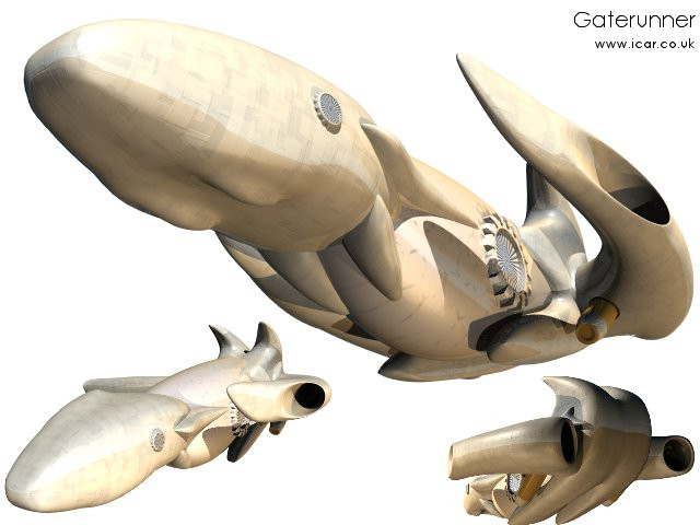
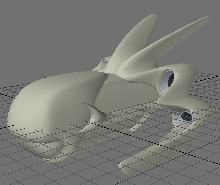
My latest craft for the Icar RPG . This is an update from an old pencil drawing I had and didn't like very much. I am using a similar texturing system as I was for the Gaterunner but I went with a more defined look for the surface. This (hopefully) gives a mix of fluid, organic-like lines and a more definite man-made technical side too.The rear view of the Bailey can be found in my scraps .
Comment and Critique always welcome.
Related content


Comments: 12

The shape is great as always; I realyl like your organic modelling style. Especially the engine(?) things, the way they are integrated into the wing bits is very nice.
Although some of the boundaries between surfaces (eg between the grey and purple surfaces in the middle) seem a bit forced and break the style a bit. And I don't like the way you can see some of the joins between the textures, like at the front. It would be nicer if you used fewer tiles of larger (or more expanded) textures.
👍: 0 ⏩: 1

I know what you mean about the texture. I have trouble getting the seams to line up. I am currently working on a number of techniques to make the joins disappear and appear a bit more organic. I think fewer tiles of larger scale textures (reworded what you said) might actually largely solve the problem. I have moved onto something infinitely more difficult but I shall return to the retexturing of this one in the future.
Thanks for the comment!
👍: 0 ⏩: 0


Looks great.
Good work.
Your ship collection continues to grow!
👍: 0 ⏩: 1
Yes, and still my players want more. More and more and more. They can't get enough of space craft. I feel like it's a never ending cycle. I give them a few, they want more. Thanks for the comment, mate!
👍: 0 ⏩: 0
Cute! Wow, I've never had any of my stuff ever called cute before.  (Smile)")
👍: 0 ⏩: 1

Well, its kinda got that round cuddly look to it..
👍: 0 ⏩: 0

Very original design... Have you thought of turning it over? It almost looks upside down to my eye -- though most of the world does ")
👍: 0 ⏩: 0

*first post dance*
Very well done! I like the shape of that thing, and the smoothness (despite the textures it looks sooth).
It makes me remind of the Half Life 2 alien ships, I love the organical look of this (don't know why it looks so organical to me).
I love the egines, the shape of those wings, and the fact that it looks a bit partitized (borken into few parts), but the textuers look a bit unnatural. And I find few places where you can clearly see them apart (the same texture but like if it was broken in half and placed.
But I like it, I think it's a great job, and very well invented.
I think you could make smoother textures on thisa one, instead of the standard ones with squares and stuff.
good job anyways!
+fav
👍: 0 ⏩: 1
Thanks Spliter. I agree that the textures do look quite inorganic. I will try putting some more curvatious mappings on it and see how it looks. I need to teach myself UV mapping and this might be the perfect opportunity to do so.
👍: 0 ⏩: 0