HOME | DD
 bramLeech — conceptual rendering3

Published: 2007-06-14 15:57:55 +0000 UTC; Views: 2503; Favourites: 49; Downloads: 8
Redirect to original
Description
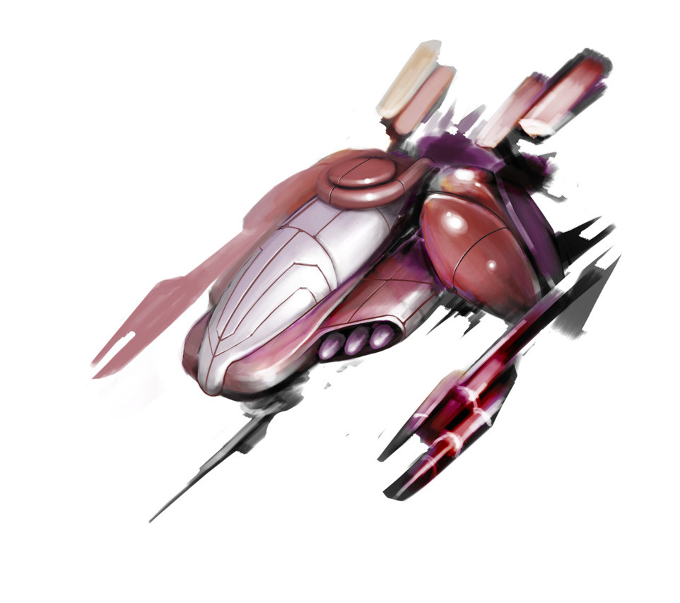
For this week, i tried to start my rendering with the cool gray colors instead the warm gray colors which i am more familiar with. After listening to my lecturer's advice and comment, i chose a part which i want to emphasize and focus most of the rendering on that certain portion, thus keep the other parts loose, but in the end, i still think that i didnt really do well...design by the great Feng Zhu, lineart traced by me.Comments please, as usuall, tell me what is wrong with it. thanksRelated content


Comments: 31


excellent! I love this concept. Is it o.k to ask what tools you used? thanks
")
👍: 0 ⏩: 1

actually i traced the design from Feng Zhu using artline marker and then rendered it using prisma color marker on a a3 size paper, this is my weekly assignment.Thanks for the fav!!
👍: 0 ⏩: 1
oh interesting. Well my favourite part is the rendering. It almost looks digital but anyhow the rendering is TOP CLASS! I havn't seen such an excellent render with traditional mediums.
Oh and you deserve the 
👍: 0 ⏩: 1
thank you very very much!!! Im still a beginner, lots more to learn....thank you!!
👍: 0 ⏩: 1
I really really really wouldn't consider you as a beginner. I saw your gallery and it's really good. Compared to mine, I suck!
 (Wink)")
👍: 0 ⏩: 1
thank you very very much for the compliment, yours is not bad as well, be confident with your artwork, my friend. ^_______^
👍: 0 ⏩: 1
no problem and thanks for the advice. Very helpful
👍: 0 ⏩: 1

wow ... this is 4 the next Star Wars movie ..... (i think)
👍: 0 ⏩: 1
haha, i dunno, ask feng zhu, the master designed it...may da force b with u, my young padawan...
👍: 0 ⏩: 0

hmm i dont really like the blue color,but the grey is just great!!
wow feng zhu's art is really brilliant....and btw,i saw u in GEMPAK's magazine hehe
 (Cool)")
👍: 0 ⏩: 1
haha, thank you, i personally think dat da blue looks abit weird oso XD...haha, izzit???did u feel dissappointed after looking at myself face?? or did i giv u a nightmare??lol....
👍: 0 ⏩: 1
u're welcome....no not at all don worry,u're cute.....i dreamed i won in the contest
👍: 0 ⏩: 1
OMG!!u r da oni person dat wud tell such a lie.....lol
👍: 0 ⏩: 1
")
👍: 0 ⏩: 1
haha, now u say i look lik a gal.....lol
👍: 0 ⏩: 1
no i mean thats my impression before i saw ur real pic....and after i say the real pic,beautiful girl punya impression changed to cute boy....ha now geddit? haha
👍: 0 ⏩: 1
haha, i understood wat u mean, juz 2 kacau u oni XD...cute boy??sounds damn wrong...thx anyway...lol..u hav msn??
👍: 0 ⏩: 1
hehe...u're welcome,yeap.u want my add?
👍: 0 ⏩: 1
yup, it is lik y not??i will note u,ok??
👍: 0 ⏩: 1

I still like your previous one, but I think that you are achieving some interesting textures in this one. I think my main crit here is that the shadow areas are warmer than the brights which confuses my eyes a bit. also the red and the blue i feel aren't really as harmonic as the colors you chose in your previous render. other than that i think the execution is good like always, looking forward to seeing more awesome stuff from ya bro!
👍: 0 ⏩: 1
yeah, i agree with you on the colors combination, thank you very much for the comment, i apprieciate it!!
👍: 0 ⏩: 0


