HOME | DD
 bratn — vektorsoftware logotypes
Published: 2007-08-08 02:38:29 +0000 UTC; Views: 6635; Favourites: 39; Downloads: 231
Redirect to original
Description
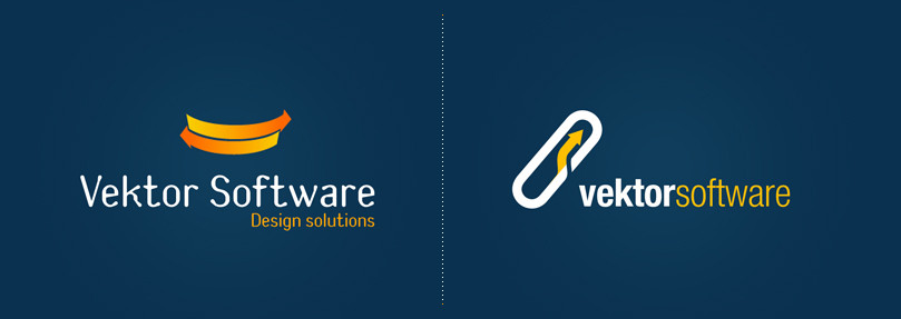
Just playing around, I didnt even show them to my friend : )Related content


Comments: 20


The 2nd one is the better one, visually-speaking. But what do the marks mean?
Also, the arrow on the 2nd one feels a bit cramped. You've got it butting up against the sides of the pill shape, and it feels a bit too tight. Loosen that up a bit and things will feel more comfortable.
👍: 0 ⏩: 1

Thanks for adviceses.
What does they means? nothing, its just a simple logotype for software and design company.
👍: 0 ⏩: 1
All logos should mean something. That's the point. They exist to communicate something to the public about the company.
👍: 0 ⏩: 1
I know what you mean, so tell me what means nike logo?: )
👍: 0 ⏩: 1
The nike logo is a stylization of a wing, which is a symbol for the Greek/Roman goddess named Nike. The goddess Nike personifies Victory, which makes sense because the company Nike is all about sports and winning. In the olden days, athletes would pray to Nike to ensure their victory in competitions and warriors would pray to Nike to ensure victory in battle.
See how it works?
👍: 0 ⏩: 1
Yeah, but to be honest 70% of all logotypes have no avid message or its hard to read them out.
👍: 0 ⏩: 1
70% of all logos are crap. You shouldn't hold yourself to the same standard. The professional design agencies all incorporate a message into logos. It's what you're supposed to do as a respectable professional. Even if your message is "we're badass," there should be a message. Not to compare you to me at all, but an example of what I'm talking about is my Napalm Riot logo . Napalm Riot doesn't set things on fire, nor do they belong to the military or anything like that. Instead, the idea is to create a symbol that evokes kicking ass. It is intended to look like something a tough motherfucker tattoo'ed on his arm, and that's the whole message. Not all logos need to have a secretive history behind them like the Nike logo does, but all good logos at least have a message they're trying to convey.
👍: 0 ⏩: 1

man i really like your comments
thanks for info.
👍: 0 ⏩: 0
Client choose 2nd ver like you said guys. Thanks for comments.
👍: 0 ⏩: 0


 (Smile)")


")


the second one is amazing.. show it to your friend!! and tell us what he say!
👍: 0 ⏩: 0
