HOME | DD
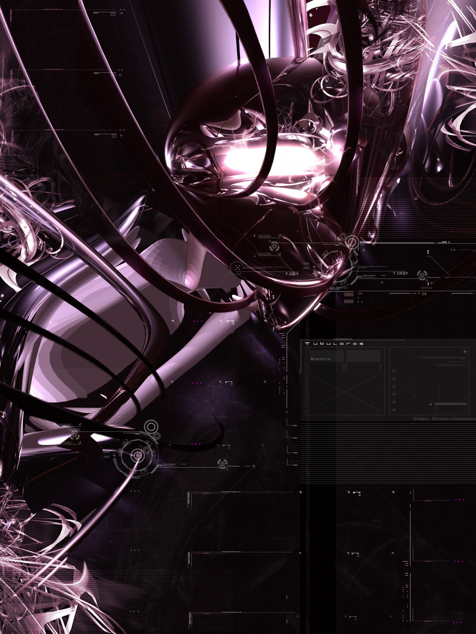
 breakerr — Tubularos
Published: 2004-01-23 07:08:24 +0000 UTC; Views: 1688; Favourites: 48; Downloads: 548
Redirect to original
Description
Image #15 in honor to my First DeviantArt Birthday.vs
Another day, another image................................... .....I dont know why It took me so long to work with one of my first friends here in
 My good buddy and I were talking one day and realized that we had been friends for so long and never did something together till now
  shame on us
 ")
Originally this was a wallpaper with 55% or more of negative space, I gave that to him and he returned as it is now.
Breaker: Bryce Main render, color adjusments, grid and other little details.
Silvatrez: Mini-renders, Typo/2D and center bolt/lightning
I wanted to edit the colors a bit more, but at this precise moment(right now be4 uploading this) my monitor is being a whore :s
Till the next one

18 images 1 image per day, a Breaker effort in honor to his first year around
Related content


Comments: 67


")

I'm lovin the render and colours , but find the big 2d box on the right a little too distracting ...seems to draw my sight away from the rest and imo it needs a border .over all Damn Fine my friend.....

👍: 0 ⏩: 0

wow thats a beautiful pic....beautiful lights and what a great 2d!
Love it!
👍: 0 ⏩: 0


the colour is quite cool..
i think that the cel-shaded render (left side) fits in to the whole shiny renders thing..
2d is still great, and definitely a
👍: 0 ⏩: 0


Pretty cool guyz ... nice 2D and great Breakeresque reflective spheres. Are those big curves bits of thin torus rings ?? Did you composite more than one render in this ? +FAV
👍: 0 ⏩: 1

Thanks for the comment buddy  (Smile)")

- Yes, the big curves are torus.
- I only did one render  (Wink)")
Thanks for the fav too

👍: 0 ⏩: 0


It all seems quite random, doesn't have no real structure, but its abstract and has some nice shapes and forms..
typo is good (although seen it before) and overall nice job
👍: 0 ⏩: 0

Heh heh... can't think of a useful comment now, i'll do it when I get ack from school, in the meanwhile. 
👍: 0 ⏩: 0

Damn, you guys should have worked together earlier. Then we'd have more pieces like this. I like the color, 2d, the whole nine basically. Great work guys.
👍: 0 ⏩: 0

awsome mate! really great!
the renders are awsome 2d is superb... what more can I say... great wor you 2
👍: 0 ⏩: 0

woah, i really like the bottom right and i guess everything else, uve outdone yourself, awesome job, deserved +fav.
👍: 0 ⏩: 0

Damn, that's tight! I like how detailed the render is & the 2d work is well done. Nice job bro.
👍: 0 ⏩: 0
<= Prev |