HOME | DD
 breakerr — xcuze

Published: 2005-12-03 20:11:09 +0000 UTC; Views: 1380; Favourites: 16; Downloads: 315
Redirect to original
Description
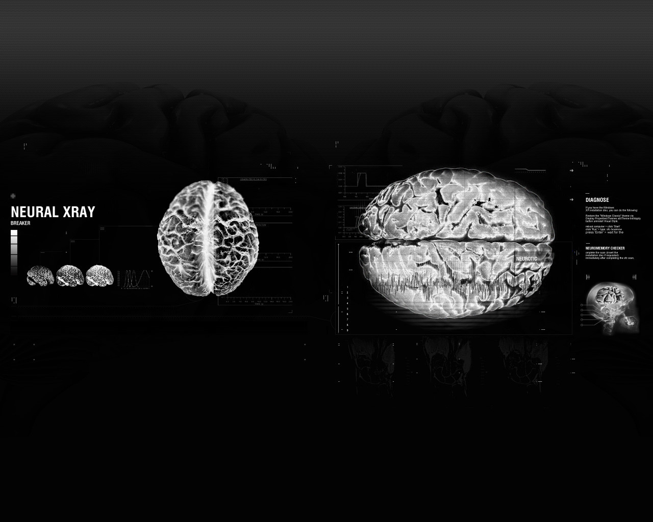
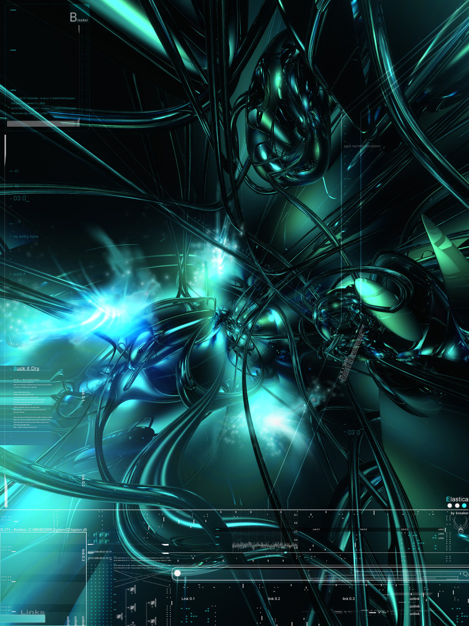
________________________________________ _________xcuze Hipócrates Rodriguez....Just playing around........
Related content


Comments: 28


i've always loved the b&w render w/ yellow typo & 2d added. looks great together!
great job on this man. always enjoy your renders and 2D work
mP

 (Smile)")
👍: 0 ⏩: 0


Fairly cool render, and the 2d is quite nicely set up. The use of yellow is cool.
👍: 0 ⏩: 0

you should have done more with the white area in the upper part of the image... Overall it's quite nice tho
👍: 0 ⏩: 0

so cool! i love the colors! it's one of my favs too!
👍: 0 ⏩: 0


liquid metal is right..is what they look like to me..and a whole lotta them...very niceeeeeee breakerr
👍: 0 ⏩: 0

dont like the grayscale, and looks sorta flat...i've seen better outta ya,.,,
Helsy
👍: 0 ⏩: 0

Reminds me a scene from ALien ")

👍: 0 ⏩: 0

..hmmm..liquid metall ..yeah...it looks so..... (Wink)")
👍: 0 ⏩: 0


powerful, intence and somewhat sexual... i loved it.
👍: 0 ⏩: 0


I would say one of your more original pieces, though there are parts of the render that don't seem to have very much definition. I'd like to see more sharper edges, personally.
The little bits of color here and there do a decent job, but they look like they're more of an afterthought than an actual indended element. More yellow would help I think.
👍: 0 ⏩: 0


