HOME | DD
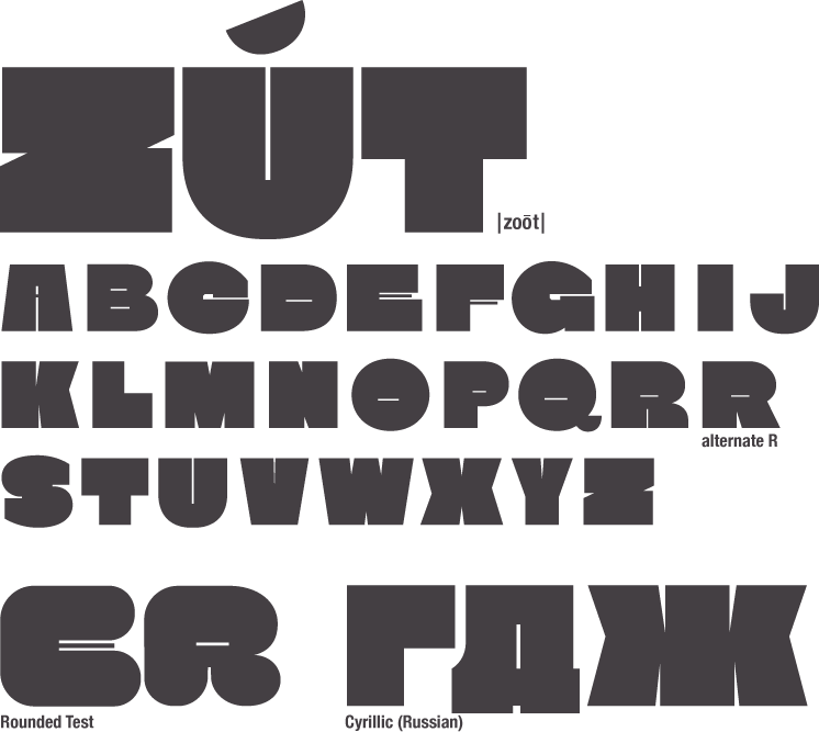
 brianskywalker — 'Alpine' font

Published: 2010-06-17 06:51:16 +0000 UTC; Views: 373; Favourites: 0; Downloads: 17
Redirect to original
Description
Experimenting with forms.Related content


Comments: 16

i like how the forms look hand-drawn, somwhat organic. reminds me a bit of centaur which is very awesome

👍: 0 ⏩: 1

Thanks! I based it off of some letters I drew by hand. I also avoided copy & paste, so it's really like a digital "hand-drawn".
👍: 0 ⏩: 1
thanks for the watch, although i won't be that active on dA anymore...
also: is there a way to purchase your fonts?
👍: 0 ⏩: 1
Right now, they are all free. But I am going to release some for sale in the future.
If you use Google+, you can circle me here: [link] And I make announcements of various things there.
👍: 0 ⏩: 1
i see! the download button, haha didn't think of that
sorry, no google+...
")
👍: 0 ⏩: 1

Really excellent design. I think it has a bit of Elmhurst though your design seems a bit more complex and interesting. Isn't the tittle a little bit too high though?
Also, this might not be true at all, but wouldn't a vertical weight distribution in the 'o' be a better fit since the n/h is quite narrow and seems to focus a bit more on the vertical strokes?
👍: 0 ⏩: 1
Thanks. I never heard of Elmhurst before now. I can definitely see what your saying, but I've actually taken perhaps more inspiration from Xavier Dupre and early 20th century type. Though it was mostly subliminal. Mainly this came from sketching in my notebook.
> Also, this might not be true at all, but wouldn't a vertical weight distribution in the 'o' be a better fit since the n/h is quite narrow and seems to focus a bit more on the vertical strokes?
Actually, you may very much be right!  (Smile)")
> Isn't the tittle a little bit too high though?
It is.
Note: I haven't touched this design in almost 2 years!
👍: 0 ⏩: 1
Ahh strangely enough I haven't designed a typeface inspired by Xavier Dupré's work even though his designs are not only original but perhaps even revolutionary.
I rarely ever sketch myself. Somehow with a pencil I just don't have any feeling for type. I recently bought a proper calligraphic pen though with which I already made some inspirational forms. I'm a big fan of Gerrit Noordzij and his calligraphic principles.
Why haven't you worked on Alpine? I mean, it sounds very recognizable. I get tired of working on the same typeface so right now I have about 8 in progress.
I thought I recognized Alpine and I just found out why. I have a tremendous collection of pictures of typefaces to inspire me, and this picture of your Alpine font resides in a folder called 'Interesting ideas' in which I put any kind of type which features inspiring details and unique letter forms which might eventually end up in one of my own designs. It's the lack of symmetry and simplicity which I find very striking about Alpine.
👍: 0 ⏩: 1
Yes, his work is great. Although indeed just a lively variation on some fairly historical models.
I quite enjoy sketching anything. It's actually sad that I now sketch letters, because what could have been some great cartoon characters and vehicles and landscapes, degrades into sketches of letterforms.
> Why haven't you worked on Alpine?
Just haven't. Although thinking about it, I did add an 'a' a few weeks ago. Before that I had unsuccessfully tried to make an ultralight. It looked terrible.
> I get tired of working on the same typeface so right now I have about 8 in progress.
Me too. But I prefer to only do 2 or 3 at a time. Usually it varies which two, but I prefer to toggle rather than go all over the place. Also, I'd be working on 20 at once if I just did everything.
> I thought I recognized Alpine and I just found out why. I have a tremendous collection of pictures of typefaces to inspire me, and this picture of your Alpine font resides in a folder called 'Interesting ideas' in which I put any kind of type which features inspiring details and unique letter forms which might eventually end up in one of my own designs. It's the lack of symmetry and simplicity which I find very striking about Alpine.
Ah, so I'm not the only one who does this? Actually, mine goes far beyond type, and is categorized into many folders because I can't keep track of them otherwise. However, I have one folder for fonts, one for calligraphy, one for lettering, and one called typography. They are all confused and I need to organize them. The typography folder has many folders nested inside, and there are more redundancies. I'd go into exactly what the problems are, but really I should just clean it up. It's a mess.
👍: 0 ⏩: 1
"what could have been some great cartoon characters and vehicles and landscapes, degrades into sketches of letterforms"
I can kind of understand that statement although it's also a bit strange coming from a type designer. I sometimes feel like a proper typeface would say much more than an illustration would. I think it's mainly my clients who perceive it as a bit disappointing that I'm focusing more on type than illustration now.
"Actually, mine goes far beyond type"
Same here. I'm incredibly obsessive with sorting my files, even my music. Everything has have a name which makes sense and be in appropriate folders with a couple of layers of sub-folders. It's pretty extreme to many people but then I never have to search for anything because I know exactly where it is.
👍: 0 ⏩: 1
Don't get me wrong - I love type. And type speaks volumes. But under it all, I want to draw. I really consider my own design and illustration work as related but separate - I don't tend to use illustration within designs, although making one is, in a way, a design process.
> I'm incredibly obsessive with sorting my files, even my music. Everything has have a name which makes sense and be in appropriate folders with a couple of layers of sub-folders.
👍: 0 ⏩: 1
"After being very organized, it slowly falls apart, then I reorganize"
I just put everything I'm too lame to organize at the moment in a separate folder. I then sporadically find an hour or so where I catch up. The structure barely changes.
"I'm a bit reactive I suppose"
Same here. I have Asperger but although people tend to see it as a complication it's more like a characteristic personality. I actually think the things we're speaking of might be traits of the kind of person a type designer is. Just a wild guess with little data to back my claim up. I tend to look at type designers as rather obsessive and eccentric people though, which I like.
👍: 0 ⏩: 1
That makes so much sense!
I've never been tested for any type of disorder like that, but I've been told I probably have one something like that by my friends. I think you probably have to be obsessive to design type.
👍: 0 ⏩: 0