HOME | DD
 BrianWolfe — T h e T r a i l I R
Published: 2005-10-12 21:00:40 +0000 UTC; Views: 633; Favourites: 28; Downloads: 86
Redirect to original
Description
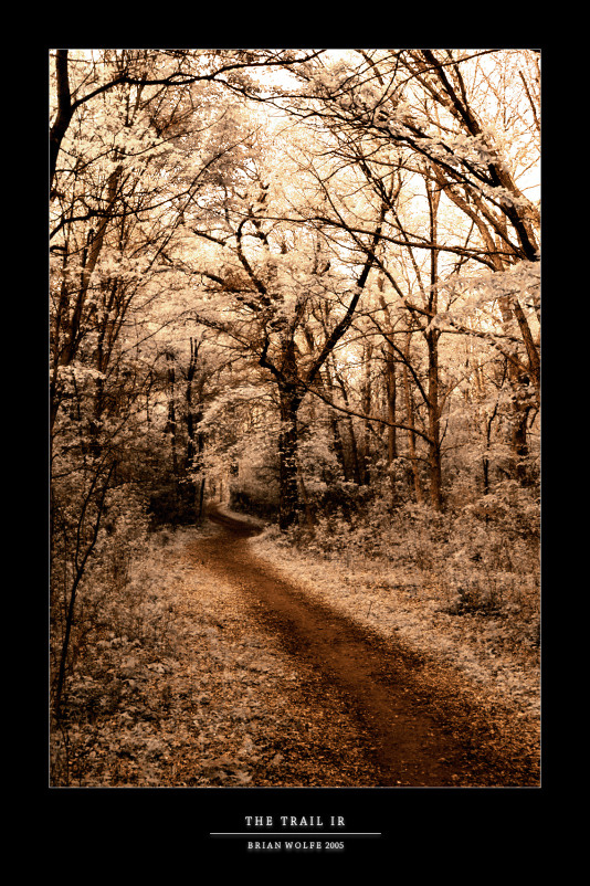
IR version of [link]I think I almost like this version better because there is a little more contrast and everything just seems to stand out a little more. So I thought I'd submit it and see what everyone else thinks.
Related content


Comments: 49

The contrast between the dark trail and the light trees is striking.
👍: 0 ⏩: 0

OMG.... this is amazing. If I had the money, I would sooo buy a print for this one!.

👍: 0 ⏩: 1

Thanks a lot!
Well, maybe I'll have to put it up for print. I usually make my prints affordable.
👍: 0 ⏩: 0

wow! it enchants the contrast and that golden tone to me that the photo takes

👍: 0 ⏩: 1


oooooooooooooooh your right i lvoe love love love this one.. its magnificent.. *heart*
👍: 0 ⏩: 1

i definately enjoy this much more in IR a VERY beautiful shot.... im gonna have to keep an eye on you
👍: 0 ⏩: 1
 (Smile)")
Glad you like it. Thanks for the watch, I hope you continue to enjoy my work.
👍: 0 ⏩: 1


yes.. this is excellent. although i love the greens the best
")
👍: 0 ⏩: 1

Ooh. Pretty. The color is just perfect for setting the mood. Nice job.
👍: 0 ⏩: 1

O! I like the way you did this one a lot. 
👍: 0 ⏩: 1


hmm, I like the photo, but I am not so fond of the IR-given colours.. those brown tones somhow don't fit in my eye. BUt you are right, the contrast is better.
Maybe the contrast-improved original would have been the best choice ? I don't know.
👍: 0 ⏩: 1
Yeah, I was hesitant to submit it because the colors did look a little bit off to me. Maybe I'll mess with the the hues and see what I can come up with.
Thanks for the feedback.
👍: 0 ⏩: 1

I think this version looks better as the color agrees better with the subject
👍: 0 ⏩: 1

i think i agree with you... i like this one better as well... also because of the contrast
👍: 0 ⏩: 1


I really like how the brown blends with the white in this one. Another great IR shot.
I've been experimenting with an IR filter plug-in for Photoshop, but it doesn't seem to work as well as the one in PSP. I think I'm going to try using an actual filter on the lens and see how that works out. These IR shots are just too good for me not to try them out.
👍: 0 ⏩: 1
Thanks!
Yeah, I plan on eventually getting a nice lens filter. I read that some digital camera's arent good for IR because they arent sensitive enough or something, still havent looked into that further myself, but you might want to do a little research on that. Just heads up if you didnt already know.
👍: 0 ⏩: 1
Yeah, I've checked into all that, and my camera (the Olympus E-300) is actually well-suited for IR photography. I've read that the Nikon D70 is the best SLR available for IR, so I would imagine other Nikons would use a similar sensor, so I think you should be all right with yours as well.
👍: 0 ⏩: 1
Cool man.
Thanks for info, I hope to get a filter or two pretty soon.
👍: 0 ⏩: 0


Welcome (sorry for the 3x post")
👍: 0 ⏩: 0